Data Representation Techniques for KS2 Students
Explore different visualization methods such as pictograms, bar charts, and line graphs to help KS2 students understand and interpret data. Learn how to represent travel modes, pet ownership, and temperature variations using visual aids. The content includes examples and questions with answers to test understanding.
Download Presentation

Please find below an Image/Link to download the presentation.
The content on the website is provided AS IS for your information and personal use only. It may not be sold, licensed, or shared on other websites without obtaining consent from the author.If you encounter any issues during the download, it is possible that the publisher has removed the file from their server.
You are allowed to download the files provided on this website for personal or commercial use, subject to the condition that they are used lawfully. All files are the property of their respective owners.
The content on the website is provided AS IS for your information and personal use only. It may not be sold, licensed, or shared on other websites without obtaining consent from the author.
E N D
Presentation Transcript
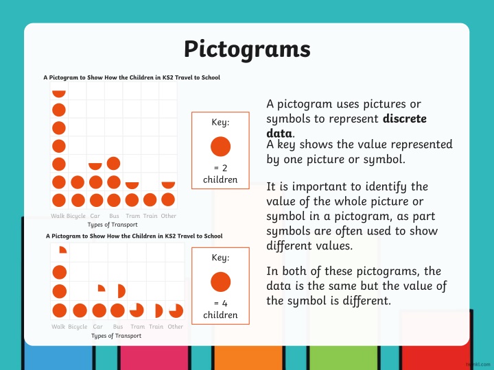
Pictograms A Pictogram to Show How the Children in KS2 Travel to School A pictogram uses pictures or symbols to represent discrete data. A key shows the value represented by one picture or symbol. Key: = 2 children It is important to identify the value of the whole picture or symbol in a pictogram, as part symbols are often used to show different values. Walk Bicycle Car Bus Tram Train Other Types of Transport A Pictogram to Show How the Children in KS2 Travel to School Key: In both of these pictograms, the data is the same but the value of the symbol is different. = 4 children Walk Bicycle Car Types of Transport Bus Tram Train Other
Bar Charts Data that is counted and has no in-between value is called discrete data. Discrete data is usually collected in a frequency table and then presented as a bar chart. Pet Cat Dog Fish Rabbit Other Number of Children 12 14 7 5 8 A bar chart has a horizontal axis and a vertical axis. A bar chart must always have a title explaining what it shows. Bars must be carefully drawn to show the data. There must be a gap between each bar. Each bar must be the same width. A Bar Chart to Show How Many Pets Y4 Have 16 14 12 Number of Children 10 8 A number line is marked on the vertical axis. The scale of this number line is chosen based on the data range. The data categories are organised on the horizontal axis. Each axis must have a label explaining what it shows. 6 4 2 0 Cat Dog Fish Rabbit Other Type of Pet
Line Graphs Line graphs are used to show changes to a measurement over time. They show continuous data. A Line Graph to Show the Temperature of the Classroom 40 38 36 Data is plotted on to a line graph in the same way as a coordinate grid. These data plots are then joined with straight lines. Temperature c 34 32 30 28 26 1 3 5 7 Time
1. 8 days 2. 4 cm 3a. 6 cm 3b. 10 cm 3c. 19.5 or 19.6 or 19.7 or 19.8 or 19.9 cm 4. It hadn t started to grow yet.
a. 17 b. 19 c. 05:00 d. Between 03:00 and 5:00


