Avoiding Death by PowerPoint: What Not to Do!
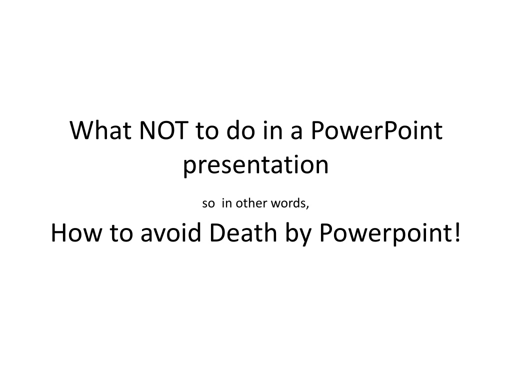

What NOT to do in a PowerPoint
presentation
so
in other words,
How to avoid Death by Powerpoint!
•
DO NOT
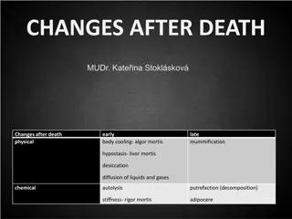
cram slides with too much detail
Nobody is excited to see an Excel spreadsheet
on a slide / An image speaks a thousand
words!
•
Another thing people really hate abut
PowerPoint presentations is when the
speaker reads out EVERY SINGLE word of the
slide. I mean, they could have just sent the
presentation through using an email or
produced a speech instead. It probably would
have been more interesting and if it wasn’t,
at least the audience could fall asleep
without feeling guilty. Reading off the slide
also carries the risk that your audience will
get bored and stop listening before you even
finish..
•
..your first slide.
•
D
o
n
’
t
u
s
e
t
o
o
m
a
n
y
a
n
i
m
a
t
i
o
n
s
!
t
h
e
y
j
u
s
t
c
a
u
s
e
m
o
t
i
o
n
s
i
c
k
n
e
s
s
.
•
DO NOT
use funky fonts
•
You want your audience to be able to understand what
is on your slide
•
And not get scared!
•
DO NOT
use pointless art clips for filling up
space
It’s just not
needed!
•
Don’t
•
Ever
•
Think
•
It’s
•
Okay
•
To
•
Bullet
•
Point
•
Everything.
•
If
•
There
•
Is
•
Too
•
Many
•
Bullet
•
Points
•
On
•
The
•
Slide,
•
No
•
One
•
Bothers
•
To
•
Read
•
Them
•
Ever!
•
And
•
It
•
Does
•
Not
•
Look
•
Good,
•
At
•
All!
•
Just
•
Don’t
•
Do
•
It
•
Ever.
•
It
•
Doesn’t
•
Make
•
Information
•
Any
•
Easier
•
To
•
Read
•
Or
•
Follow.
•
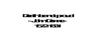
DO NOT
use fonts smaller than 36pt for headings and
20pt for text.
•
It’s hard to read, isn’t it? and it could have been something important!
In a PowerPoint presentation, it's crucial to steer clear of common pitfalls that can bore or overwhelm your audience. Avoid cramming slides with excessive details, reading every word aloud, using too many animations, garish colors, or funky fonts. Instead, opt for concise content, visual aids, and clear design choices to keep your audience engaged. By eschewing unnecessary clutter and focusing on delivering a polished presentation, you can captivate your viewers effectively.

Download Presentation

Please find below an Image/Link to download the presentation.
The content on the website is provided AS IS for your information and personal use only. It may not be sold, licensed, or shared on other websites without obtaining consent from the author.If you encounter any issues during the download, it is possible that the publisher has removed the file from their server.
You are allowed to download the files provided on this website for personal or commercial use, subject to the condition that they are used lawfully. All files are the property of their respective owners.
The content on the website is provided AS IS for your information and personal use only. It may not be sold, licensed, or shared on other websites without obtaining consent from the author.
E N D
Presentation Transcript
What NOT to do in a PowerPoint presentation so in other words, How to avoid Death by Powerpoint!
DO NOT cram slides with too much detail Nobody is excited to see an Excel spreadsheet on a slide / An image speaks a thousand words!
Another thing people really hate abut PowerPoint presentations is when the speaker reads out EVERY SINGLE word of the slide. I mean, they could have just sent the presentation through using an email or produced a speech instead. It probably would have been more interesting and if it wasn t, at least the audience could fall asleep without feeling guilty. Reading off the slide also carries the risk that your audience will get bored and stop listening before you even finish..
Dont use too many animations! they just cause motion sickness.
DO NOT use many awful colours it will only blind your audience
DO NOT DO NOTuse funky fonts You want your audience to be able to understand what is on your slide And not get scared!
DO NOT use pointless art clips for filling up space It s just not needed!
Dont Ever Think It s Okay To Bullet Point Everything. If There Is Too Many Bullet Points On The Slide, No One Bothers To Read Them Ever! And It Does Not Look Good, At All! Just Don t Do It Ever. It Doesn t Make Information Any Easier To Read Or Follow.
DO NOT use fonts smaller than 36pt for headings and 20pt for text. It s hard to read, isn t it? and it could have been something important!