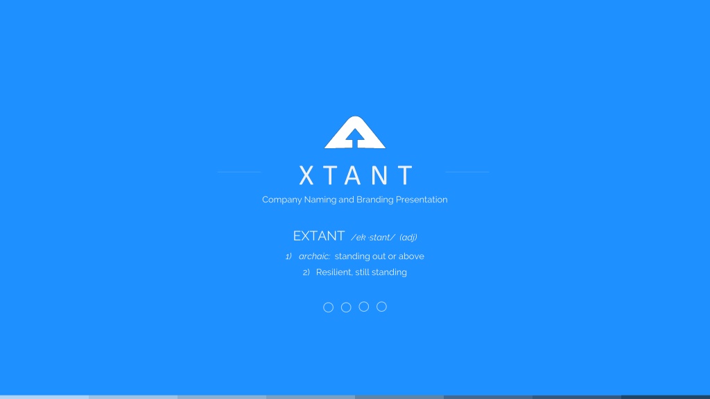
XTANT Company Naming & Branding: Standing Out and Resilient
"Explore the transformation of XTANT Medical Systems through strategic branding decisions, logo design process, and color psychology. Witness the journey of rebranding a merged entity to establish a strong market presence and gain investor visibility. From the rationale behind the name change to the selection of brand colors, delve into a comprehensive rebranding strategy that highlights resilience and distinctiveness in the competitive landscape."
Download Presentation
Please find below an Image/Link to download the presentation.
The content on the website is provided AS IS for your information and personal use only. It may not be sold, licensed, or shared on other websites without obtaining consent from the author. Download presentation by click this link. If you encounter any issues during the download, it is possible that the publisher has removed the file from their server.

Presentation Transcript
X T A N T Company Naming and Branding Presentation EXTANT /ek stant/ (adj) 1) archaic: standing out or above 2) Resilient, still standing
2 XTANT MEDICAL SYSTEMS Rationale behind the name change XTANT Medical Systems has been chosen as the merged parent company name of Bacterin and X-spine. This name was designed to portray both companies in the Biologics and Hardware market space. By definition, extant means to stand out or above which we believe our company will represent in the market. The E has been dropped from the company name in order to differentiate ourselves from the TV show Extant, thus increasing value in online marketing campaigns. Medical Systems demonstrates good visibility with the investor community and provides the option of acquiring additional sub companies.
XTANT MEDICAL SYSTEMS Rebranding Process Outline Logo competitor analysis of similar combined companies Adoption of colors from X-spine Graphic Design creates multiple logo options using competitor analysis and overall definition of the company name Marketing will narrow options to top 3 logos which best represent the new company goal Top 3 logos will be reviewed by CEO, Marketing, and option of X-spine input Each logo will be accompanied by a business card design, homepage mock-up, and displayed on various background colors (black logo on white background, white logo on black background). Top logo design will be put into a brand identity guide which will include font, color, and positioning. Additional materials will be created using the new logo
Why So Blue? Top 3 designs presented and top design is selected Joe Hallock s Colour Assignment Study found clear favorite colors for both male and female Brand Identity audiences. Blue was a staggering Guide created favorite for both genders, XTANT BRANDING The roadmap for rebranding preferred by 57% of men, and 35% of women. Graphic Design creates multiple logo options Additional materials and branding of company Colors are adopted/selected Logo Competitor Analysis
COLOR PALLETE Blues and Grays Blue evokes feelings of calmness and spirituality as well as security and trust. Seeing the color blue causes the body to create chemicals that are calming. It is no surprise that it's the most favored of the colors. Light blues give a more relaxing, friendly feel. Great examples are social sites like Facebook and Twitter who use lighter blues. - Allison Stuart, 99 Designs
LOGOS Version 1
LOGOS Version 1 Version 1 Color on Light Version 1 Grayscale on Light Version 1 Color on Dark Version 1 Grayscale on Dark This logo iteration does a great job of encompassing the definition of EXTANT. The use of negative space to create the up arrow above the horizon line is metaphoric for company goals and ambitions, while literally portraying above and beyond . This logo feels balanced and creates a sense of motion.
LOGOS Version 2
LOGOS Version 2 Version 2 Color on Light Version 2 Grayscale on Light Version 2 Color on Dark Version 2 Grayscale on Dark This iteration shows forward progress and forward thinking. The rectangular balance of this logo makes it very easy to reproduce across all media.
LOGOS Version 3
LOGOS Version 3 Version 3 Color on Light Version 3 Grayscale on Light Version 3 Color on Dark Version 3 Grayscale on Dark Similar to the rationale of version 1, this iteration uses the up arrow to portray upward progress and heightened goals and ambtions.