Understanding Responsive Design and Optimizing Online Reading Patterns

Responsive design is crucial for web development as it ensures websites adapt to various devices. Online reading behavior differs from print, highlighting the importance of structuring content effectively. By optimizing layout based on the F-shaped pattern, you can enhance user engagement.

Download Presentation

Please find below an Image/Link to download the presentation.
The content on the website is provided AS IS for your information and personal use only. It may not be sold, licensed, or shared on other websites without obtaining consent from the author. Download presentation by click this link. If you encounter any issues during the download, it is possible that the publisher has removed the file from their server.
E N D
Presentation Transcript
Writing Web Content Corporate Web Development Training: Part 1 Responsive design Online reading Structuring content
Responsive Design Responsive websites detect the device used to view them And adapt accordingly
Responsive Design Users of tablets, mobiles and desktops all see the same website content it s just optimised for their device. When creating content you need to understand how it will work on different devices. Think about webpages as being made up of separate pieces of content that adapt in different ways across devices.
Checking how your content works on different devices is vital It means your message is effective, whatever device is used
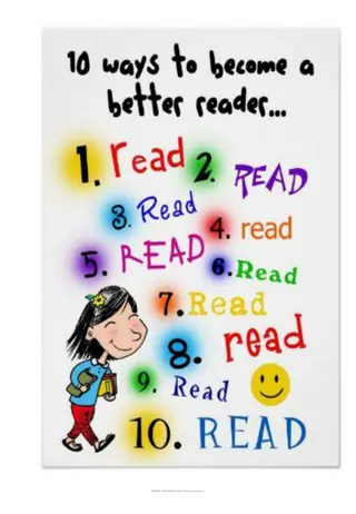
Online Reading Reading online is proven to be very different to reading print Research shows people look at web pages using certain patterns We can exploit those reading patterns to make sure key messages are effective
Online Reading Online readers: won t read all of your content they scan are task-focused if you don t answer their questions, they leave can enter your website on any page not the start noticethe first paragraph, words and headings known as the F -shaped pattern look for ways to verify how up-to-date your content is Smaller screens increase this behaviour
F-shaped Pattern Online readers tend to noticethe top of the page,first paragraph, words and headings Heat map showing eye tracking on web pages Websites optimized for smaller mobile screens: more linear eye movement to follow swiping people expect content to be visually split into chunks priority is still the top of the page people less likely to see lower content Image source: www.nngroup.com
Online Reading Bad No F-Shape text doesn t exploit where users look for effective messaging Hard to read - imagine how this looks on a mobile screen Big blocks of content - nothing to draw your eye in No sub headings to break up text and help scan reading Only 1 hyperlink and it s not descriptive No bullets to break up text Look at start of each paragraph, there s a repetitive use of words
Online Reading Good F-Shape text mirrors this to exploit where users look for effective messaging Content is short so is quick and easy to scan read Uses sub headings signposts what each section is about Use of descriptive hyperlinks to take you to more information Bullets to break up text Image adds context and interest to the page
Structuring Your Content Physically helps people to read online Makes your content easilyunderstood Results in a more effective website
Structuring a Web Page For every page you create make a tick list. Make sure you think about: the purpose of the page who you are writing the page for what users of your site want to know their key questions and tasks what you want your user to do next
Start with the Point 1. Primary message is understood at a glance: Clear/descriptive page title and introduction 2. Secondary message needs more focus: Page content with your key information 3. Supporting messages - what else is there to know/do? calls to action (register at an event/apply) related information (images/video) qualifiers to support your message (quotes)
Messaging Example 1 Here you can see 3 levels marked on a webpage: 1 1. Primary message Clear/descriptive page title and short introduction. Can be understood quickly. 2. Secondary message Key page content with more detail. Needs more focus to read. 3 2 3. Supporting messages A quote is selected to help support messaging.
Messaging Example 2 1 A different page layout: 1. Primary message You know exactly what this page is about and what type of information you ll find. 2 2. Secondary message Lists key content. Conveys lots of information, so more to read. 3 3. Supporting messages A Call to Action. A button is used to help people book a place. Relevant social media links are also provided.
Writing Web Content Corporate Web Development Training: Part 1 Complete Responsive design Online reading Structuring content Now complete Part 2