Importance of Color in Design: Warm vs. Cool Colors
Color plays a crucial role in design, with warm colors like red and orange exuding warmth and energy while cool colors like blues and greens convey calmness. Understanding the psychological effects of colors can help in creating the right ambiance for different spaces. Warm colors are ideal for high-activity areas like kitchens and family rooms, whereas cool colors are great for creating a soothing environment.

Download Presentation

Please find below an Image/Link to download the presentation.
The content on the website is provided AS IS for your information and personal use only. It may not be sold, licensed, or shared on other websites without obtaining consent from the author. Download presentation by click this link. If you encounter any issues during the download, it is possible that the publisher has removed the file from their server.
E N D
Presentation Transcript
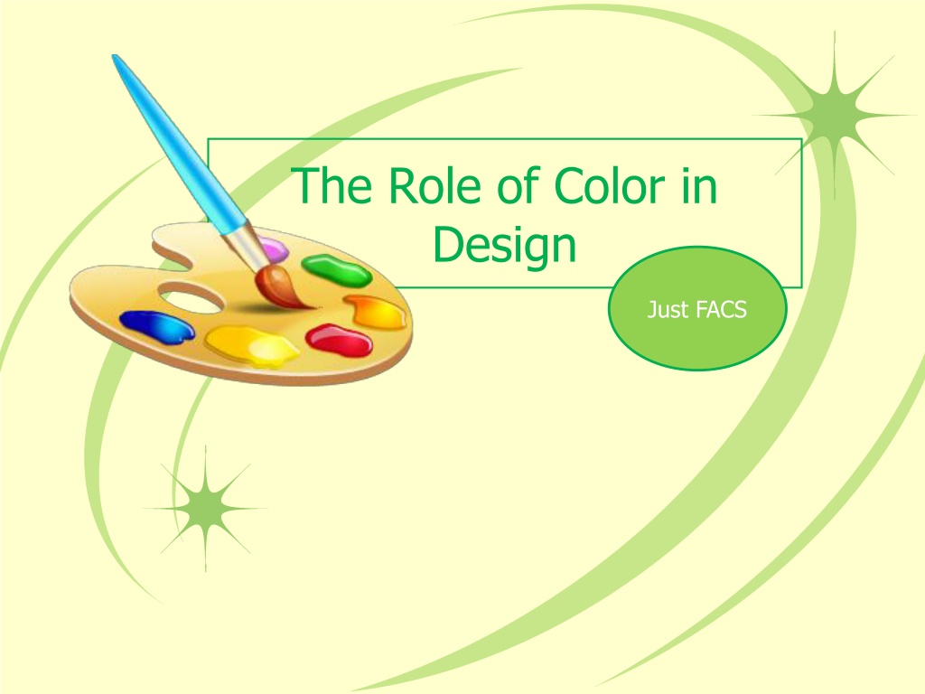
The Role of Color in Design Just FACS
Warm Colors Warm colors: red, orange, and yellow Red and orange conveys the most warmth Warm colors are suitable for areas of high activity such as kitchens and family rooms
Cool Colors Cool colors: blues and greens Popular in bedrooms, bathrooms and home offices because of their relaxing effect.
Illusions with Color Warm colored objects appear closer than cool colored ones. You can visually enlarge a room by painting the walls a cool color. High ceilings painted dark colors appear lower and a light color will allow a ceiling to seem higher. Bold, bright colors make objects stand out.
Components of Color Pigments- substances that absorb some light rays and reflect others. Hue is the color feature that makes one color different from others. Intensity is the brightness or dullness of a color. Complement color is the color opposite it on the color wheel. Value is the lightness or darkness of a color. Adding white to a hue creates a tint. Ex. Pink is a tint of red. Adding black to a he creates a shade. Lowers the value and darkens it. Adding gray to a color creates a tone.
Color Scheme A combination of colors selected for a room design in order to create a mood or set a tone. Provides guidelines for designing successfully with color. Color schemes look best when one color dominates
Types of Color Schemes 1. Neutral 2. Monochromatic 3. Analogous 4. Complementary 5. Split-Complementary 6. Triad
Neutral Neutral color schemes can be easier to live with than with vibrant color schemes. Often used as background colors in rooms because they blend well with other colors Touches of accent colors are usually added for interest
Monochromatic Tints and shades of one color on the color wheel
Analogous 3 to 5 hues next to each other on the color wheel
Complement Two colors that are directly opposite each other on the color wheel. complementarywheel
Split Complement Three colors, they combine one color with the two colors on each side of its complement
Triad Three colors that are equal distance apart on the color wheel. triadicwheel