Understanding Color Theory: A Visual Guide for Effective Communication

Explore the fundamentals of color theory, from primary to tertiary colors, and how they can be combined to achieve aesthetic blends, readability, and convey meaning. Discover the role of the color wheel in making purposeful color selections for creating visual impact and contrast in design and communication.

Download Presentation

Please find below an Image/Link to download the presentation.
The content on the website is provided AS IS for your information and personal use only. It may not be sold, licensed, or shared on other websites without obtaining consent from the author. Download presentation by click this link. If you encounter any issues during the download, it is possible that the publisher has removed the file from their server.
E N D
Presentation Transcript
Introduction to Color Theory: Color & Rhetorical Purpose MARK PEPPER Brought to you in cooperation with the Purdue Online Writing Lab
Color Theory Color Theory is a system of rules and guidance for mixing various colors in order to: Create Aesthetically Pleasing Blends Produce Maximum Readability and Clarity Draw on Cultural Associations to Effect Meaning
Why Learn Color Theory? Many people choose not to consult color theory. They think, Well, I ve got a good eye for these things. The good eye for color may or may not be true based on who s thinking it but in order to justify your choices it is good to have some theory to fall back on.
The Foundation of Color At its core, color is light. Light is composed of many different colors and the various mixtures of light compose the colors that we can see.
Primary Colors Colors that can not be created by mixing other colors)
Secondary Colors Colors made by mixing primary colors
Tertiary Colors Colors that mix primary and secondary colors
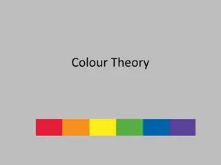
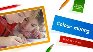
Taken Together The Color Wheel
Using the Wheel Colors are arranged on the wheel in such a way that purposeful color choices can be made. Choices of color combination depend on what you are trying to accomplish. Such as: Contrast Blending Affect
Using the Wheel Complementary Colors are the colors opposite from one another on the wheel. These colors provide the most visual contrast. Contrast is the noticeable level of difference between two colors.
Contrast with Text The more a color contrasts with the colors around it, the more easily visible that color will appear. This fact is extremely important when using different colored texts and backgrounds This is why black text on a white background is so popular and effective. There s a high degree of contrast effective. There s a high degree of contrast. This is why black text on a white background is so popular and On the other hand, blue and black offer little contrast. An extended read of this combination could be painful.
Contrast with Text (cont.) But be careful, even though colors may contrast they may not always work well for text and background pairing. Simultaneous Contrast occurs when a color like red is fore grounded on blue. Note how the text appears to slightly vibrate. This would get annoying really quickly. But simultaneously be aware of extreme lack of contrast in your text and background choices. Honestly, this is just painful. Do not make your readers struggle with this!
Rhetorical Color Contrast Contrast draws attention to the item that is most contrasting (or different) among a number of other design elements. Therefore, you can use color contrast to draw attention to an element of your design that is more important, relevant, or immediately pressing.
Practical Example Neither of these flyers is completely ineffective and both provide shape contrast with the text box. But the orange box above provides a nice contrast with the blues and grays of the clothes rack. The blue box here, however, is too similar to the clothes color palette.
Analogous Colors Analogous Colorsare colors positioned next to each other on the color wheel. These colors havevery little contrast; therefore, they will provide harmonious blends.
Analogous Colors in Nature Nature offers an excellent look at analogous colors in action. Question: what color of flower could be added to this photo to provide a strong and attention drawing contrast?
Color and Cultural Association Color s often come with feelings, moods, and associations that you can draw on. For example, the color Red is largely associated with danger, aggression, stimulation, and excitement. Red stop signs signify danger if you don t stop, and stimulate your senses with excitement if you don t see one coming up!
Color and Cultural Association It s an important to remember that these color associations do not come from the color itself. Without us to interpret it, red is simply light without any meaning laden characteristics. Because these associations depend on us, they can differ from culture to culture, and they can also change over time. For example, purple use to be associated with solely belonging to royalty. This PowerPoint could now be beheaded if it weren t made by a King or Queen!
Resources for Color Complementation The internet contains a number of resources that can help you find sets of colors that complement each other that is, colors that create a sense of visual harmony. Adobe Color Wheel This free tool helps you select colors that complement each other via a set of predefined relationships. It s remarkably intuitive and user- friendly.
Where to Go to Get More Help Purdue University Writing Lab Heavilon 226 Web: http://owl.english.purdue.edu/ Phone: (765) 494-3723 Email: owl@owl.english.purdue.edu
The End Introduction to Color Theory Brought to you in cooperation with the Purdue Online Writing Lab


")