7 Indicators That Your BI Reporting Is Top Notch
Is your BI reporting truly delivering the insights you need? In this blog, we explore the seven key indicators that signal top-notch BI reporting. From data accuracy and user-friendly dashboards to actionable insights and robust security, learn how t

Download Presentation

Please find below an Image/Link to download the presentation.
The content on the website is provided AS IS for your information and personal use only. It may not be sold, licensed, or shared on other websites without obtaining consent from the author. Download presentation by click this link. If you encounter any issues during the download, it is possible that the publisher has removed the file from their server.
E N D
Presentation Transcript
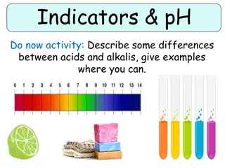
7 Indicators That Your BI Reporting Is Top Notch Indicator #1: Precision in Every Data Point One of the first indicators of precision in your data is consistency across various reports and dashboards. If the same data point appears in multiple reports, it should be identical across all of them. Discrepancies can signal errors in data entry or processing. Regularly cross-referencing data across different reports can help maintain this consistency. Implementing automated checks for data accuracy during collection and entry, as well as manual reviews by data analysts. Automated validation can involve setting up rules that flag anomalies or data points that fall outside expected ranges. Manual validation may involve cross-checking data with source documents or systems. robust validation processes is critical. These processes include To witness precision in every data point, your BI reporting tools should offer real-time data accuracy. This means the data presented in reports and dashboards should be up-to-date, reflecting the most current information available. Implementing real-time data feeds and automated data refreshes can help achieve this level of accuracy. Encouraging user feedback and setting up an error reporting system can also help ensure data precision. Users interacting with BI reports and dashboards can often spot inconsistencies or errors that may have been overlooked. Providing an easy way for users to report these issues can help quickly address and correct any inaccuracies. Regular data audits are essential for maintaining precision. These audits involve systematically reviewing data entries, processing steps, and outputs to identify and rectify any errors. Audits should be scheduled periodically and conducted thoroughly to ensure ongoing data accuracy. Indicator #2: Users Love Your Dashboards When users love your dashboards, it signifies that your BI reporting tools are not just functional but also highly effective and user-centric. A dashboard that wins user
approval seamlessly blends aesthetics, usability, and powerful analytics, providing a comprehensive view of the data that drives informed decision-making. Here's a deep dive into what makes a dashboard truly beloved by its users. An intuitive design is the cornerstone of any great dashboard. It s crucial for BI reporting tools to prioritize a user-friendly interface that allows users to navigate through complex data effortlessly. The layout should be clean and uncluttered, presenting data clearly and concisely. Users should be able to find the information they need without getting overwhelmed. Providing options for users to customize their dashboards according to their specific needs enhances usability, including adjusting widgets, changing data visualization types, and setting personal preferences for data display. Furthermore, ensuring that your dashboards are responsive, meaning they adapt seamlessly to different devices and screen sizes, is particularly important for business users who may need to access BI reporting tools on mobile devices. Real-time data access is a game-changer for BI reporting. It allows users to make decisions based on the most current information available, providing a significant advantage in fast-paced business environments. Utilizing robust data integration techniques to pull data from various sources in real-time is essential. APIs and ETL (Extract, Transform, Load) processes can be configured to ensure seamless data flow into your BI reporting software. Setting up automatic data refresh intervals keeps the dashboard data up-to-date without manual intervention, ensuring that users always see the latest information. Data visualizations are at the heart of BI reporting tools. Engaging and interactive visualizations help users understand complex data sets quickly and effectively. Users are able to delve deeper into the data without ever leaving the dashboard because to interactive features like drill-downs, hover-over effects, and clickable charts. Using a variety of chart types, including bar charts, line graphs, pie charts, and heat maps, helps in choosing the right visualization for the data being presented and the insights you want to highlight. Implementing consistent color coding and themes enhances readability and helps users quickly grasp key trends and patterns. For users to truly love your dashboards, they must perform well under all conditions and scale seamlessly as data volumes grow. Ensuring that the underlying queries powering the dashboards are optimized for performance is crucial, involving indexing databases, using efficient query structures, and minimizing data processing times. Using scalable infrastructure solutions such as cloud-based BI reporting tools helps handle increasing data loads and user demands without compromising performance. Implementing load balancing techniques distributes the workload evenly across servers, ensuring that dashboard performance remains consistent even during peak usage times.
Personalization takes BI reporting to the next level by providing users with insights and alerts tailored to their specific needs and roles. Allowing users to create dashboards that are personalized to their roles and responsibilities ensures they have quick access to the most relevant data. Setting up automated alerts to notify users of significant changes or anomalies in the data helps them stay informed and act promptly. These alerts can be configured to trigger based on predefined thresholds or conditions, ensuring timely responses to important developments. Indicator #3: Visuals That Tell the Story Effective visuals not only simplify complex information but also highlight key trends and patterns that might otherwise go unnoticed. Clarity ensures that users can quickly grasp the significance of the data without getting bogged down by unnecessary details. Simplicity helps in making complex data sets more accessible and understandable. Using clean, uncluttered designs for charts and graphs is essential. Avoid overcrowding visuals with too much information, which can overwhelm users. Instead, focus on highlighting the most critical data points. This approach not only enhances readability but also ensures that the key messages are conveyed effectively. For example, in financial BI reporting tools, using a straightforward line graph to depict revenue trends over time can be more impactful than a complicated 3D chart. Interactive elements in data visualizations allow users to explore the data more thoroughly. Features such as drill-downs, hover-over effects, and clickable charts enable users to dive deeper into the data without cluttering the initial view. Drill-down capabilities are particularly useful in BI reporting tools UK, where users may need to analyze data at different levels of granularity. For instance, a sales dashboard might allow users to drill down from annual sales figures to monthly or even daily data. This interactivity helps in uncovering hidden insights and understanding the underlying factors driving the trends. Hover-over effects can provide additional context without overwhelming the initial visual. When a user hovers over a data point, additional information, such as exact values or related metrics, can be displayed. This feature is valuable in BI reporting software, where detailed insights are often required to make informed decisions. Choosing the right type of visualization is also very crucial for effective BI reporting. Different types of data require different visualization methods to convey their stories accurately.
For example, bar charts are excellent for comparing categorical data, such as sales performance across different regions. Line graphs are ideal for showing trends over time, making them perfect for tracking KPIs like revenue growth or website traffic. Pie charts can be useful for illustrating proportions, such as market share distribution among competitors. Heat maps are another powerful tool in BI reporting tools. They can visually represent data density and variations, helping users identify patterns and outliers. In a customer service dashboard, a heat map might show the frequency of service requests across different hours of the day, highlighting peak times and potential bottlenecks. Implementing real-time data feeds into your BI reporting tools can significantly enhance their value. This requires robust data integration techniques, such as APIs and streaming data pipelines, to ensure that data is continuously updated. For example, in an inventory management dashboard, real-time data updates can help in monitoring stock levels and identifying shortages promptly. Dynamic updates are particularly crucial for BI reporting tools UK, where businesses often operate in highly competitive and rapidly changing markets. Being able to respond quickly to emerging trends can provide a significant competitive advantage. Indicator #4: Insights That Drive Action What we call actionable insights are disclosures based on data that allow us to take calculated and timely action. These insights are not just about presenting information but about highlighting specific areas where action is needed, providing clear direction on what steps to take next. For BI reporting tools to generate actionable insights, they must be designed to interpret data in a way that highlights critical trends, anomalies, and opportunities. This requires the use of analytical models and complex algorithms capable of processing massive amounts of data and revealing useful patterns. By analyzing past sales data, predictive analytics can foretell how sales will behave in the future, giving companies the opportunity to make proactive adjustments to their strategy. The relevance of the insights is crucial for driving action. BI reporting tools must tailor insights to the specific needs and context of the business. This customization ensures that the data is not only relevant but also aligned with the strategic goals of the organization. Contextualizing insights involves correlating data from various sources to provide a holistic view of the business environment. For instance, a retail company might combine
sales data with customer feedback and social media trends to gain a comprehensive understanding of consumer behavior. This integrated approach helps in identifying not just what is happening, but why it is happening, thereby guiding more precise actions. Automation in BI reporting tools enhances the efficiency and effectiveness of deriving actionable insights. Automated alerts can notify users of significant changes or anomalies in the data, prompting immediate action. Setting up automated workflows based on predefined rules ensures that critical issues are addressed promptly. For example, an automated alert might notify the sales team of a sudden drop in conversion rates, triggering a review of recent marketing campaigns and prompt corrective actions. Automation not only speeds up the response time but also ensures consistency in how issues are handled. Indicator #5: Adapting and Scaling with Ease As businesses grow and their data needs become more complex, BI reporting tools must evolve to handle increasing data volumes and diverse requirements. One of the cornerstones of scalable BI reporting tools is seamless data integration. As businesses grow, they often incorporate various data sources, including CRM systems, ERP platforms, financial software, and more. Effective BI reporting tools should be capable of integrating data from these disparate sources effortlessly. To achieve this, leveraging robust APIs and data connectors is essential. These tools facilitate the smooth flow of data into your BI reporting software, ensuring that all relevant information is captured and available manufacturing company might integrate data from its production, inventory, and sales systems to gain a holistic view of its operations. This seamless integration allows for real-time data updates and comprehensive reporting. for analysis. For instance, a As data volumes increase, BI reporting tools must scale to process large datasets efficiently. This scalability ensures that performance remains optimal even as the business expands. Adopting cloud-based BI reporting tools can significantly enhance scalability. Cloud platforms like AWS, Google Cloud, and Azure provide scalable infrastructure that can handle large data volumes and high user concurrency without compromising performance. For example, a retail chain expanding its operations across multiple regions can leverage cloud-based BI reporting tools to process and analyze sales data from all locations simultaneously, providing timely and accurate insights.
Advanced data warehousing solutions play a pivotal role in scaling BI reporting tools. Data warehouses consolidate large volumes of data from various sources, enabling efficient storage, retrieval, and analysis. Using modern data warehousing technologies such as Amazon Redshift, Google BigQuery, or Snowflake can enhance the performance and scalability of your BI reporting software. These platforms offer high-speed data processing capabilities and support complex queries, ensuring that users can generate reports quickly and accurately. For instance, a financial services firm might use Snowflake to aggregate transaction data, providing analysts with the ability to perform in-depth analysis and detect trends. Implementing real-time data pipelines using tools like Apache Kafka or AWS Kinesis allows for continuous data ingestion and processing. This real-time capability ensures that BI reporting tools provide up-to-date insights, enabling businesses to react swiftly to market trends, operational issues, or customer needs. For example, an e-commerce company can use real-time analytics to monitor website traffic and sales performance, adjusting marketing strategies dynamically to maximize conversions. Indicator #6: Collaboration at Its Best BI reporting tools are important in breaking down silos and fostering communication across departments. By integrating communication features directly into BI reporting software, teams can discuss insights and trends within the context of the data itself. Embedded chat functions, comment threads, and annotation capabilities allow users to collaborate directly within dashboards and reports. For instance, a sales team reviewing a monthly performance report can leave comments and questions on specific data points, facilitating a focused discussion. This integrated approach ensures that communication is data-driven and contextually relevant. BI reporting tools that provide real-time data updates ensure that all team members have access to the latest information simultaneously, enabling swift and coordinated decision-making. BI reporting tools with collaborative features empower teams to analyze data together, combining diverse perspectives to uncover deeper insights. Shared dashboards and reports enable multiple users to interact with the same data sets, fostering a collaborative analytical environment.
For example, during a product development cycle, cross-functional teams including marketing, sales, and R&D can work together on a shared dashboard to analyze customer feedback, sales trends, and product performance. This collective analysis helps in making more informed decisions, as different departments contribute their expertise to interpret the data. To ensure the integrity of collaborative efforts, BI reporting tools should include version control and audit trail features. These capabilities allow teams to track changes to reports and dashboards, maintaining a clear history of data interactions and modifications. Version control enables users to revert to previous versions of reports if needed, providing a safety net against errors or unintended changes. Audit trails offer transparency by recording who accessed the data, what changes were made, and when they occurred. This transparency fosters accountability and trust among team members, ensuring that collaborative efforts are both effective and secure. Collaboration is enhanced when BI reporting tools integrate seamlessly with other enterprise platforms. Cross-platform integration ensures that data flows smoothly between different systems, providing a unified view of the business. For instance, integrating BI reporting software with project management tools like Asana or Trello allows teams to link data insights directly to project tasks and milestones. This integration ensures that data-driven insights are actionable and aligned with the overall project objectives. Similarly, connecting BI reporting tools with CRM systems like Salesforce can streamline customer data analysis, enabling sales and marketing teams to collaborate more effectively. Indicator #7: Security that Can Be Trusted Ensuring that your BI reporting tools offer robust security measures not only protects sensitive data but also builds trust among users. Data encryption is a critical component of securing BI reporting tools. By encrypting data both at rest and in transit, businesses can protect their information from unauthorized access and breaches. Encryption at rest involves securing data stored in databases, data warehouses, or cloud storage. Advanced encryption standards (AES) are commonly used to ensure that stored data is unreadable without the correct decryption key. For example, a financial institution using BI reporting software can encrypt transaction records to safeguard customer information.
Encryption in transit secures data as it moves between servers, databases, and user devices. Using protocols such as TLS (Transport Layer Security) ensures that data remains protected during transmission. This is particularly important for BI reporting tools UK, where compliance with stringent data protection regulations like GDPR requires robust encryption methods. Role-based access control (RBAC) is essential for maintaining data privacy within BI reporting tools. RBAC restricts access to data based on user roles, ensuring that only authorized personnel can view or interact with sensitive information. Implementing RBAC involves defining roles and permissions within the BI reporting software. For instance, a sales manager might have access to sales performance data, while a finance manager can view financial reports. By segmenting data access, businesses can prevent unauthorized users from accessing confidential information, enhancing overall security. Multi-factor authentication (MFA) adds an extra layer of security by requiring users to provide multiple forms of verification before accessing the BI reporting tools. Consider a combination of their password, device (mobile device), and identity (biometric verification). MFA significantly reduces the risk of unauthorized access, even if a user's password is compromised. For example, a data analyst logging into the BI reporting software might receive a verification code on their mobile device, ensuring that only they can complete the login process. This additional security measure is particularly important for BI reporting tools UK, where protecting sensitive business data is a top priority. Compliance with data protection regulations is a critical aspect of security in BI reporting. Businesses must ensure that their BI reporting tools adhere to industry standards and legal requirements to avoid penalties and protect user data. For businesses operating in the UK, GDPR compliance is essential. This involves implementing measures such as data minimization, ensuring data accuracy, and enabling user rights to access and erase their data. BI reporting software should provide features that support these requirements, such as audit trails, data anonymization, and user consent management. By complying with these regulations, businesses can build trust with their customers and protect their reputation. Data masking is a technique used to protect sensitive information by replacing it with fictional data while preserving its usability for analysis. This ensures that even if unauthorized users access the data, they cannot view the actual sensitive information.
Implementing data masking within BI reporting tools can protect personal identifiable information (PII), financial data, and other confidential information. For example, a healthcare provider using BI reporting software can mask patient records to ensure that sensitive health information remains protected during data analysis. This technique is especially relevant for BI reporting tools UK, where stringent data protection regulations require robust measures to safeguard sensitive data. Conclusion Ensuring that your BI reporting is top-notch involves evaluating key indicators such as data accuracy, user-friendly dashboards, comprehensive data visualization, actionable insights, scalability, collaboration, and robust security measures. By focusing on these critical aspects, you can significantly enhance the effectiveness of your BI reporting tools and drive better business decisions. Grow stands out as a leading provider of BI reporting software, offering advanced features and capabilities that align with these seven indicators. With Grow, you can achieve precision in every data point, design dashboards that users love, generate visuals that tell compelling stories, derive insights that drive action, and ensure your BI tools adapt and scale with ease. Grow also excels in facilitating seamless collaboration and providing security you can trust. To experience the benefits of top-notch BI reporting firsthand, start your 14-day free trial with Grow today. Discover how Grow s BI reporting tools can transform your data analysis and decision-making processes. For more information about Grow s cost and user reviews, visit our Capterra page. Don t miss out on the opportunity to elevate your BI reporting. Try Grow now and see why businesses across the UK and beyond trust our BI reporting tools for their data needs. Original Source: https://bit.ly/46tuzFf