Petivity - Increasing Productivity with a Fun Twist
Petivity is a productivity tool designed to eliminate distractions and improve time management. With features like task completion reminders, website blocking, and self-care activities, Petivity aims to enhance productivity in a fun and engaging way. The team behind Petivity is dedicated to helping users achieve a healthy work-life balance and stay focused on their tasks. The recent interface design changes and the addition of a mobile version further enhance the user experience, making Petivity a valuable tool for those looking to boost their productivity levels.

Download Presentation

Please find below an Image/Link to download the presentation.
The content on the website is provided AS IS for your information and personal use only. It may not be sold, licensed, or shared on other websites without obtaining consent from the author. Download presentation by click this link. If you encounter any issues during the download, it is possible that the publisher has removed the file from their server.
E N D
Presentation Transcript
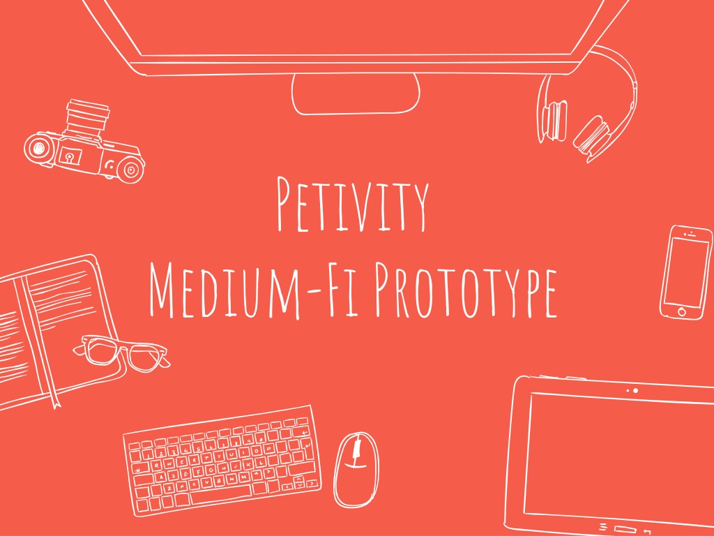
Petivity Medium-Fi Prototype
MEET THE TEAM Sidra Ijaz Ivan Salinas Jonathan Mao Crystal Zheng
1. ValueProp,ProblemandS olutionOverview
Petivity Productivity s Best Friend Problem: People often have a difficult time completing tasks because of distractions, poor time management, and/or unhealthy work-life balance. Solution: We aim to increase productivity by effectively eliminating distractions and keeping people on track in a fun and engaging way.
Web: Task 1 (Simple): Look through the to-do list and complete one of the tasks. Now that you ve completed a task, add the task Laundry (which should be completed within 2 days) to your to-do list. Task 2 (Complex): Schedule blocking time for Sunday at 2:30PM. Enable buzzfeed to be blocked and add Tumblr to your list of blocked websites. Start blocking to see blocking effect. Task 3 (Medium): Schedule one of Petivity s self-care activity suggestions on the calendar. Mobile: Also addresses Task 2: begin blocking timer to start and end Forest app-like blocking mechanism, then interact with pet.
Changes: For task 1, we revised the task so the user adds the same task as the one they checked off to the list so all of our Marvel screens will be consistent and reusable. For task 2, we revised the wording because we no longer have two buttons for hard or soft block but one that blocks everything. Since we figured out the task flow for the scheduled block times calendar, we incorporated it in task 2.
3. Revised interface design
3. A Major changes
1. Created a mobile version to supplement the web application/chrome extension No Mobile Application A Mobile Application! ?
Rationale: We added a mobile component so our design became a hybrid Web-Mobile design because we were notified that all projects needed a mobile component. Thus, we pivoted from our original (solely web-based) application and received helpful advice from Landay and Kerry as to how to pivot from our original plans. The mobile component also further allows the user to have even more interactivity with the pet, which was emphasized in studio as something we should try to implement further.
After Sketch: web Made calendar only show three days
Rationale: We changed it to a 3-day calendar because users expressed that it was hard to see the events and to discern the self-care events from the normal events. Furthermore, in studio, there was a mention of a 3-day calendar as a possible alternative. For our prototype, we made the font bigger and side calendars/main calendar more legible. By having a 3-day calendar, we were able to make the font size bigger and more legible and de-clutter the interface a bit.
After Sketch: web Have only one button labeled Start Blocking
Rationale: We changed the hard and soft block buttons to just one button that says start blocking because our users were confused with what hard and soft meant as well as why there were two buttons for blocking. So as of now, we are only implementing functionally the hard block, which aligns more closely with what users normally think of when a site is blocked.
3. b TASK FLOWS
Check off Laundry to-do
Click to add a new task
Fill out the task components and then click confirm User is back at main page
Main Page Click on scheduled blocking times Click approx. 2:30PM Sunday TASK 2: Web
Click confirm Scheduled block time block appears in calendar Click to return to main Click on scheduled blocking times to go back to the main screen TASK 2: Web
User is back at main page TASK 2: Web
Go to Settings Click to add Buzzfeed to your blocked sites list TASK 2: Web
Blocking of Buzzfeed should be enabled now Select to add a new website to block TASK 2: Web
Type in new website (tumblr) to add it to the blocked sites list TASK 2: Web
Timer starts automatically Click buttons to navigate Main Page Click on crab Click on page Clicks on restart Main Page After feeding the crab Click on home Click on worm TASK 2 Mobile
Main Page Click on self-care calendar and it should appear Click on wanna go swimming? TASK 3: Web
Click confirm Adds self care item to the calendar TASK 3: Web
Click self-care calendar Main Calendar should display schedule self- care activity now TASK 3: Web
4. Prototype overview
PROTOTYPING TOOLS We used: Photoshop Marvel How the Tools Helped: Helped create the visuals for the prototype Helped mimic how the user would interact with the tool - used as emulator for Android and laptop/desktop view How the Tools Didn t Help: Could not create the full breadth of options Could not do actions like swipe/scroll Could not use actually user-typed input
Limitations/trade offs of the current prototype We turned all interactions into click interactions for both web and mobile to simplify interactions and implementation in Marvel To simplify and focus on our main task flows, we did not include: In Mobile: Pages for personalizing the pet, pet store, profile, settings, link account to social media, inventory, accounts, etc. In Web: the ability to toggle the calendar view scope, additional ways of input, animations and more interactiveness with pet, etc.
Wizard of Oz Techniques On Mobile: The time changing as if time was passing for the block time when blocking was activated On Web: Self-care suggestions automatically appear once self- care calendar is chosen. It is simulating the fact that self-care suggestions would be optimized with AI based on time available, interests, past selections, etc. to offer the 3 optimal selections for user. After clicking start blocking, user is automatically brought to the blocked social media site to see what the site would look like. Then, user clicks to get out. In real world, the user would be shown the blocked page only after navigating to the site normally.
Hard-coded Features and Why Required: On mobile, we hard-coded: Textual content for the usual profile during sign-up and login The food quantity/type icon since the amount would be what is accumulated in the web account On web, we hard-coded: Textual content for the pop-up boxes and any input field Why required? - Since it s not possible/too complicated to track user text input for prototype in Marvel, we resorted to hard-coding. Furthermore, we hard-coded the amount of food items because that would normally sync with user account and since we have a fictional user, there s no actual account to sync.
Thank You! Any Questions?


 flow")


:")


:")