Redesigning Web Laboratory: A Journey of Innovation and Collaboration
Exploring the transformation of a library website through the redesign process, from the formation of a diverse committee to the launch of an improved product. The project focuses on enhancing functionality, navigation, and user accessibility. Collaboration with IT faculty and the integration of innovative tools contribute to the success of the redesign, ultimately resulting in a more streamlined and user-friendly online platform.
Download Presentation

Please find below an Image/Link to download the presentation.
The content on the website is provided AS IS for your information and personal use only. It may not be sold, licensed, or shared on other websites without obtaining consent from the author. Download presentation by click this link. If you encounter any issues during the download, it is possible that the publisher has removed the file from their server.
E N D
Presentation Transcript
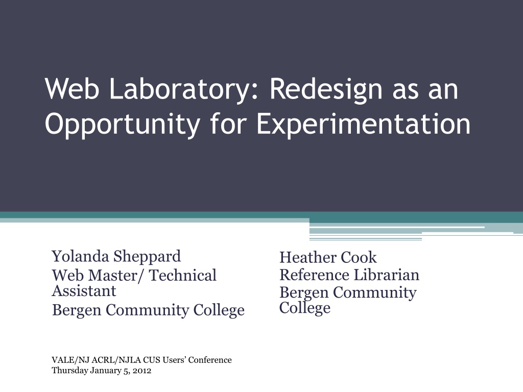
Web Laboratory: Redesign as an Opportunity for Experimentation Yolanda Sheppard Web Master/ Technical Assistant Bergen Community College Heather Cook Reference Librarian Bergen Community College VALE/NJ ACRL/NJLA CUS Users Conference Thursday January 5, 2012
The Committee Formed Spring 2011 Diverse Group: Dean of Library and Assistant Dean Web Master Innovative Interfaces Specialist Metadata/Cataloging Librarian Reference Librarian
Website Vision Statement The Library website will: Be accessible to all users, on all browsers, from all devices Provide access to all Library resources and services Adhere to the Bergen Community College website guidelines
Website Design Goals Navigation All information within one click of the home page Easy to update and maintain All pages reviewed/Updated every 6 months Every unique piece of information exists only once, but may appear many times
The Process What s being done right now? In Libraries and beyond Functionality at the center Major Concerns: 1. Navigation 2. Database subject sorting 3. Editing existing pages/Layout of home page Applied innovations and ideas from test website to current website
The Product Launched October 2011 70+ pages down to 35 Improved current website with problem solving ideas from the test website In the cloud: Formsite, Libguides, Drupal, Google Calendar, Google Forms Link from the Library s home page
Collaboration Before Meeting with IT Faculty Department chair Alternatives to SharePoint Suggested tools Drupal (ex. www.whitehouse.gov) Microsoft Expression Web After Suggested some tweaks: Fonts Links to pages outside of site Plans to ask next semesters Web Design class to give feedback
Drupal Drupal Gardens Host Gator Web Hosting Application Hosting Drupal VPS Hosting (Virtual Private Server) Easy and Affordable
Feedback Google Docs Forms- used to gather feedback Link to feedback on test website Feedback received: Suggestions, clarifications, confusing items, language issues, navigation
Feedback by Affiliation Other 10% Student 23% Faculty 67%
Feedback Type Negative 7% Positive 21% Suggestions 72%
Database access should have its own box, not just a tab. -Faculty /Staff Where is the My Library Account link? -Faculty/Staff And perhaps the search for databases could be by keyword rather than subject? -Faculty/Staff I like how everything is easier to access. -Student I don t think its much different from the former, but it s a nice touch. -Student
Looking Toward the Future Keep in test phase and work on suggestions Useful exercise for editing, updating and finding solutions outside of the box for the current website
Questions? http://ssltestlibrary.net Yolanda Sheppard ysheppard@bergen.edu Heather Cook hcook@bergen.edu
