Trends in Exchange Insurer Participation and Choice for 2017-2018
The figures illustrate a decline in the number of insurers available through exchanges from 2017 to 2018, resulting in decreased choices for enrollees. The data shows a decrease in counties with only one exchange insurer, as well as differences in insurer options between metro and non-metro areas. The distribution of exchange enrollees based on the number of insurers available also shows changes over the two years.

Download Presentation

Please find below an Image/Link to download the presentation.
The content on the website is provided AS IS for your information and personal use only. It may not be sold, licensed, or shared on other websites without obtaining consent from the author. Download presentation by click this link. If you encounter any issues during the download, it is possible that the publisher has removed the file from their server.
E N D
Presentation Transcript
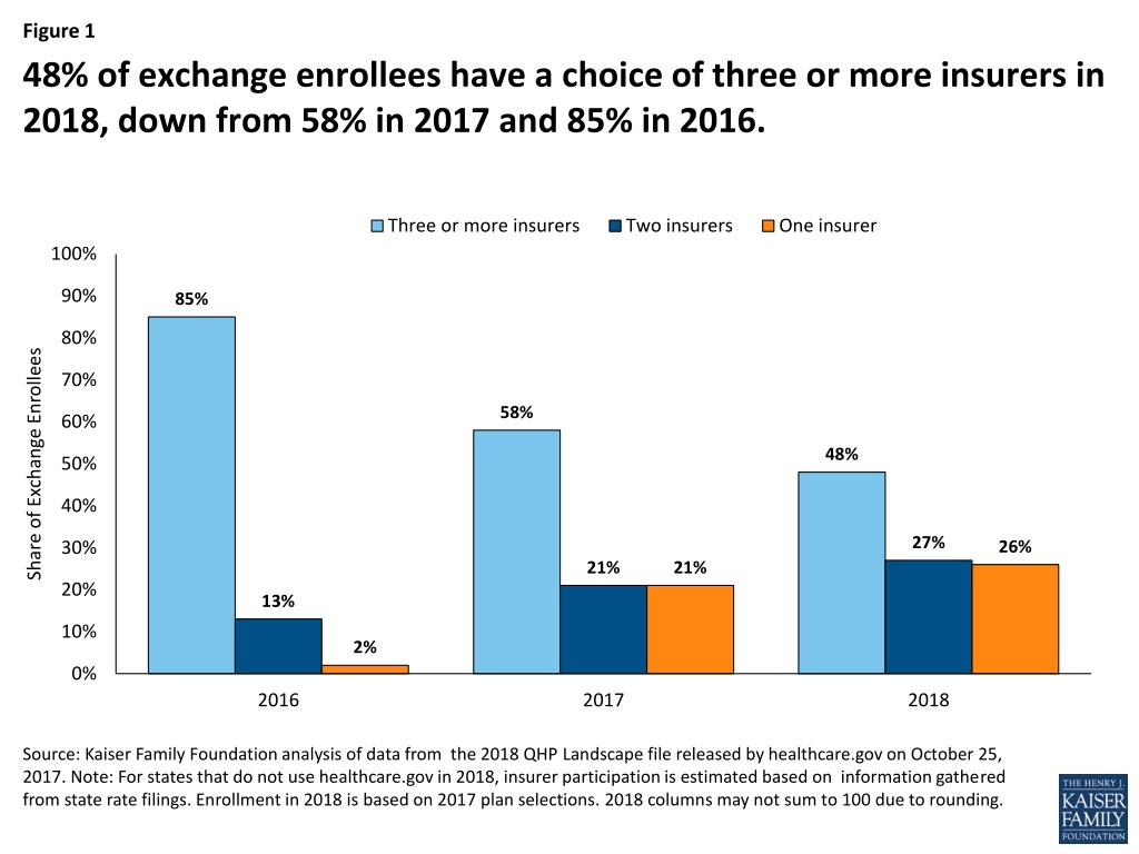
Figure 1 48% of exchange enrollees have a choice of three or more insurers in 2018, down from 58% in 2017 and 85% in 2016. Three or more insurers Two insurers One insurer 100% 90% 85% 80% Share of Exchange Enrollees 70% 58% 60% 48% 50% 40% 27% 26% 30% 21% 21% 20% 13% 10% 2% 0% 2016 2017 2018 Source: Kaiser Family Foundation analysis of data from the 2018 QHP Landscape file released by healthcare.gov on October 25, 2017. Note: For states that do not use healthcare.gov in 2018, insurer participation is estimated based on information gathered from state rate filings. Enrollment in 2018 is based on 2017 plan selections. 2018 columns may not sum to 100 due to rounding.
Figure 2 1,623 counties have only one exchange insurer in 2018 compared to 1,036 counties in 2017 Three or more insurers Two insurers One insurer 1,800 1,623 1,600 1,400 1,158 Number of Counties 1,200 1,036 950 949 1,000 800 570 600 400 200 0 2017 2018 Source: Kaiser Family Foundation analysis of data from the 2018 QHP Landscape file released by healthcare.gov on October 25, 2017. Note: For states that do not use healthcare.gov in 2018, insurer participation is estimated based on information gathered from state rate filings. Enrollment is based on 2017 plan selections.
Figure 3 52% of exchange enrollees living in metro counties will have a choice of three or more insurers in 2018 60% Three or more insurers Two insurers One insurer 55% 52% 50% Share of Exchange Enrollees 40% 28% 30% 26% 22% 20% 17% 10% 0% Metro Non-Metro Source: Kaiser Family Foundation analysis of data from the 2018 QHP Landscape file released by healthcare.gov on October 25, 2017. Note: For states that do not use healthcare.gov in 2018, insurer participation is estimated based on information gathered from state rate filings. Enrollment is based on 2017 plan selections. Metro/Non-Metro county classifications are based on definitions from the Federal Office of Rural Health Policy.
Figure 4 Distribution of Exchange Enrollees by Number of Insurers in 2017 and 2018 2017 2018 30% 27% 26% 24% 25% Share of Exchange Enrollees 21% 21% 20% 20% 17% 15% 10% 10% 8% 7% 5% 5% 5% 5% 3% 1% 1% 0% 0% 0% 1 2 3 4 5 6 7 8 9 Number of Insurers Source: Kaiser Family Foundation analysis of data from the 2018 QHP Landscape file released by healthcare.gov on October 25, 2017. Note: For states that do not use healthcare.gov in 2018, insurer participation is estimated based on information gathered from state rate filings. Enrollment is based on 2017 plan selections. 2018 columns may not sum to 100 due to rounding.
Figure 5 52% of counties will have one exchange insurer in 2018, compared to 33% of counties with one exchange insurer in 2017 One insurer Two insurers Three or more insurers 21% Enrollees (2017) 21% 58% Enrollees (2018) 26% 27% 48% 33% 37% 30% Counties (2017) 52% 30% 18% Counties (2018) 0% 10% 20% 30% 40% 50% 60% 70% 80% 90% 100% Source: Kaiser Family Foundation analysis of data from the 2018 QHP Landscape file released by healthcare.gov on October 25, 2017. Note: For states that do not use healthcare.gov in 2018, insurer participation is estimated based on information gathered from state rate filings. Enrollment is based on 2017 plan selections. Percent of exchange enrollees in2018 may not sum to 100 due to rounding.
Figure 6 Insurer Participation by County in 2018 Source: Kaiser Family Foundation analysis of data from the 2018 QHP Landscape file released by healthcare.gov on October 25, 2017. Note: For states that do not use healthcare.gov in 2018, insurer participation is estimated based on information gathered from state rate filings. Enrollment is based on 2017 plan selections. See the interactive map here: https://www.kff.org/health-reform/issue-brief/insurer-participation-on-aca-marketplaces/