Primary Slide Layout and Design Tips
This presentation offers insights on the primary slide layout and design tips. It showcases the recommended use of the Calibri Light font and UW Medicine color palette. Learn how to add images, customize background settings, and choose different slide layouts effectively. Utilize the provided template information to enhance the visual appeal and readability of your slides efficiently.
Download Presentation

Please find below an Image/Link to download the presentation.
The content on the website is provided AS IS for your information and personal use only. It may not be sold, licensed, or shared on other websites without obtaining consent from the author.If you encounter any issues during the download, it is possible that the publisher has removed the file from their server.
You are allowed to download the files provided on this website for personal or commercial use, subject to the condition that they are used lawfully. All files are the property of their respective owners.
The content on the website is provided AS IS for your information and personal use only. It may not be sold, licensed, or shared on other websites without obtaining consent from the author.
E N D
Presentation Transcript
Presentation Title Name, Title
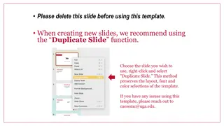
Template Info This is the primary slide layout. Try to keep to no more than five bullets for readability. The font used throughout this template is Calibri Light, and a UW Medicine color palette is embedded. To choose a different slide layout, right-click the slide thumbnail to the left, hover over Layout, and choose a different style for that slide. Some elements, like the gold bar, are built into the Slide Master and not intended to be altered, but they can if necessary.
To add image, go to: Design Tab > Format Background, select Picture or Texture fill
BANNER SLIDE To add a background image to this slide, go to: Design Tab > Format Background, select Picture or Texture fill.


