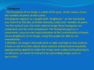
Misconceptions About Histograms: Understanding Data Representation

Histograms play a crucial role in representing data distribution. However, misconceptions can arise, such as confusing them with bar charts, misinterpreting frequency and data values, and attributing time or variability misconceptions. Understanding these misconceptions is essential for accurate data analysis.

Download Presentation

Please find below an Image/Link to download the presentation.
The content on the website is provided AS IS for your information and personal use only. It may not be sold, licensed, or shared on other websites without obtaining consent from the author.If you encounter any issues during the download, it is possible that the publisher has removed the file from their server.
You are allowed to download the files provided on this website for personal or commercial use, subject to the condition that they are used lawfully. All files are the property of their respective owners.
The content on the website is provided AS IS for your information and personal use only. It may not be sold, licensed, or shared on other websites without obtaining consent from the author.
E N D
Presentation Transcript
Everyone can read a histogram, or can they? Jennifer J. Kaplan, UGA Journal of Statistics Education (JSE) webinar 16 September 2014 Joint work with: John Gabrosek, GVSU, Phyllis Curtiss, GVSU, Chris Malone, WSU
The histogram below shows the distribution of yearly income in dollars for a random sample of 356 adults living in Atlanta, GA.
The histogram below shows the distribution of yearly income in dollars for a random sample of 356 adults living in Atlanta, GA. What is the purpose of histograms? What makes a good, complete description of this display?
Common Misconceptions about Histograms 1. Not distinguishing between a bar chart and a histogram, and why this distinction is important. 2.Confusing the frequency (y-axis) information with the data values (x-axis). 3.Thinking that a flatter histogram equates to less variability in the data. 4. Viewing a histogram as a time plot believing (incorrectly) that values on the left side of the graph took place earlier in time.
Misconception 1: Students dont understand the distinction between a bar chart and a histogram, and why this distinction is important. Can the median of the data be found?
Misconception 1: Students dont understand the distinction between a bar chart and a histogram, and why this distinction is important. The following graph shows the birthplace of students in a large introductory statistics course. Circle the letter of your choice. Answer Choice A: The median is Michigan. B: The median cannot be told from the graph but could be if more information were given. C: The median cannot be found for this information even if we had the birthplace for each individual student. Pre Post 25.5% 25.9% 35.2% 24.5% 39.3% 49.6%
Which of the following graphs gives the best display of the distribution of number of medals won in that it allows the sports fan to describe the shape, center and spread of the variable, the number of medals won by countries that won at least one medal? Which graph is a histogram? A. B. 10 C. D. 8 6 4 2 0 0 5 10 15 20 25 30 35
Which of the following graphs gives the best display of the distribution of number of medals won in that it allows the sports fan to describe the shape, center and spread of the variable, the number of medals won by countries that won at least one medal? A. B. 10 C. D. 8 6 4 2 0 0 5 10 15 20 25 30 35 Answer Choice Pre Post A: Case value graph in order of data table B: Case value graph ordered to look bell-shaped C: Histogram D: Case value graph ordered to look increasing 20.2% 7.3% 35.5% 62.4% 10.6% 16.1% 33.7% 14.2%
Misconception 2: Students use the frequency (y axis) instead of the data values (x axis) when reporting on the center of the distribution and the modal group of values. Find the Median SAT score. Which group has the larger mode?
Misconception 2: Students use the frequency (y axis) instead of the data values (x axis) when reporting on the center of the distribution and the modal group of values. Find the Median SAT score. ~ 75% correct Which group has the larger mode?
Misconception 3: Students believe that a flatter histogram exhibits less variability than bumpy histograms. Which data set has the least variability?
Misconception 3: Students believe that a flatter histogram exhibits less variability than bumpy histograms. Which data set has the least variability? Answer Choice A: The one with the large center peak because it has the most values close to the mean. B: The U-shaped one because it has the smallest number of distinct scores. C: The uniform one because there is no change in scores. D: Either the one with the center peak or the bumpy one, because they both have the smallest range. E: The bell shaped one because it looks the most normal. Pre Post 18.5% 26.2% 7.5% 3.3% 58.8% 48.3% 9.2% 6.3% 6.0% 15.9%
Misconception 4: For data that has an implied (though not collected) time component, students read the histogram as a time plot believing (incorrectly) that values on the left side of the graph took place earlier in time. Are there three times during the semester in which students spend a lot of money?
Misconception 4: For data that has an implied (though not collected) time component, students read the histogram as a time plot believing (incorrectly) that values on the left side of the graph took place earlier in time. There appears to be three times during the semester (beginning/middle/end) in which students spend a lot of money on printing at this college. Answer Choice True False Pre 36.3% 33.8% 63.7% 66.2% Post
Common Misconceptions about Histograms 1.Not distinguishing between a bar chart and a histogram, and why this distinction is important. 2.Confusing the frequency (y-axis) information with the data values (x-axis). 3.Thinking that a flatter histogram equates to less variability in the data. 4. Viewing a histogram as a time plot believing (incorrectly) that values on the left side of the graph took place earlier in time.
The histogram below shows the distribution of yearly income in dollars for a random sample of 356 adults living in Atlanta, GA. What is the purpose of histograms? What makes a good, complete description of this display?
The histogram below shows the distribution of yearly income in dollars for a random sample of 356 adults living in Atlanta, GA. What is the purpose of histograms? What makes a good, complete description of this display?
The histogram below shows the distribution of yearly income in dollars for a random sample of 356 adults living in Atlanta, GA. What is the purpose of histograms? What makes a good, complete description of this display?
The histogram below shows the distribution of yearly income in dollars for a random sample of 356 adults living in Atlanta, GA. Shape, Center, Variability in Context.
Student Descriptions of Histograms Pre-Instruction vs. Post Instruction: Three Prompts: Describe as completely as possible the distribution shown in the histogram, being sure to explain what the graph tells you about yearly income for adults in Atlanta. Describe as completely as possible what the graph tells you about yearly income for adults in Atlanta. Describe as completely as possible the distribution shown in the histogram.
Student Descriptions of Histograms Pre-Instruction vs. Post Instruction: College students tend to get 6 to 8 hours of sleep at night. The graph is unimodal and symmetric with median 7.
Student Descriptions of Histograms Three Prompts: Describe as completely as possible the distribution shown in the histogram, being sure to explain what the graph tells you about yearly income for adults in Atlanta. Describe as completely as possible what the graph tells you about yearly income for adults in Atlanta. Describe as completely as possible the distribution shown in the histogram.
Student Descriptions of Histograms Three Prompts: Describe as completely as possible the distribution shown in the histogram, being sure to explain what the graph tells you about yearly income for adults in Atlanta. Describe as completely as possible what the graph tells you about yearly income for adults in Atlanta. More likely to have context. Describe as completely as possible the distribution shown in the histogram. The graph is right skewed.
Thank You! for your attention Research funded in part by NSF DUE 1322962 Questions? Kaplan, J.J., Gabrosek, J.G., Curtiss, P. & Malone, C. (2014). Investigating student understanding of histograms. Journal of Statistics Education, 22(2). http://www.amstat.org/publications/jse/v22n2/kaplan.pdf


 instead")
 instead")