Engage Your Audience with a Detective Mystery Approach
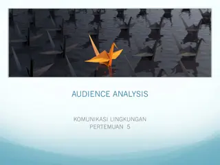
Set the stage for your presentation with an intriguing full-screen photograph or collage to captivate the audience's attention. Avoid using typical outline structures and opt for a detective mystery theme to engage and stimulate the audience's thinking. Craft your slides with high-resolution images, proper alignment, and concise text points for an interactive and captivating presentation experience.
Download Presentation

Please find below an Image/Link to download the presentation.
The content on the website is provided AS IS for your information and personal use only. It may not be sold, licensed, or shared on other websites without obtaining consent from the author.If you encounter any issues during the download, it is possible that the publisher has removed the file from their server.
You are allowed to download the files provided on this website for personal or commercial use, subject to the condition that they are used lawfully. All files are the property of their respective owners.
The content on the website is provided AS IS for your information and personal use only. It may not be sold, licensed, or shared on other websites without obtaining consent from the author.
E N D
Presentation Transcript
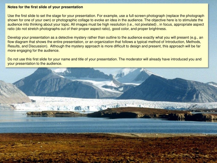
Notes for the first slide of your presentation Use the first slide to set the stage for your presentation. For example, use a full-screen photograph (replace the photograph shown for one of your own) or photographic collage to evoke an idea in the audience. The objective here is to stimulate the audience into thinking about your topic. All images must be high resolution (i.e., not pixelated) , in focus, appropriate aspect ratio (do not stretch photographs out of their proper aspect ratio), good color, and proper brightness. Develop your presentation as a detective mystery rather than outline to the audience exactly what you will present (e.g., an flow diagram that shows the entire presentation, or an organization that follows a typical method of Introduction, Methods, Results, and Discussion). Although the mystery approach is more difficult to design and present, this approach will be far more engaging for the audience. Do not use this first slide for your name and title of your presentation. The moderator will already have introduced you and your presentation to the audience.
Main topic title (28 pt.) Subtopic title (24 pt.; right justified) One of three templates for text slides Item 1 (24 pt.): One line preferred; two-lines maximum Item 2 (24 pt.) Use Arial font for all text in presentation Item 3 (24 pt.) Notes Tip: For fine alignment of objects, hold down the CTRL key while moving any of cursor keys Use this slide as a template for text slides: White background only (no themes or other colors). Do not use the PowerPoint default text box and bullets (use insert blank slide, then copy/paste the objects on this slide). Try to make your points in a few key words on one line of text. Your points do not need to be complete and proper sentences; use the fewest number of key words to introduce your point. Remember that you need the audience to listen to you and think about what you are saying, rather than reading extensive text on a slide. Copy/paste the bullets and text boxes to other slides (the color of the line and bullets above can be changed to match your presentation); be sure to retain the alignment. Replace the Main topic title box with your major topic, e.g., Introduction, Methods, etc., and replace the Subtopic title box with subtopics within the major topic (Data analysis, Field site, etc.). Use capitals only on the first word of the titles and bulleted points (unless it is a proper noun or acronym). Avoid colloquialisms and nonstandard abbreviations and acronyms. Change the colors to suite you taste, but avoid light colors such as yellow or very bright colors.
Main topic title (26 pt.) Subtopic title (24 pt.; right justified) One of three templates for text slides Item 1 (24 pt.): One line maximum Item 2 (24 pt.) Use one, two, or three words Item 3 (24 pt.) Use Arial font for all text in presentation Notes Tip: For fine alignment of objects, hold down the CTRL key while moving any of cursor keys Use this slide as a template for text slides: White background only (no themes or other colors). Do not use the PowerPoint default text box and bullets (use insert blank slide, then copy/paste the objects on this slide). Try to make your points in a few key words on one line of text. Your points do not need to be complete and proper sentences; use the fewest number of key words to introduce your point. Remember that you need the audience to listen to you and think about what you are saying, rather than reading extensive text on a slide. Copy/paste the bullets and text boxes to other slides (the color of the line and bullets above can be changed to match your presentation); be sure to retain the alignment. Replace the Main topic title box with your major topic, e.g., Introduction, Methods, etc., and replace the Subtopic title box with subtopics within the major topic (Data analysis, Field site, etc.). Use capitals only on the first word of the titles and bulleted points (unless it is a proper noun or acronym). Avoid colloquialisms and nonstandard abbreviations and acronyms. Change the colors to suite you taste, but avoid light colors such as yellow or very bright colors.
Main topic title (24 pt.) Subtopic title (24 pt.; right justified) One of three templates for text slides Item 1 (24 pt.): One line maximum Item 2 (24 pt.) Use one, two, or three words Item 3 (24 pt.) Use Arial font for all text in presentation Notes Tip: For fine alignment of objects, hold down the CTRL key while moving any of cursor keys Use this slide as a template for text slides: White background only (no themes or other colors). Do not use the PowerPoint default text box and bullets (use insert blank slide, then copy/paste the objects on this slide). Try to make your points in a few key words on one line of text. Your points do not need to be complete and proper sentences; use the fewest number of key words to introduce your point. Remember that you need the audience to listen to you and think about what you are saying, rather than reading extensive text on a slide. Copy/paste the bullets and text boxes to other slides (the color of the line and bullets above can be changed to match your presentation); be sure to retain the alignment. Replace the Main topic title box with your major topic, e.g., Introduction, Methods, etc., and replace the Subtopic title box with subtopics within the major topic (Data analysis, Field site, etc.). Use capitals only on the first word of the titles and bulleted points (unless it is a proper noun or acronym). Avoid colloquialisms and nonstandard abbreviations and acronyms. Change the colors to suite you taste, but avoid light colors such as yellow or very bright colors.
Main topic title (24 pt.) Subtopic title (24 pt.; right justified) One of three templates for text slides Item 1 (24 pt.): One line maximum Item 2 (24 pt.) Use one, two, or three words Item 3 (24 pt.) Use Arial font for all text in presentation Notes Tip: For fine alignment of objects, hold down the CTRL key while moving any of cursor keys Use this slide as a template for text slides: White background only (no themes or other colors). Do not use the PowerPoint default text box and bullets (use insert blank slide, then copy/paste the objects on this slide). Try to make your points in a few key words on one line of text. Your points do not need to be complete and proper sentences; use the fewest number of key words to introduce your point. Remember that you need the audience to listen to you and think about what you are saying, rather than reading extensive text on a slide. Copy/paste the bullets and text boxes to other slides (the color of the line and bullets above can be changed to match your presentation); be sure to retain the alignment. Replace the Main topic title box with your major topic, e.g., Introduction, Methods, etc., and replace the Subtopic title box with subtopics within the major topic (Data analysis, Field site, etc.). Use capitals only on the first word of the titles and bulleted points (unless it is a proper noun or acronym). Avoid colloquialisms and nonstandard abbreviations and acronyms. Change the colors to suite you taste, but avoid light colors such as yellow or very bright colors.
Notes on slides with photographs Use only full-screen photographs. All images must be: (1) high resolution (i.e., not pixelated), (2) in focus, (3) of the appropriate aspect ratio (do not stretch photographs out of their proper aspect ratio), (4) good color, and (5) proper brightness. Note that images from the Internet are often of poor quality, especially when displayed full screen. It is better not to have a photograph than to show a poor quality photograph. Do not use small photographs as insets. In some cases, it may be appropriate to add text (e.g., bulleted points or a sentence) on photographs. Be sure that the text is clearly visible and legible. A text box can be an effective way to display text on a photograph; the transparency of the photograph can also increased so that the visibility of the text is increased.
Notes on slides with data graphs Use only full-screen data graphs that are created in standard conventions of scientific graphics. The recommended program for creating scientific graphs is SigmaPlot (or a scientific graphics program with similar features; graphs drawn with programs such as PowerPoint are oriented toward business graphs and are generally not appropriate for scientific data). However, whichever software program that is used for creating the graphs, these must meet the standard scientific conventions shown in the figures (right, and next slide). All final graphs must be full- screen and high resolution (i.e., not pixelated), appropriate aspect ratio (do not stretch photographs out of their proper aspect ratio), good color, and proper brightness. Note that images from the Internet are often of poor quality, especially when displayed full screen. It is better not to have a photograph than to show a poor quality photograph. Do not use small graphs as insets. Recommended settings for a line graph No graph title or legend outside the graph axes, tick marks only with associated numerals, labels near lines or bars (not as a separate legend), etc.
Notes on slides with data graphs Use only full-screen data graphs that are created in standard conventions of scientific graphics. The recommended program for creating scientific graphs is SigmaPlot (or a scientific graphics program with similar features; graphs drawn with programs such as PowerPoint are oriented toward business graphs and are generally not appropriate for scientific data). However, whichever software program that is used for creating the graphs, these must meet the standard scientific conventions shown in the figures (right, and next slide). All final graphs must be full- screen and high resolution (i.e., not pixelated), appropriate aspect ratio (do not stretch photographs out of their proper aspect ratio), good color, and proper brightness. Note that images from the Internet are often of poor quality, especially when displayed full screen. It is better not to have a photograph than to show a poor quality photograph. Do not use small graphs as insets. Recommended settings for a line graph No graph title or legend outside the graph axes, tick marks only with associated numerals, labels near lines or bars (not as a separate legend), etc.
Conceptual graphs Use conceptual graphs and flow diagrams to illustrate complex relationships, interactions, and processes. Conceptual graphs are an excellent way to quickly and effectively convey complex ideas. These graphs must be clear, use appropriate colors (avoid combinations such as red and green, or light blue and yellow), and displayed full screen.
Pregnant Male Female Lactating Predation Birth rate Mule deer population Disease Death rate Winter Summer Sagebrush Season Forbs Spring Bunchgrasses Flow diagrams In PowerPoint, use the autoshapes and connectors functions in PowerPoint to create flow diagrams. Such graphs are an excellent way to effectively summarize processes and overall function of a system. Flow diagrams are an excellent way to convey complex relationships as well as how you integrated the various categories of the MNR program. Rate of food intake Energy for Growth & maintenance
Tables Avoid the use of tables. Present tabular data in graphical form. If tables are used, be sure to use large font (20 24 pt., Arial) and minimize the amount of data in the table. The data must be clearly readily at the far end of a large auditorium.
Acknowledgements A slide that acknowledges the contribution of colleagues or funding support is appropriate, but the persons mentioned should have contributed significantly to the study. Last slide Use the last slide to make your final and overall point or conclusion. Connect the your statements for the last slide to the key points you made on the first slide of your presentation. Do not use a photograph that is unrelated to the topic of the presentation (e.g., a photograph of a sunset or a favorite hiking spot or activity) or use text such as Questions? or Thank you! If a photograph is used, be sure it directly relates to the topic of the presentation and emphasizes the main conclusions. A conceptual graph can be effective for the last slide, especially if it summarizes your key points and connects to the points you made on the first slide of your presentation. References and credits Do not present a list of references in the presentation. However, do prepare extra slides of your references that can be recorded or printed out by viewers at a later time. Credit all images as: 1. If the image is used in its original form as published , use From: Smith 2008 or Smith and Jones 2008 or Smith et al. 2008. 2. If you have altered the image from its original published form, use Adapted from: instead of From: as above. 3. Use 8 pt. Arial text and place the citation in the bottom right or left of the page. During the presentation, it may be appropriate in some cases to speak the citation, e.g., as illustrated by Smith et al. 2008
