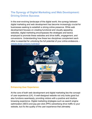
Effective Web Design Strategies for User Engagement

In web design, integrating plain language, usability, and information architecture is crucial for creating a useful website. People tend to scan rather than read online, emphasizing the need for clear and concise content. Understanding why people visit your site and organizing content to meet their needs are key considerations for designers. Additionally, identifying your target customers through surveys and interactions helps tailor your website effectively.

Download Presentation

Please find below an Image/Link to download the presentation.
The content on the website is provided AS IS for your information and personal use only. It may not be sold, licensed, or shared on other websites without obtaining consent from the author.If you encounter any issues during the download, it is possible that the publisher has removed the file from their server.
You are allowed to download the files provided on this website for personal or commercial use, subject to the condition that they are used lawfully. All files are the property of their respective owners.
The content on the website is provided AS IS for your information and personal use only. It may not be sold, licensed, or shared on other websites without obtaining consent from the author.
E N D
Presentation Transcript
Basics (and musts) of web design: integration of plain language, usability, and information architecture www.plainlanguage.gov Lisbon | October 13, 2010
The three requirements for a useful website Logically organized (information architecture) Easy to use (usability) Understandable (plain language)
Why do people come to your site? They DON T come to read
We know people dont read on the web They scan. Nielsen and Morkes, in a famous 1997 study, found that 79 percent of their test users always scanned any new page they came across; only 16 percent read word-by-word. A recent study of people reading long-form text on tablets finds higher reading speeds than in the past, but they're still slower than reading print. http://www.useit.com/alertbox/ipad-kindle-reading.html
Some horrifying facts* Based on analysis of 45,237 page views, Nielsen found that people read an average of 18% of what s on a page. However, as the number of words on a page goes up, the percentage read goes down. To get people to read half your words, you have to limit your page to 110 words or fewer. *http://www.useit.com/alertbox/percent-text-read.html
Why do people come to your site? Customers come to your site to perform a task. They come because they expect to get self-service.
Organizing your content Your customers need to be able to find what they need, but the way you organize your information isn t necessarily the way they look for it.
Who are your customers? Who are your customers? On-site survey If you deal with customers by mail, include a paper survey in a regular mailing. Visit offices where users interact with your organization directly. Talk to users, and the people who serve them. Do one-on-one interviews Do a focus group You can read about these and other techniques at www.usability.gov
What are their needs? What do they need to know? What is their level of knowledge? Are they experienced web users? What technology do they have? And, most importantly, What do they want to do?
Identify customers top tasks People come to your website with a specific task in mind. If your website doesn t help them complete that task, they ll leave. Identify the mission the purpose of your website, to help you clarify the #1 top task your website should help people accomplish.
Logical organization You ve identified your customers top tasks, but you still have a lot of material that some customers want. How do you figure out how to organize your site? If you thought even for a second that the answer might be by office WRONG! The easiest method is an old-fashioned card sort.
Remember - DON T Write for your supervisor or co-workers DO Write for your customers Make a list of who reads your content Decide why they read it and what information they need Address your customers top tasks
Writing your content Identify your audience Write to meet the needs of your audience Choose simple, everyday words Keep your sentences and paragraphs short Use active voice, headings and pronouns Use bulleted lists and tables
Print Writing Tells a story Is linear has a beginning, middle, and end Is often consumed in a relaxed setting Written in complete sentences
Web Writing Easy to scan Quick, accessible source of info Minimal text User-friendly Users may be stressed, impatient, skeptical, or disoriented Interactive
Writing content When you start thinking about content pages, keep these points in mind: Think topics, not stories. Think about having a conversation with your customer. Eliminate anything that s not part of the conversation. A very few content pages might contain more extensive information.
Remember On average, visitors read about 18% of what s on the page, and the more words you have, the lower the percent they read. So, use the inverted pyramid. Begin with the shortest and clearest statement you can make about your topic. Conclusions/Key Info Background
Eliminate words Some common sources of wordiness Passive voice Redundancies Prepositional phrases Hidden verbs Unnecessary modifiers Failure to use pronouns
Omit Information Remember, your web content is a conversation with your customer. If material doesn t belong in the conversation, it doesn t belong on the web. Hopefully, you can research what customers really want. You aren t Santa Claus. You can t serve all customers. If you serve your top 3 or 4 customer groups, you re doing good.
What your customers don t care about When your office was formed Who is the head What the head said the day he was sworn in What the head looks like What your annual report from 3 years ago looked like How the Bureau is organized What you did for customers 5 years ago The text of a law that authorizes your office
Displaying your content Be consistent! Consistent design and color scheme (remember to take into consideration low-vision readers and screen reader users) Consistent style for headings Consistent navigation Use lots of white-space Use lots of informative headings Take care with links
Links: Eye Track study results The best links in the study: The worst links in the study: Used plain language Were specific and clear Used bland, generic words Used made-up words or terms Started with speech- introduction language Used common words Started with the essence of the message Were action-oriented * http://www.useit.com/alertbox/nanocontent.html
USE Logical organization Informative headings Pronouns Active voice Lists and tables Common words (no jargon)
Avoid Hidden verbs Abbreviations Long sentences Unnecessary words Information the user doesn t want
The requirements (recap) Know and write for your audience Make sure your audience can quickly and easily find and use the information they want Make sure your stool has three legs: Logical organization Easy to use Easy to understand
 of web")


")