Data Types and Summary Statistics in Exploratory Data Analysis

Exploratory Data Analysis
Part I: Data Types and Summary Statistics
Gregory S. Karlovits, P.E., PH, CFM
US Army Corps of Engineers
Hydrologic Engineering Center


2
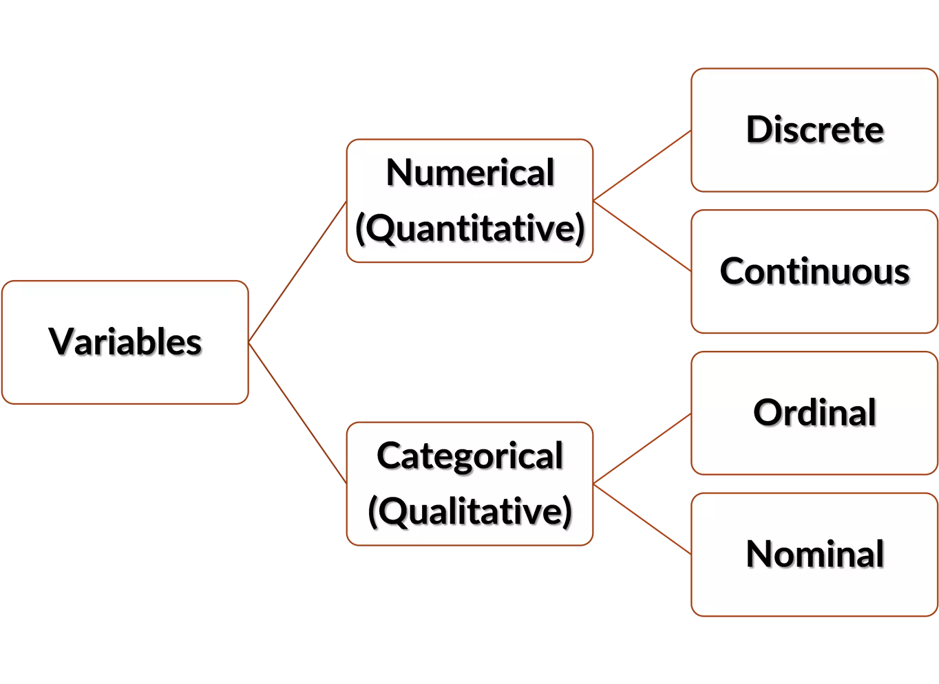
Data are the result of
observing or measuring
selected characteristics of the
study units, called
variables.
Distinct labels
Ranked categories
Continuous set of
numbers
Discrete set of
numbers


See Tamhane and Dunlop (2000), chapter 4

3
USGS Flow Measurements
USGS Flow Measurements
Measuring Agency
Measure Rating
Measure Duration
Streamflow
USGS
USACE
Other
Excellent
Fair
Good
Poor
Unknown
Unspecified
[<blank>, 0.0, 0.1, 0.2, …] hours
in ft
3
s
-1
Nominal
Nominal
Ordinal
Ordinal
Discrete
Discrete
Continuous
Continuous
4
Numerical Variables
Numerical Variables
Interval vs. Ratio
Interval vs. Ratio
Comparable by
difference, but
not ratio
Comparable by
both, has “natural
zero”
Example:
Temperature
Example:
Distance
STRONGER
STRONGER
SCALE
SCALE
80°F is
not
4 times
hotter than 20°F.
50 km
is
10 times
farther than 5 km.
5
Categorical Data Summaries
Categorical Data Summaries
Frequency Table
Frequency Table
Pareto Chart
Pareto Chart
Arithmetical operations are
not meaningful for categorical
data.
Summary statistic:
Count
6
Numerical Data Summaries:
Numerical Data Summaries:
Percentiles
Percentiles
The
α
-percentile of a dataset is the data value
where
α
% of the data are below it.
9.1
90%
8.0
75%
5.0
50%
3.25
25%
1.9
10%
10.0
100%
1.0
0%
Values shown at right have
been interpolated.
Excel:
=PERCENTILE.INC(x, k)
[R]:
quantile(x, probs)
7
Numerical Data Summaries:
Numerical Data Summaries:
Five-Number Summary
Five-Number Summary
A quick, standard way to
represent a dataset.
Other measures can be
derived from it.
8.0
75%
5.0
50%
3.25
25%
10.0
100%
1.0
0%
•
Minimum
•
25
th
percentile (first quartile)
•
50
th
percentile (median/second quartile)
•
75
th
percentile (third quartile)
•
Maximum
[R]:
fivenum(x)
8
Numerical Data Summaries:
Numerical Data Summaries:
Central Tendency
Central Tendency
Mean
Mean
Median
Median
n odd
n even
Mode
Mode
Most frequently-occurring value
9
Numerical Data Summaries:
Numerical Data Summaries:
Central Tendency (Robust)
Central Tendency (Robust)
Trimmed
Trimmed
Mean
Mean
Trimean
Trimean
Q
1
– first quartile (25
th
percentile)
Q
2
– median (50
th
percentile)
Q
3
– third quartile (75
th
percentile)
Weighted averaging schemes
Weighted averaging schemes
Weighted average of
Weighted average of
many values
many values
Weighted average of 3
Weighted average of 3
values
values
[R]:
mean(x, trim = 0.25)
Midhinge
Midhinge
Q
1
– first quartile (25
th
percentile)
Q
3
– third quartile (75
th
percentile)
Weighted average of 2
Weighted average of 2
values
values
10
Numerical Data Summaries:
Numerical Data Summaries:
Dispersion
Dispersion
Variance
Variance
Standard
Standard
Deviation
Deviation
Coefficient of
Coefficient of
Variation
Variation
11
Numerical Data Summaries:
Numerical Data Summaries:
Dispersion (Robust)
Dispersion (Robust)
Inter-
Inter-
Quartile
Quartile
Range
Range
Q1 – first quartile (25
th
percentile)
Q3 – third quartile (75
th
percentile)
Median
Median
Absolute
Absolute
Deviation
Deviation
median distance between each data point
and the sample median
Quartile
Quartile
Coeff. of
Coeff. of
Dispersion
Dispersion
Scale-invariant
12
Numerical Data Summaries:
Numerical Data Summaries:
Asymmetry (Skew)
Asymmetry (Skew)
Coeff. of
Coeff. of
skewness
skewness
Yule’s
Yule’s
Coeff.
Coeff.
Summary
•
Data are recorded as nominal, ordinal, discrete, or continuous
variables
•
Data summaries depend on the kind of variable you observe
•
Robust statistics are a method for describing a dataset that is
resilient to outliers
13
Exploratory Data Analysis
Part II: Visualization
Gregory S. Karlovits, P.E., PH, CFM
US Army Corps of Engineers
Hydrologic Engineering Center
Why should you look at your data?
15
Histogram
Excel:
=FREQUENCY(data, bins)
[R]:
hist(x)
Histogram
https://statistics.laerd.com/statistical-guides/understanding-histograms.php
Kernel Density Estimation
[R]:
density(x)
Kernel Density Estimation
Empirical CDF (eCDF)
[R]:
ecdf(x)
Empirical Quantile Plot
Data Value
Data Value
Estimated
Estimated
by plot pos
by plot pos
Plotting Position Uncertainty
5%
5%
95%
95%
Box Plots
Box Plots
25
25
th
th
percentile “Q
percentile “Q
1
1
”
”
Median “Q
Median “Q
2
2
”
”
75
75
th
th
percentile “Q
percentile “Q
3
3
”
”
Inter-quartile
Inter-quartile
range
range
(IQR = Q
(IQR = Q
3
3
– Q
– Q
1
1
)
)
Q
Q
3
3
+ 1.5 * IQR
+ 1.5 * IQR
Q
Q
1
1
- 1.5 * IQR
- 1.5 * IQR
Outlier
Outlier
210°
Box Plots
Scatter Plots
A Note on Correlation
27
Excel:
=CORREL(x, y)
[R]:
cor(x, y)
Covariance
is a multivariate extension of
variance.
Correlation
is a normalized version of
covariance.
The 4-Plot
28
Test 4 major assumptions:
•
Randomness
•
Fixed distribution, with:
•
Fixed location
•
Fixed variation
Independent and
Identically-Distributed
(IID)
Run Sequence Plot
29
Plot the data in the order
they were observed
Use the order (index) as
the x-axis variable
Used to test:
•
Randomness
•
Fixed location
•
Fixed variation
[R]:
plot(x)
Time Series Plot
•
If the run sequence plot is indexed by time, then it is a time
series plot
30
Run Sequence Plot
31
Well-Mixed
Well-Mixed
32
Potentially
Potentially
Autocorrelated
Autocorrelated
Non-Stationary
Non-Stationary
in Mean
in Mean
Non-Stationary
Non-Stationary
in Variance
in Variance
Run Sequence Plot
Diagnostics
Lag Plots
33
Plot x
i-1
vs x
i
Add a 1:1 line
Used to test:
•
Randomness
[R]:
lag.plot(x, lags = 1)
Lag Plot Diagnostics
34
Well-Mixed
Well-Mixed
Potentially
Potentially
Autocorrelated
Autocorrelated
Definitely
Definitely
Autocorrelated
Autocorrelated
Histogram
Diagnostics
35
Bell Curve
Bell Curve
Short-Tailed
Short-Tailed
Long-Tailed
Long-Tailed
Bimodal
Bimodal
Skewed
Skewed
Normal Q-Q Plot
36
Compute z-scores for data
Plot against sorted data
Plot line through Q
1
and Q
3
Used to test:
•
Normality
[R]:
qqnorm(x)
qqline(x)
Linear
Linear
37
Non-Linear
Non-Linear
Bulging
Bulging
Curled Tails
Curled Tails
(Long)
(Long)
Curled Tails
Curled Tails
(Short)
(Short)
Normal Q-Q
Plot
Diagnostics
Non-Linear
Non-Linear
Summary
•
Data visualization can help you avoid analysis pitfalls
•
Many visualization tools help you diagnose common issues in a
dataset
38
Exploratory Data Analysis
Part III: Analysis Questions
Gregory S. Karlovits, P.E., PH, CFM
US Army Corps of Engineers
Hydrologic Engineering Center
What Questions Should I Ask of a Set of
Data?
•
What does the data look like?
•
What is a typical value?
•
How much do data in a sample vary?
•
What is a good model for a set of data?
•
How different are two sets of data?
•
Is a dataset taken from a single population?
•
Were the samples taken independently?
40
This is not an exhaustive list!
What do the data look like?
•
Use visualization methods appropriate for data type
•
If the data look this way, what may have created them?
41
What is a typical value?
•
Consider measures of central tendency
•
Look at dispersion measures to see how much the data spread
out
•
Look at histograms or density plots
42
How much do data in a sample vary?
•
Frequency-based visualizations can show where the
observations fall and how often
•
e.g. histogram, density plot
•
Summary visualizations may tag outliers or show data far from
the rest
•
e.g. box plots, eCDFs, empirical quantile plots
•
Measures of dispersion and asymmetry
43
What is a good model for a set of data?
•
First check to make sure the sample behaves well enough to use
the typical models
•
Start with the 4-plot
•
Look at the shape of the histogram
•
Examine the Q-Q plot for various distributions
44
How different are two sets of data?
•
Look at measures of central tendency
•
Compare dimensionless measures for dispersion if the centers
seem different
•
Compare samples on the same plot
•
Use box plots
•
Use scatter plots
45
Is the dataset taken from a single
population?
•
Look at the run-sequence plot for drifting central tendency
•
Look at the run-sequence plot for changes in the spread of the
data
•
Do summary statistics line up with what you see in histograms?
46
Were the samples taken independently?
•
Look at the run-sequence plot for periodic behavior
•
Look at the lag plot for clustering along the diagonal
47
Summary
•
Before starting an analysis, ask your data some questions that
help guide your analysis
•
Rely on the exploratory data analysis tools to answer the
questions
48
Hello everyone, I'm Greg Karlovits from the Hydrologic Engineering Center. Welcome to our course on statistical methods in hydrology. This video is part one of three on the topic of exploratory data analysis and will discuss data types and summary statistics. Let's get started.
Data types, including discrete numerical, continuous numerical, ordinal, and nominal, are essential in exploratory data analysis. Variables can be categorized based on their nature, such as numerical variables (interval vs. ratio) and categorical data summaries. Learn about USGS flow measurements, numerical data summaries like percentiles and the five-number summary, and how to interpret different types of data effectively.

Download Presentation

Please find below an Image/Link to download the presentation.
The content on the website is provided AS IS for your information and personal use only. It may not be sold, licensed, or shared on other websites without obtaining consent from the author. Download presentation by click this link. If you encounter any issues during the download, it is possible that the publisher has removed the file from their server.
E N D
Presentation Transcript
Exploratory Data Analysis Part I: Data Types and Summary Statistics Gregory S. Karlovits, P.E., PH, CFM US Army Corps of Engineers Hydrologic Engineering Center
Data are the result of observing or measuring selected characteristics of the study units, called variables. Discrete set of numbers Discrete Numerical (Quantitative) Continuous set of numbers Continuous Variables Ordinal Ranked categories Categorical (Qualitative) Nominal Distinct labels 2 See Tamhane and Dunlop (2000), chapter 4
USGS Flow Measurements USGS Measuring Agency Nominal USACE Other Excellent Good Fair Poor Unknown Unspecified Measure Rating Ordinal Measure Duration [<blank>, 0.0, 0.1, 0.2, ] hours Discrete Continuous Streamflow in ft3 s-1 3
Numerical Variables Interval vs. Ratio Comparable by difference, but not ratio Comparable by both, has natural zero Example: Temperature 80 F is not 4 times hotter than 20 F. Example: Distance 50 km is 10 times farther than 5 km. 4
Categorical Data Summaries Arithmetical operations are not meaningful for categorical data. Summary statistic: Count Rating Excellent Good Fair Poor Unknown Unspecified Total Frequency 22 115 84 26 1 16 264 Relative Frequency (%) 8.3 43.6 31.8 9.8 0.4 6.1 100 Frequency Table Pareto Chart 5
Numerical Data Summaries: Percentiles 10.0 100% 10 10 10 The -percentile of a dataset is the data value where % of the data are below it. 9.1 90% 9 9 9 9 8 8 8 7 6 6 6 5 5 5 4 4 4 4 4 3 3 2 2 2 1 1 1 8.0 75% Values shown at right have been interpolated. 5.0 50% 3.25 25% Excel: =PERCENTILE.INC(x, k) 1.9 10% 1.0 0% [R]: quantile(x, probs) 6
Numerical Data Summaries: Five-Number Summary 10.0 100% 10 10 10 A quick, standard way to represent a dataset. 9 9 9 9 8 8 8 7 6 6 6 5 5 5 4 4 4 4 4 3 3 2 2 2 1 1 1 8.0 75% Other measures can be derived from it. Minimum 25th percentile (first quartile) 50th percentile (median/second quartile) 75th percentile (third quartile) Maximum 5.0 50% 3.25 25% [R]: fivenum(x) 1.0 0% 7
Numerical Data Summaries: Central Tendency ? ? =1 Mean ? ?=1 ?? ????= ?1 ?2 ??= ???? Median ? ?+1 n odd 2 ? ? + ? ?+1 ? = 2 n even 2 2 Mode Most frequently-occurring value 8
Numerical Data Summaries: Central Tendency (Robust) Weighted averaging schemes Trimmed Mean [R]: mean(x, trim = 0.25) Weighted average of many values ?? =?1+ ?3 2 Weighted average of 2 values Midhinge Q1 first quartile (25th percentile) Q3 third quartile (75th percentile) ?? =?1+ 2?2+ ?3 4 Weighted average of 3 values Trimean Q1 first quartile (25th percentile) Q2 median (50th percentile) Q3 third quartile (75th percentile) 9
Numerical Data Summaries: Dispersion ? 1 Variance 2= ?? ?2 ?? ? 1 ?=1 Standard Deviation 2 ??= ?? Coefficient of Variation ?? =?? ? 10
Numerical Data Summaries: Dispersion (Robust) Inter- Quartile Range Q1 first quartile (25th percentile) Q3 third quartile (75th percentile) ??? = ?3 ?1 Quartile Coeff. of Dispersion ??? =?3 ?1 ?3+ ?1 Scale-invariant Median Absolute Deviation median distance between each data point and the sample median ??? = median ?? ? 11
Numerical Data Summaries: Asymmetry (Skew) Coeff. of skewness ? ?? ?3 ?? ?=1 ? ? = 3 ? 1 ? 2 ?3+ ?1 2 ?3 ?1 Yule s Coeff. ?2 ?3+ ?1 2?2 ?3 ?1 = 2 12
Summary Data are recorded as nominal, ordinal, discrete, or continuous variables Data summaries depend on the kind of variable you observe Robust statistics are a method for describing a dataset that is resilient to outliers 13
Exploratory Data Analysis Part II: Visualization Gregory S. Karlovits, P.E., PH, CFM US Army Corps of Engineers Hydrologic Engineering Center
Why should you look at your data? Property Mean of x Sample variance of x Mean of y Sample variance of y Correlation between x and y Value 9 11 7.50 4.125 0.816 y = 3.00 + 0.5 00x Linear regression line Coefficient of determination of the linear regression 0.67 15
Excel: =FREQUENCY(data, bins) Histogram [R]: hist(x)
Histogram https://statistics.laerd.com/statistical-guides/understanding-histograms.php
[R]: density(x) Kernel Density Estimation
[R]: ecdf(x) Empirical CDF (eCDF)
Empirical Quantile Plot Data Value Estimated by plot pos
Box Plots Outlier Q3 + 1.5 * IQR 75thpercentile Q3 Inter-quartile range (IQR = Q3 Q1) Median Q2 25thpercentile Q1 Q1 - 1.5 * IQR 210
A Note on Correlation Covariance is a multivariate extension of variance. ? Correlation is a normalized version of covariance. ? 1 ?? ? ?? ?? ? ?? ? ???= ? 1 ?=1 Excel: =CORREL(x, y) [R]: cor(x, y) 27
The 4-Plot Test 4 major assumptions: Randomness Fixed distribution, with: Fixed location Fixed variation Independent and Identically-Distributed (IID) 28
Run Sequence Plot Plot the data in the order they were observed Use the order (index) as the x-axis variable Used to test: Randomness Fixed location Fixed variation [R]: plot(x) 29
Time Series Plot If the run sequence plot is indexed by time, then it is a time series plot 30
Run Sequence Plot Well-Mixed 31
Potentially Autocorrelated Run Sequence Plot Diagnostics Non-Stationary in Mean Non-Stationary in Variance 32
Lag Plots Plot xi-1 vs xi Add a 1:1 line Used to test: Randomness [R]: lag.plot(x, lags = 1) 33
Potentially Autocorrelated Lag Plot Diagnostics Well-Mixed Definitely Autocorrelated 34
Histogram Diagnostics Bell Curve Short-Tailed Long-Tailed Skewed Bimodal 35
Normal Q-Q Plot Compute z-scores for data ??=?? ? ?? Linear Plot against sorted data Plot line through Q1 and Q3 Used to test: Normality [R]: qqnorm(x) qqline(x) 36
Normal Q-Q Plot Diagnostics Non-Linear Non-Linear Bulging Curled Tails (Long) Curled Tails (Short) 37
Summary Data visualization can help you avoid analysis pitfalls Many visualization tools help you diagnose common issues in a dataset 38
Exploratory Data Analysis Part III: Analysis Questions Gregory S. Karlovits, P.E., PH, CFM US Army Corps of Engineers Hydrologic Engineering Center
What Questions Should I Ask of a Set of Data? What does the data look like? What is a typical value? How much do data in a sample vary? What is a good model for a set of data? How different are two sets of data? Is a dataset taken from a single population? Were the samples taken independently? This is not an exhaustive list! 40
What do the data look like? Use visualization methods appropriate for data type If the data look this way, what may have created them? 41
What is a typical value? Consider measures of central tendency Look at dispersion measures to see how much the data spread out Look at histograms or density plots 42
How much do data in a sample vary? Frequency-based visualizations can show where the observations fall and how often e.g. histogram, density plot Summary visualizations may tag outliers or show data far from the rest e.g. box plots, eCDFs, empirical quantile plots Measures of dispersion and asymmetry 43
What is a good model for a set of data? First check to make sure the sample behaves well enough to use the typical models Start with the 4-plot Look at the shape of the histogram Examine the Q-Q plot for various distributions 44
How different are two sets of data? Look at measures of central tendency Compare dimensionless measures for dispersion if the centers seem different Compare samples on the same plot Use box plots Use scatter plots 45
Is the dataset taken from a single population? Look at the run-sequence plot for drifting central tendency Look at the run-sequence plot for changes in the spread of the data Do summary statistics line up with what you see in histograms? 46
Were the samples taken independently? Look at the run-sequence plot for periodic behavior Look at the lag plot for clustering along the diagonal 47
Summary Before starting an analysis, ask your data some questions that help guide your analysis Rely on the exploratory data analysis tools to answer the questions 48


")

")
")