Creating Eye-Catching Poster Designs with Customizable Colors and Formats
Learn how to design visually appealing posters with customizable colors and formats. This guide provides insights into adjusting colors, optimizing layouts for print, and utilizing the zoom slider for detailed examination. Explore examples showcasing effective poster appearance formatting techniques to make your design stand out.
Download Presentation

Please find below an Image/Link to download the presentation.
The content on the website is provided AS IS for your information and personal use only. It may not be sold, licensed, or shared on other websites without obtaining consent from the author.If you encounter any issues during the download, it is possible that the publisher has removed the file from their server.
You are allowed to download the files provided on this website for personal or commercial use, subject to the condition that they are used lawfully. All files are the property of their respective owners.
The content on the website is provided AS IS for your information and personal use only. It may not be sold, licensed, or shared on other websites without obtaining consent from the author.
E N D
Presentation Transcript
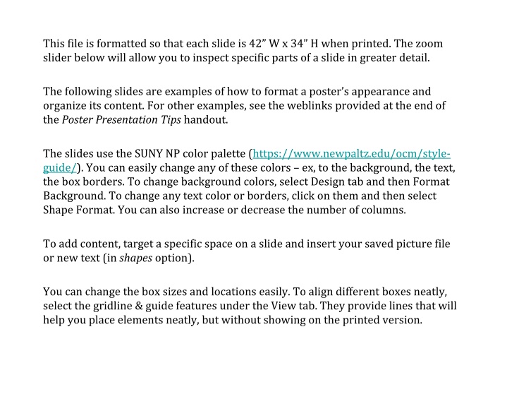
This file is formatted so that each slide is 42 W x 34 H when printed. The zoom slider below will allow you to inspect specific parts of a slide in greater detail. The following slides are examples of how to format a poster s appearance and organize its content. For other examples, see the weblinks provided at the end of the Poster Presentation Tips handout. The slides use the SUNY NP color palette (https://www.newpaltz.edu/ocm/style- guide/). You can easily change any of these colors ex, to the background, the text, the box borders. To change background colors, select Design tab and then Format Background. To change any text color or borders, click on them and then select Shape Format. You can also increase or decrease the number of columns. To add content, target a specific space on a slide and insert your saved picture file or new text (in shapes option). You can change the box sizes and locations easily. To align different boxes neatly, select the gridline & guide features under the View tab. They provide lines that will help you place elements neatly, but without showing on the printed version.
Title Author(s) (Faculty mentor s name, department) Discussion Results Introduction Dude, check out my cool poster. It has a NP blue borders with a white background. Want to change the background color? Go to Design Format Background. Want to change the border s size or color? Just on it. and adjust the line s weight currently 50-point size via Shape Format / Shape Outline / Weight / More Lines. You can also change the color there. Research Questions You can also move the boxes around, thicken their borders, or remove them, etc. See the following templates, for example. Materials and Methods Selected references Acknowledgements this section should be used to recognize any sources of funding or inspiration
Title Author(s) (Faculty mentor s name, department) Discussion Results Introduction Created the same as the first example. But with NP Orange background to brighten your visitors day. Hmm, should we change this text color? Maybe to blue?? Research Questions Materials and Methods Selected references Acknowledgements this section should be used to recognize any sources of funding or inspiration
Title Author(s) (Faculty mentor s name, department) Implications Findings Background Nice background! Liking the thicker borders too! How? Follow the steps in the previous poster to create a normal white background with thick borders. Then right-click on an empty white space, select Format Background, and then use the gradient fill option. Hypotheses Next Steps But don t overdo it. A light background with dark font writing works best. Procedures Acknowledgements this section should be used to recognize any sources of funding or inspiration
TITLE Author(s) (faculty mentor s name, department) (correspondence: X@newpaltz.edu) This project was supported by funding from _____. Summary Procedure Background Much wider and center column for the key findings. This is becoming a popular approach at poster sessions. Oh, and check out those nifty patterns for the headings! Conclusions Findings Project Goals Next Steps
TITLE Author(s) (faculty mentor s name, department) (correspondence: X@newpaltz.edu) This project was supported by funding from _____. Background Results Similar to the previous one, but even wider center space to provide your project s conclusion (take-home point) in very large font, alongside some eye- catching imagery. The idea is to grab people s attention, hit them with the big idea, and then talk with them about the particulars of the project if they re interested. That s why the background and methods etc. are relegated to the side, in smaller font than the center. It s a different approach to the conventional left-to-right story. For more on this idea: - https://www.youtube.com/watch?v=1RwJbhkCA58 - https://osf.io/ef53g/ Methods Discussion
Title Author Names Introduction This is the main takeaway from your research. It should be simplified to one or two sentences. Add your information, graphs and images to this section. Methodology Results Add your information, graphs and images to this section. Add your information, graphs and images to this section.
