Understanding Box-and-Whisker Plots for Data Analysis
A box-and-whisker plot, or boxplot, visually represents the distribution of data using key statistical measures such as minimum, lower quartile, median, upper quartile, and maximum values. By analyzing these summary statistics, one can gain insights into the spread and central tendency of a dataset. Two examples illustrate how to draw boxplots for given data.

Download Presentation

Please find below an Image/Link to download the presentation.
The content on the website is provided AS IS for your information and personal use only. It may not be sold, licensed, or shared on other websites without obtaining consent from the author. Download presentation by click this link. If you encounter any issues during the download, it is possible that the publisher has removed the file from their server.
E N D
Presentation Transcript
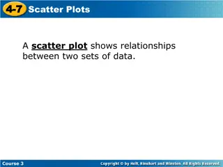
4 October 2024 Box and whisker plots LO: To draw and interpret box and whisker diagrams www.mathssupport.org
Box and whisker plots A box and whisker diagram or simply box plot is a visual display of some of the descriptive statistics of a data set It shows: The minimum value The lower quartile (Q1) These five numbers form the five-number summary of a data set The median (Q2) The upper quartile (Q3) The maximum value It is possible to get a sense of a data set s distribution by examining a five-number summary. www.mathssupport.org www.mathssupport.org
A box-and-whisker diagram A box-and-whisker diagram, or boxplot, can be used to illustrate the spread of the data in a given distribution. Knowing the five-number summary we draw the boxplot Median Q2 Maximum value Upper quartile Q3 Lower quartile Q1 Minimum value Whisker Whisker A short line at the left hand side is the minimum value A short line at the right hand side is the maximum value The left end of the box is the lower quartile The right side of the box is the upper quartile. A vertical line in the interior of the box is the median Lines from the minimum and maximum points to the box are the whiskers www.mathssupport.org
A box-and-whisker diagram A box-and-whisker diagram, or boxplot, can be used to illustrate the spread of the data in a given distribution. Knowing the five-number summary we draw the boxplot Range Interquartile range Q1 Q3 xMax xMin From the diagram we are able to find the range We are also able to find the interquartile range www.mathssupport.org
Box-and-whisker diagram Example 1: Draw a Box plot for the data below Q2 Q3 Q1 3, 4, 4, 6, 8, 8, 8, 9, 10, 10, 15 Upper Quartile = 10 Lower Quartile = 4 Maximum Median = 8 Minimum 12 13 3 4 5 6 7 8 9 10 11 14 15 www.mathssupport.org
A box-and-whisker diagram Example 2: Draw a Box plot for the data below Q2 Q1 Q3 4, 4, 5, 6, 8, 8, 8, 9, 9, 9, 10, 12 Upper Quartile = 9 Lower Quartile = 5 Median = 8 Maximum Minimum 4 5 6 7 8 9 10 11 12 www.mathssupport.org
Box-and-whisker diagram Example 3: Draw a box and whisker for this sample: First list the sample in order, to determine the median and the quartiles 1 5 7 9 11 15 22 Minimum Maximum Upper quartile Median Lower quartile 0 2 4 6 8 10 12 14 16 18 20 22 24 www.mathssupport.org
Box-and-whisker diagram Example 4: Given the information below, draw a box and whisker plot. o Minimum: 82 o Lower Quartile: 94 o Median: 95 o Upper Quartiles: 102 o Maximum: 110 80 90 100 110 www.mathssupport.org www.mathssupport.org
A box-and-whisker diagram Example 5: (a) Using the GDC, find the median and upper and lower quartiles for this data set. 37, 43, 43, 44, 44, 46, 46, 47, 47, 47, 47, 48, 51, 52, 53, 53, 54 Turn on the calculator Click stat www.mathssupport.org
A box-and-whisker diagram Example 5: (a) Using the GDC, find the median and upper and lower quartiles for this data set. 37, 43, 43, 44, 44, 46, 46, 47, 47, 47, 47, 48, 51, 52, 53, 53, 54 Turn on the calculator Click stat Click 1 Edit www.mathssupport.org
A box-and-whisker diagram Example 5: (a) Using the GDC, find the median and upper and lower quartiles for this data set. 37, 43, 43, 44, 44, 46, 46, 47, 47, 47, 47, 48, 51, 52, 53, 53, 54 Turn on the calculator Click stat Click 1 Edit In List 1 Type in the data www.mathssupport.org
A box-and-whisker diagram Example 5: (a) Using the GDC, find the median and upper and lower quartiles for this data set. 37, 43, 43, 44, 44, 46, 46, 47, 47, 47, 47, 48, 51, 52, 53, 53, 54 Turn on the calculator Click stat Click 1 Edit In List 1 Type in the data Click stat Move the cursor right: Calc Click 1: 1-Var stat List: L1 Scroll down to Calculate enter www.mathssupport.org
A box-and-whisker diagram Example 5: (a) Using the GDC, find the median and upper and lower quartiles for this data set. 37, 43, 43, 44, 44, 46, 46, 47, 47, 47, 47, 48, 51, 52, 53, 53, 54 Turn on the calculator Click stat Click 1 Edit In List 1 Type in the data Click stat Move the cursor right: Calc Click 1: 1-Var stat List: L1 Scroll down to Calculate enter Scroll down Median Q1 Q3 We got them 47 44 51.5 www.mathssupport.org
A box-and-whisker diagram Example 5: (a) Using the GDC, find the median and upper and lower quartiles for this data set. (b) Show this data on a box plot. 37, 43, 43, 44, 44, 46, 46, 47, 47, 47, 47, 48, 51, 52, 53, 53, 54 2nd StatPlot Press 1 Scroll down to Type 37, 43, 43, 44, 44, 46, 46, 47, 47, 47, 47, 48, 51, 52, 53, 53, 54 Median 47 Q1 Q3 Min x 44 51.5 37 enter select Press zoom Max x 54 www.mathssupport.org
A box-and-whisker diagram Example 5: (a) Using the GDC, find the median and upper and lower quartiles for this data set. (b) Show this data on a box plot. 37, 43, 43, 44, 44, 46, 46, 47, 47, 47, 47, 48, 51, 52, 53, 53, 54 37, 43, 43, 44, 44, 46, 46, 47, 47, 47, 47, 48, 51, 52, 53, 53, 54 2nd StatPlot Press 1 Scroll down to Type Median 47 Q1 Q3 Min x 44 51.5 37 enter select Press zoom Max x 54 Press 9 ZoomStat www.mathssupport.org
A box-and-whisker diagram Example 5: (a) Using the GDC, find the median and upper and lower quartiles for this data set. (b) Show this data on a box plot. 37, 43, 43, 44, 44, 46, 46, 47, 47, 47, 47, 48, 51, 52, 53, 53, 54 37, 43, 43, 44, 44, 46, 46, 47, 47, 47, 47, 48, 51, 52, 53, 53, 54 2nd StatPlot Press 1 Scroll down to Type Median 47 Q1 Q3 Min x 44 51.5 37 enter select Press zoom Max x 54 Press 9 ZoomStat Sketch the diagram on your book www.mathssupport.org
A box-and-whisker diagram Example 5: (a) Using the GDC, find the median and upper and lower quartiles for this data set. (b) Show this data on a box plot. 37, 43, 43, 44, 44, 46, 46, 47, 47, 47, 47, 48, 51, 52, 53, 53, 54 37, 43, 43, 44, 44, 46, 46, 47, 47, 47, 47, 48, 51, 52, 53, 53, 54 Median 47 Q1 Q3 Min x 44 51.5 37 Max x 54 46 36 38 40 42 44 48 54 52 56 50 www.mathssupport.org
Parallel Box and whisker diagrams A parallel box and whisker diagram or parallel box plot enables us to make a visual comparison of the distributions of two data sets We can easily compare descriptive statistic such as Their median The range The interquartile range www.mathssupport.org www.mathssupport.org
Parallel Box and whisker diagrams Example 6: A gardener collected data on two types of tomato. The parallel box and whisker plot below shows data for the masses in grams of the tomatoes in the two samples. Compare and contrast the two types and advise the gardener which type of tomato he should grow in future. www.mathssupport.org www.mathssupport.org
Parallel Box and whisker diagrams Example 6: Type A 52 grams 49 grams 57 grams 8 grams 14 grams Type B 52 grams 51 grams 54 grams 3 grams 8 grams Median Lower Quartile Upper Quartile Interquartile range Range www.mathssupport.org www.mathssupport.org
Parallel Box and whisker diagrams Example 6: From this table we can see that both types of tomato have the same average mass because their medians are the same. Comparing the medians and interquartile ranges shows that there is far more variation in the masses of the type A tomatoes, which means that the masses of type B are more consistent than those of type A. However, comparing the upper quartiles, shows that type A tomatoes will generally have a larger mass than those of type B. Nevertheless, there will be some type A tomatoes that are lighter than any of type B. Taking all this together, the gardener would be best advised to plant type A tomatoes in future as he is likely to get a better yield from them than from type B. www.mathssupport.org www.mathssupport.org
Outliers Outliers are extraordinary data that are separated from the main body of the data. However, we have so far identified outliers rather informally by looking at the data directly, or at a column graph of the data A commonly used test to identify outliers involves the calculation of upper and lower boundaries: Upper boundary = upper quartile + 1.5 IQR Any data larger than the upper boundary is an outlier. Lower boundary = lower quartile 1.5 IQR Any data smaller than the lower boundary is an outlier. Outliers are marked with an asterisk on a box plot. It is possible to have more than one outlier at either end www.mathssupport.org www.mathssupport.org
Outliers Example 7: Test the following data for outliers. Construct a box and whisker for this data 8 8 8 1 3 3 5 7 7 8 9 9 10 10 12 13 14 18 Q3 = 10 Max = 18 Min = 1 IQR = Test for outliers: Upper boundary Median = 8 = 10 Q1 = 7 Q1 Q3 = 3 7 Lower boundary = lower quartile 1.5 IQR = 7 1.5 3 = 2.5 = upper quartile + 1.5 IQR = 10 + 1.5 3 = 14.5 18 is above the upper boundary, so it is an outlier. 1 is below the lower boundary, so it is an outlier. Each whisker is drawn to the last value that is not an outlier * * 0 2 4 6 8 10 12 16 18 20 14 www.mathssupport.org www.mathssupport.org
Thank you for using resources from A close up of a cage Description automatically generated For more resources visit our website https://www.mathssupport.org If you have a special request, drop us an email info@mathssupport.org www.mathssupport.org