Understanding Scatter Diagram Method for Correlation Analysis


Scatter Diagram Method
Methods of Determining Correlation:
Scatter Diagram Method.
Karl Pearson's Coefficient of Correlation.
Spearman's Rank Correlation Coefficient; and.
Methods of Least Squares.
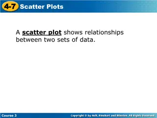
Scatter Diagram Method
Definition: The Scatter Diagram Method is the simplest method to study
the correlation between two variables wherein the values for each pair
of a variable is plotted on a graph in the form of dots thereby
obtaining as many points as the number of observations. Then by
looking at the scatter of several points, the degree of correlation is
ascertained. The degree to which the variables are related to each
other depends on the manner in which the points are scattered over
the chart. The more the points plotted are scattered over the chart,
the lesser is the degree of correlation between the variables. The more
the points plotted are closer to the line, the higher is the degree of
correlation. The degree of correlation is denoted by “r”.
The following types of scatter diagrams tell about the degree of
correlation between variable X and variable Y.
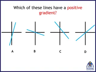
Perfect Positive Correlation (r=+1):
The correlation is said to be perfectly positive when all the points lie on
the straight line rising from the lower left-hand corner to the upper right-
hand corner.
Perfect Negative Correlation (r=-1):
When all the points lie on a straight line falling from the upper left-hand
corner to the lower right-hand corner, the variables are said to be
negatively correlated.
High Degree of +Ve Correlation (r=
+ High):
The degree of correlation is high when the points plotted fall under the
narrow band and is said to be positive when these show the rising
tendency from the lower left-hand corner to the upper right-hand
corner.
High Degree of –Ve Correlation (r=
– High):
The degree of negative correlation is high when the point plotted fall in
the narrow band and show the declining tendency from the upper
left-hand corner to the lower right-hand corner.
Low degree of +Ve Correlation (r= +
Low):
The correlation between the variables is said to be low but positive
when the points are highly scattered over the graph and show a rising
tendency from the lower left-hand corner to the upper right-hand
corner.
Low Degree of –Ve Correlation (r= +
Low):
The degree of correlation is low and negative when the points are
scattered over the graph and the show the falling tendency from the
upper left-hand corner to the lower right-hand corner.
No Correlation (r= 0):
The variable is said to be unrelated when the points are haphazardly
scattered over the graph and do not show any specific pattern. Here
the correlation is absent and hence r = 0.
Scatter Diagram Method is a simple and effective way to study the correlation between two variables. By plotting data points on a graph, it helps determine the degree of correlation between the variables. Perfect positive and negative correlations, as well as high and low degrees of correlation, can be identified through the scatter diagram method. This method provides insights into how variables are related to each other based on the distribution of points on the chart.

Download Presentation

Please find below an Image/Link to download the presentation.
The content on the website is provided AS IS for your information and personal use only. It may not be sold, licensed, or shared on other websites without obtaining consent from the author. Download presentation by click this link. If you encounter any issues during the download, it is possible that the publisher has removed the file from their server.
E N D
Presentation Transcript
Methods of Determining Correlation: Scatter Diagram Method. Karl Pearson's Coefficient of Correlation. Spearman's Rank Correlation Coefficient; and. Methods of Least Squares.
Scatter Diagram Method Definition: The Scatter Diagram Method is the simplest method to study the correlation between two variables wherein the values for each pair of a variable is plotted on a graph in the form of dots thereby obtaining as many points as the number of observations. Then by looking at the scatter of several points, the degree of correlation is ascertained. The degree to which the variables are related to each other depends on the manner in which the points are scattered over the chart. The more the points plotted are scattered over the chart, the lesser is the degree of correlation between the variables. The more the points plotted are closer to the line, the higher is the degree of correlation. The degree of correlation is denoted by r . The following types of scatter diagrams tell about the degree of correlation between variable X and variable Y.
Perfect Positive Correlation (r=+1): The correlation is said to be perfectly positive when all the points lie on the straight line rising from the lower left-hand corner to the upper right- hand corner.
Perfect Negative Correlation (r=-1): When all the points lie on a straight line falling from the upper left-hand corner to the lower right-hand corner, the variables are said to be negatively correlated.
High Degree of +Ve Correlation (r= + High): The degree of correlation is high when the points plotted fall under the narrow band and is said to be positive when these show the rising tendency from the lower left-hand corner to the upper right-hand corner.
High Degree of Ve Correlation (r= High): The degree of negative correlation is high when the point plotted fall in the narrow band and show the declining tendency from the upper left-hand corner to the lower right-hand corner.
Low degree of +Ve Correlation (r= + Low): The correlation between the variables is said to be low but positive when the points are highly scattered over the graph and show a rising tendency from the lower left-hand corner to the upper right-hand corner.
Low Degree of Ve Correlation (r= + Low): The degree of correlation is low and negative when the points are scattered over the graph and the show the falling tendency from the upper left-hand corner to the lower right-hand corner.
No Correlation (r= 0): The variable is said to be unrelated when the points are haphazardly scattered over the graph and do not show any specific pattern. Here the correlation is absent and hence r = 0.


:")
:")


:")
:")