Western's Visual Identity Guidelines
Western's visual identity revolves around a primary color palette of brown and gold, with gold taking the lead role. The neutral colors add sophistication, while accent colors should be used sparingly. The chosen font is Montserrat, and official photos can be accessed through the Office of Marketing and Strategic Communication.
Download Presentation

Please find below an Image/Link to download the presentation.
The content on the website is provided AS IS for your information and personal use only. It may not be sold, licensed, or shared on other websites without obtaining consent from the author.If you encounter any issues during the download, it is possible that the publisher has removed the file from their server.
You are allowed to download the files provided on this website for personal or commercial use, subject to the condition that they are used lawfully. All files are the property of their respective owners.
The content on the website is provided AS IS for your information and personal use only. It may not be sold, licensed, or shared on other websites without obtaining consent from the author.
E N D
Presentation Transcript
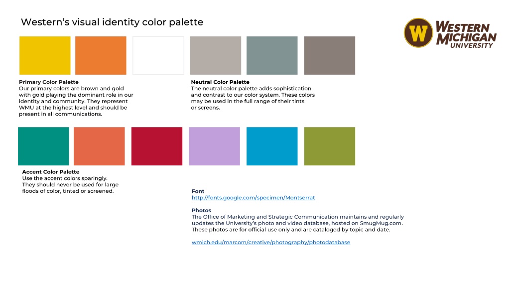
Westerns visual identity color palette Primary Color Palette Our primary colors are brown and gold with gold playing the dominant role in our identity and community. They represent WMU at the highest level and should be present in all communications. Neutral Color Palette The neutral color palette adds sophistication and contrast to our color system. These colors may be used in the full range of their tints or screens. Accent Color Palette Use the accent colors sparingly. They should never be used for large floods of color, tinted or screened. Font http://fonts.google.com/specimen/Montserrat Photos The Office of Marketing and Strategic Communication maintains and regularly updates the University s photo and video database, hosted on SmugMug.com. These photos are for official use only and are cataloged by topic and date. wmich.edu/marcom/creative/photography/photodatabase
1 2 3 4 Section title Section title Section title Section title Template slide 2
1 Section title Template section slide 3
Template section slide 4 Click to edit Master text Second level Third level Fourth level Fifth level Click to edit Master text Second level Third level Fourth level Fifth level 1 Section title

![textbook$ What Your Heart Needs for the Hard Days 52 Encouraging Truths to Hold On To [R.A.R]](/thumb/9838/textbook-what-your-heart-needs-for-the-hard-days-52-encouraging-truths-to-hold-on-to-r-a-r.jpg)

