Unveiling the Art and Science of Cartography
Cartography is the intricate discipline of creating maps that visually communicate geographical information. A map serves as a symbolized image of reality, representing selected features on Earth's surface. This summary delves into the goals of cartography, the essential components of a well-designed map, and the importance of clarity, order, balance, visual contrast, unity, harmony, and visual hierarchy in map creation to effectively convey spatial relationships and geographic details.

Download Presentation

Please find below an Image/Link to download the presentation.
The content on the website is provided AS IS for your information and personal use only. It may not be sold, licensed, or shared on other websites without obtaining consent from the author.If you encounter any issues during the download, it is possible that the publisher has removed the file from their server.
You are allowed to download the files provided on this website for personal or commercial use, subject to the condition that they are used lawfully. All files are the property of their respective owners.
The content on the website is provided AS IS for your information and personal use only. It may not be sold, licensed, or shared on other websites without obtaining consent from the author.
E N D
Presentation Transcript
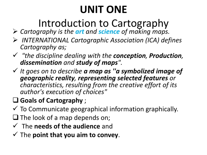
UNIT ONE Introduction to Cartography Cartography is the art and science of making maps. INTERNATIONAL Cartographic Association (ICA) defines Cartography as; "the discipline dealing with the conception, Production, dissemination and study of maps". It goes on to describe a map as ''a symbolized image of geographic reality, representing selected features or characteristics, resulting from the creative effort of its author's execution of choices" Goals of Cartography ; To Communicate geographical information graphically. The look of a map depends on; The needs of the audience and The point that you aim to convey.
Map A graphic depiction of all or part of a geographic realm in which the real-world features have been replaced by symbols in their correct spatial location at a reduced scale. A symbolized image of geographic reality, representing selected features or characteristics resulting from the creative efforts of cartographers and designed for use when spatial relationships are of special relevance . Map is a mathematically determined representation of the Earth s surface systematically plotted to scale upon a plane surface. A graphic representation drawn to scale using colors, symbols, and labels. An abstraction. Medium for displaying geographic information . A primary language of geography.
Maps tells to us: Location of the required place and its name. Give information about the surrounding features. The distance b/n two d/t features. Indicates the direction of the required features. The relationship b/n d/t features.
A well-designed map should include: Clarity: Suppose, to produce an effective Geomorphological map (E.g. an effect of glaciation on a landscape), the map-maker need to deeply understand about that geomorphologic action Order: Sequenced as Title, overall pattern, map legend, peripheral data. Balance: refers to the overall layout of the map elements (title, legend, scale, north arrow or inset maps and border). Visual Contrast: The clarity of the map derives in part from clear visual contrast between symbols used to represent different features It gives the eye a focal point and makes the map more interesting/attract map- reader s attention A map that contains only lines of the same color and weight is unlikely to attract the map reader's attention.
Unity and Harmony: The map shouldn t be too complex, but even if it represents complex spatial patterns, the map-reader must understand it at a glance use related/consistent symbols, colors and patterns . Visual Hierarchy: According to the purpose of the map, unnecessary information should be eliminated entirely Information that is relevant to the purpose of the map should be symbolized in a way that makes more important information visually more prominent.
Basic characteristics of all maps: all maps are concerned with two primary elements. locations and attributes. all maps are reductions of reality (scale). all maps are transformations of space. map projections and coordinate systems. all maps are abstractions of reality. (generalization and its components) all maps use signs and symbolism. (Cartographic symbolization).
Types of Maps Based on function there are three broad categories of maps 1, Reference maps generally show several types of spatial data without specific emphasis on one type over another. Reference maps can vary in their complexity and size, but generally include just the various geographic features that give a picture of the area being mapped, e.g. political boundaries, cities, and topographic features.
2 THEMATIC MAP The map which has a specific theme or focus. Thematic maps can vary in topic, complexity, purpose and kind of representation. They generally show characteristics, or attributes, of features that vary spatially. The attribute can vary in a qualitative or nominal way, e.g. categories of land cover; or the attribute can vary in a quantitative way, e.g. amount of precipitation. Thematic maps can represent data with points, lines, areas or volumes.
3 SPACIAL PURPOSE MAPS It lie somewhat between reference maps and thematic maps as they are often reference-like in their use but are made for specific types of users or pertain to a specific type of data. Navigational maps, like those in road atlases , are considered special-purpose maps, as are maps for certain industries or occupations, like soil maps, and municipal utility maps.
Based on scale, there are three types of maps. They are: Small scale maps Medium scale maps Large scale maps
Larger_ scale maps are: Less area More detail Less generalization Less classification Smaller_ scale maps are: More area Less detail More generalization More classification
Map Symbolization Symbolization is the processing of assigning symbols to represent features.. Many factors must be considered when selecting symbols for a map, such as; The scale Of the map, The nature of the phenomenon being mapped, The available data, and the display method of the finished product.
The following sections explore the symbolization process in greater depth. There is no consensus on the quantitative limits of the terms small, medium, and large scale. Nevertheless, in the junior high school textbooks, maps with scales of 1:50, 000 or greater are large scale maps. The term large refers to the relative sizes at which objects are represented on the map. Accordingly, when little reduction is involved and features such as roads are large, the map is termed a large scale map. They show greater details of reality as shown in the topographical map of Ethiopia.
Maps with scales ranging from 1:50, 000 to 1: 250, 000 are medium scale maps. The term medium refers to the relative sizes at which objects are represented on the map. Accordingly, when mediumreduction is involved and features such as roads are medium in size, the map is termed a medium scale map
Maps with scales greater than 1: 250, 000 are small scale maps. Accordingly, when large reduction is involvedand features such as roads are small, the map is termed a small- scale map. Thus, reality is represented in a highly generalized or simplified manner on small- scale maps whereas it is represented in detail on large-scale maps.
Maps Based on Subject Matter It is also useful to group maps on the basis of the subject matter they portray. But there is no limit to the number of classes of maps that can be created by grouping them according to their dominant subject matter. Thus, there are; geological maps, climatic maps, population maps, economic maps, statistical maps, cadastral maps, plans.etc
ways of representing scale on maps There are three customary ways of expressing scale on a map. They are representative fraction, graphic and verbal scale. 1. Representative fraction (RF) - is a ratio expressing the relationship of the number of units on the map to the number of the same units on the real earth. It can be shown either as 1: 50 000 or 1/50 000. In this scale, it means that one unit length on the map represents 50 000 units of length on the earth s surface The unit of distance in both the numerator and denominator of the fraction must be the same. For example, you can read the scale mentioned above as one millimetre on the map represents 50 000 millimetres on the earth s surface. It is also possible to read it as one centimeter on the map represents 50 000 centimeters on the earth s surface.
2 Verbal (Statement) scale It is the expression of map distance in relation to the same earth distance in words. For example, one centi-meter to one kilometer or one centimeter represents one kilo-meter is an example of a verbal scale.
3. Graphic or Bar Scale is a line or a bar subdivided to show map distance, and the same distance on the earth s surface. The distance between any two divisions can be measured with a ruler, and you can read the map distance. This distance on the map has the ground distance as labeled on the line or bar. This form of scale is very useful when the map is to be reduced during reproduction because it changes in correct proportion to the amount of reduction.
Purpose of map The look of a map depends largely on its intended use and intended audience. Examples, store geographic information aid navigation or mobility aid analysis, such as measuring or computing Summarize large amounts of statistical data for forecasting or detecting trends Visualize what was otherwise invisible
Elements of map The title identifies the map area and the type of map. Cartographers may list the title simply or artistically. Another important feature on a map is the legend or map key. Information needed to read a map is found in the map legend
Most maps use symbols or colors to represent different geographic features. The map legend helps determine what the symbols and colors mean. Almost all maps have scales. Scales compare a distance measured on the map to the actual distance on the surface of the earth. Scales appear on maps in several forms, but most cartographers draw a line scale as a point of reference Some cartographers place an arrow that points to the North Pole on the map. This is a north arrow.
UNIT TWO MAP PROJECTION AND COORDINATE SYSTEM Coordinate: is a set of numbers that designate location in a given reference system, such as, x, y in a plane coordinate system or x, y, z in a three dimensional coordinate system. Coordinate pairs represent location on the earth's surface relative to other locations.
A Coordinate Systemis a reference system used to measure horizontal and vertical distances on a plan metric (flat surface) map. A coordinate system is used to define a location on the Earth. It is created in association with a map projection, datum, and reference ellipsoid and describes locations in terms of distances or angles from a fixed reference point.
There are 2 types of coordinate systems: Geographic Coordinate Systems /unprojected/ spherical A reference system using latitude and longitude to define the location of points on the surface of the earth. Projected Coordinate Systems A Projected coordinate system (PCS) is a two- dimensional planar surface. However, the Earth's surface is three- dimensional. Transforming three-dimensional space onto a two-dimensional surface is called projection.
Latitude and Longitude Coordinates are expressed in degrees, minutes and seconds. Position coordinates are based on an angular distance from a known reference point. LATITUDE measures the position of a given point in terms of it sangular distance from the equator. That is, latitude is an indicator of how far north or south of the equator a given point is situated. All points north of the equator are designated as north latitude (northern hemisphere), all points south of the equator are designated as south latitude (southern hemisphere). Angle from equator: latitude Angle east of Greenwich: longitude
The equator is 0 latitude, and the north and south poles are at 90 angles from the equator. Longitude Longitude lines (also called "meridians") run north-south and meet at the poles. It measures distance east and west of the Prime Meridian, from 0 degrees at the Prime.
Geographic Coordinate System Geographic Coordinate System is a three dimensional spherical surface to define locations on the earth. The spherical grid system uses simple geometry and sets two sets of imaginary lines (Parallels and Meridians) around the earth. With this system we can then describe the locations of any of the objects we wish to describe. The position of any point is defined by the intersection of both imaginary lines. PARALLELS circle the globe from east to west (Latitude) MERIDIANS are drawn from pole to pole (Longitude)
A: PARALLELS B: MERIDIANS
Projected Coordinate System A projected coordinate system is a flat, two- dimensional representation of the Earth. Reference systems, called rectangular coordinates or plane coordinates, allow us to locate objects correctly on flat maps (Two- dimensional maps projected from reference globe). It is based on a sphere or spheroid geographic coordinate system, but it uses linear units of measure for coordinates, so that calculations of distance and area are easily done in terms of the same units.
The latitude and longitude coordinates are converted to x and y coordinates on the flat projection. The x coordinate is, usually, the eastward direction of a point and the y coordinate is, usually, the northward direction of a point. The centerline that runs east and west is referred to as the x-axis and the centerline that runs north and south is referred to as the y-axis.
Map projections When we transform three-dimensional surface to create a flat map sheet. This mathematical transformation is commonly referred to as a map projection. or A map projection is the systematic transformation of locations on the earth (latitude/longitude) to planar coordinates.
Fig Map Projection - the transformation of a curved earth to a flat map (3D to 2D)
Classification of Map projections Representing the earth s surface in two dimensions causes distortion in the; shape, area, distance, or direction of the data. Generally, there are three levels of recognition for map projections: class, aspect and property. Based on Class: The cylindrical projection The planar (Azimuthal) projection The conical projection
1. Planar or polar projection Surface of the globe is projected onto a plane tangent at only one point. Project map data onto a flat surface touching the globe. This type of projection is made upon a plane tangent to the reference surface (the globe). Used frequently at N or S pole Usually only one hemisphere shown (centered on N or S pole) For example: Lambert Azimuthal Equal Area
2. Conic projection Resulted from projecting a spherical surface onto a cone. Normally shows just one semihemisphere in middle latitudes. Very popular for maps of East-West oriented land masses Example: Lambert Conformal Conic
3. Cylindrical projection It usually places the earth inside a cylinder with the equator tangent to the inside of the cylinder. low distortion at equator, higher distortion approaching poles. a good choice for use in equatorial and tropical regions, e.g., Ecuador, Kenya, Ethiopia, Malaysia For example: Mercator projection
Properties (Map Projection types based on characteristics of the resultant projected maps) Co formality-angle preserved Equivalence (Equal Area)-areas preserved Equidistance-Equal distance in one direction
1 Conformal projections The angle between any two lines on the earth must be the same between their projected counterparts on the map; in particular, each parallel must cross every meridian at right angles. It is most often used type of projection for world map, example in Mercator type of projection in which distance and size greatly distorted at Polar Regions but shape and direction are accurate. It is valuable for sea travel and ship navigators.
2. Equivalent projections (Equal _area): The area of a figure on the earth remains the same on the plane independent of the shape or size of the figure. To keep the area property, it the scale at a point is increased in one direction, and then it is reduced in another direction. 3. Equidistant projections Distance from a single location to all other locations is preserved. The meridian and certain parallel circles are truly projected. In this type of projection the scale of the map will be kept unity. A combination of conformality and equivalency with some degree of equidistance can be made.
Aspect: Based on the orientation of the axis :( Cylindrical projection) can be classified: The normal aspect The transverse aspect The oblique aspect
Universal Transverse Mercator projection (UTM) UTM is a cylindrical map projection established in 1936 by international Union of Geodesy and Geophysics, adopted by US Army in 1947, and the purpose was to get a transversal Mercator map of the whole Earth. mapping agencies, including NATO and now it is commonly used in topographic and thematic mapping for referencing satellite imagery. The earth is divided in 60 zones in longitude, between the latitudes 84 N and 80 S, each 6 in longitude since the distortion at the poles is too great with this projection. The numbering of zones starts from the 180th meridian from Greenwich and going eastwards. The middle meridian in each zone is the central meridian in the projection. The international reference Ellipsoid 1924 is commonly used with the most important exception of North America where Clarke s 1866 ellipsoid is used, and in Africa Clark s 1880 ellipsoid is used Ethiopia lies in the zones 35-38.
In short, the universal Transverse Mercator (UTM) system: The Projection is the Gauss-Kruger version of the Transverse Mercator equidistant cylindrical projection . Intended for mapping areas 840N -800s Unit of measure is meter The world is divided into 60 zones 60 of longitude in width Zone 1s starts at 1800W and each zone has its own coordinate system The easting of the origin of each zone is assigned a value of 5000,000m. The northing for each southern hemisphere the equator is assigned a northing value of 1,000,000 m. The UTM might use one of the following spheroid International Clarke 1880 (Africa), Clarke 1866 (N. America) Everest or Bessel (Asia)
Selection of a suitable map projection The selection of map projection for GIS will be influenced by the following: How the results of analysis are best presented in the form of a map. In order to make any quantitative measurements (area, length, etc) the degree of accuracy must be examined. General rules for selecting a projection Tropical country cylindrical projection Temperate country Conical projection Polar regions azimuthal projection
Unit 3 Topographic mapping In modern mapping, a topographic map is a type of map characterized by large-scale detail and quantitative representation of relief, usually now using contour lines, but historically using a variety of methods. Traditional definitions require a topographic map to show both natural and man-made features. Topographic maps are detailed, accurate graphic representations of features that appear on the Earth's surface. These features include:
cultural: roads, buildings, urban development, railways, airports, names of places and geographic features, administrative boundaries, state and international borders, reserves hydrography: lakes, rivers, streams, swamps, coastal flats relief: mountains, valleys, slopes, depressions vegetation: wooded and cleared areas, vineyards and orchards A map legend (or key) lists the features shown on that map, and their corresponding symbols
Map scales / generalization Cartographic generalization may appear in the following ways: (1). The selection of objects (the restriction of the contents of the map to objects that are essential), (2) The carefully considered simplification of contours (the planned outlining of objects, both linear and those that occupy an area, in which the peculiarities of the outlines typical of such objects are maintained and sometimes even emphasized. (3) The generalization of quantitative characteristics by reducing the number of divisions within which quantitative differences for specific features shown on the map are indicated (for example, in the case of a population scale for built-up areas, combining two divisions on the scale, such as less than 500 inhabitants and from 500 to 2,000 inhabitants into one division, less than 2,000 inhabitants ), (4) The generalization of qualitative characteristics by simplifying the classifications for the features being shown (not subdividing forests according to type when showing vegetation on topographical maps), and (5) The replacement of individual features by general designations (indicating a population center by blocks and a geometrical sign instead of marking individual buildings).


:")

")
 system:")
 system:")


![❤Book⚡[PDF]✔ Star Maps: History, Artistry, and Cartography (Springer Praxis Book](/thumb/21625/book-pdf-star-maps-history-artistry-and-cartography-springer-praxis-book.jpg)