Sven's 10 Golden Rules for a Captivating Presentation
Sven Bergmann shares essential tips for delivering successful presentations, focusing on audience engagement and clarity. From understanding audience knowledge levels to utilizing impactful visuals, these rules are designed to help presenters effectively communicate their message and leave a lasting impression.
Download Presentation

Please find below an Image/Link to download the presentation.
The content on the website is provided AS IS for your information and personal use only. It may not be sold, licensed, or shared on other websites without obtaining consent from the author. Download presentation by click this link. If you encounter any issues during the download, it is possible that the publisher has removed the file from their server.
E N D
Presentation Transcript
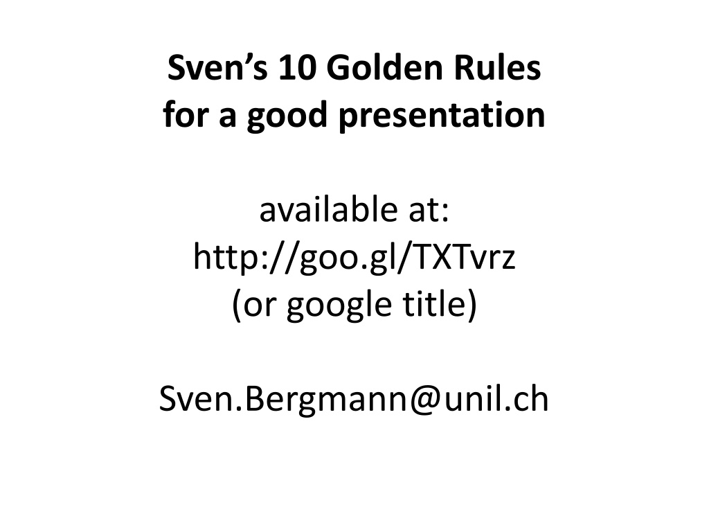
Svens 10 Golden Rules for a good presentation available at: http://goo.gl/TXTvrz (or google title) Sven.Bergmann@unil.ch
1. Never underestimate the ignorance of your audience! Always assume that your audience has less background than what you d hope for, talk to the outsider rather than the expert, and avoid jargon!
2. Introduce your topic quite general Don t try to impress your audience with petty details, concentrate on the big picture!
4. Give an outline only for a longer talk But always summarize your take-home messages even in a short presentation (<20 minutes).
5. Always have your name, e-mail (and web-site if you have one) on your first and last slide!
6. Never say what you will not talk about, rather use your time to say what you want to convey!
7. Use as little text as possible! Pictures speak more than thousand words and are processed by most brains much faster! If you really need some text to remind you what to say, don t put it on the slide, use the comment function of Powerpoint! But do not read out a ready text, always speak freely!
8. For the little text you need use a big sans-serif font! Arial, not Times, is easy to read. Use high contrast colors! A white background has the advantage that you'll have more light in the room such that less people fall asleep. Always make sure that your slides can be easily viewed by the half-blind in the last row!
9. Look at your audience frequently, try to make eye-contact, and do not talk to your slides!
10. Avoid hiding behind a reading stand, be visible and stand in the spot light if there is any!
Svens 10 Golden Rules for a good presentation available at: http://goo.gl/TXTvrz (or google title) Sven.Bergmann@unil.ch

![❤[READ]❤ Robotic Exploration of the Solar System: Part I: The Golden Age 1957-19](/thumb/21623/read-robotic-exploration-of-the-solar-system-part-i-the-golden-age-1957-19.jpg)


