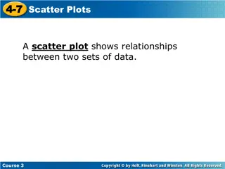
Scatter Diagrams and Correlation
Scatter diagrams and correlation help analyze the relationship between two variables, showcasing direction, linearity, and strength of correlation. Positive and negative correlations are discussed, along with how to draw scatter diagrams and identify trends by eye.

Download Presentation

Please find below an Image/Link to download the presentation.
The content on the website is provided AS IS for your information and personal use only. It may not be sold, licensed, or shared on other websites without obtaining consent from the author.If you encounter any issues during the download, it is possible that the publisher has removed the file from their server.
You are allowed to download the files provided on this website for personal or commercial use, subject to the condition that they are used lawfully. All files are the property of their respective owners.
The content on the website is provided AS IS for your information and personal use only. It may not be sold, licensed, or shared on other websites without obtaining consent from the author.
E N D
Presentation Transcript
8 March 2025 Scatter diagrams and line of best fit, by eye. LO: To draw scatter diagrams and the line of best fit by eye. www.mathssupport.org
Scatter graphs and correlation Scatter graphs (scatter plots) are used to investigate the possible relationship between two variables that both relate to the same event . The relationship between two variables is called correlation. For example, Do tall people weigh more than short people? If there is more rain, will it be colder? If you revise longer, will you get better marks? Do second-hand car get cheaper with age? Is more electricity used in cold weather? www.mathssupport.org
Scatter graphs and correlation The independent variable should be on the horizontal axis. (x) The dependent variable should be on the vertical axis. (y) X y To draw a scatter diagram plot the (x, y) values from the data table as dots on a graph X X Dependent variable X X X X X X X X X X X X X X The pattern formed by the dots give us some indication of the correlation. X X 0 x Independent variable www.mathssupport.org
Correlation. Refers to the relationship or association between two variables There are several characteristics we consider when describing the correlation between two variables: Direction. Direction. Linearity. Linearity. Strength Strength www.mathssupport.org
Direction Negative Correlation:- For a generally downward trend, we say that the correlation is negative. When the independent variable increases, the dependent variable decreases Positive Correlation:- For a generally upward trend, we say that the correlation is positive. An increase in the independent variable means that the dependant variable generally increases. For randomly scattered points, with no upward or downward trend, we say there is no correlation. For randomly scattered points, with no upward or downward trend, we say there is no correlation. No correlation:- No apparent link between the variables. www.mathssupport.org
Linearity We determine whether the points follow a linear trend. These points are roughly linear. Approximately form a straight line These points do not follow a linear trend These points do not follow a linear trend www.mathssupport.org
Strength The strength of correlation is usually described as either strong, moderate or weak Strong positive Moderate positive Weak positive Weak negative Moderate negative Weak negative Strong negative www.mathssupport.org
Scatter graphs We can use scatter graphs to find out if there is any relationship or correlation between two sets of data. 18 24 16 21 20 28 15 21 16 22 21 26 19 25 17 22 20 27 18 23 Hand span (cm) Foot length (cm) y 28 What can we deduce from this graph? There is correlation between the hand spam and the foot length X 27 X X 26 Foot length (cm) Describe the correlation between hand spam and foot length 25 X 24 X 23 X There is strong, positive linear correlation between the hand spam and the foot length 22 X X 21 X X 16 17 20 19 21 18 15 0 x Hand spam (cm) www.mathssupport.org
Plotting scatter graphs This table shows the temperature on 10 days and the number of ice creams a shop sold. Plot the scatter graph. Temperature ( C) Ice creams sold 10 14 20 y 40 14 16 20 19 22 23 19 What can we deduce from this graph? There is correlation between the Temperature and the number of ice creams sold 21 22 25 30 22 15 18 16 18 19 35 30 X Ice creams sold 25 Describe the correlation between Temperature and the number of Ice creams sold There is strong, positive linear correlation between the Temperature and the number of ice creams sold X X 20 X X X X 15 X X X 10 5 16 18 24 22 26 20 14 0 x Temperature ( C) www.mathssupport.org
Plotting scatter graphs We can use scatter graphs to find out if there is any relationship or correlation between two set of data. Hours watching TV Hours doing homework 2.5 0.5 y 2 4 3.5 0.5 2 2 1.5 3 2.5 2 3 1 5 0 1 2 0.5 3 What can we deduce from this graph? There is correlation between the two variables. 3.5 Hours doing homework X 3 X Describe the correlation between the number of hours watching TV and the number of hours doing homework There is strong, negative linear correlation between the variables. 2.5 X X 2 X X 1.5 1 X 0.5 X X X 2 3 6 5 4 1 0 x Hours watching TV www.mathssupport.org
Line of best fit A line of best fit (trend line) is drawn on a scatter diagram to find the direction of an association between two variables and to show the trend. The line of best fit can then be used to make predictions. To draw the line of best fit by eye: Calculate the mean point, finding the mean of the x-values and the mean of the y-values Draw a line that will balance the number of points above the line and the number of points bellow the line The line must pass through the mean point www.mathssupport.org
Drawing a Line of Best Fit A line of best fit can be drawn to data that shows a correlation. The stronger the correlation between the data, the easier it is to draw the line. The line of best fit should pass trough the mean point ( ?, ?) ( ?, ?) The line can be drawn by eye and should have roughly the same number of data points on either side. The sum of the vertical distances above the line should be roughly the same as those below. www.mathssupport.org
Ten students were surveyed to find the number of marks they received in a Maths test and a Science test. The results were: 40 79 60 65 30 73 56 67 45 85 Science 48 91 70 71 50 85 65 75 60 95 Maths (a) Plot a scatter graph for this data. 100 90 80 70 Maths 60 50 40 30 70 80 60 40 50 Science 90 100 20 30 www.mathssupport.org
Ten students were surveyed to find the number of marks they received in a Maths test and a Science test. The results were: 40 79 60 65 30 73 56 67 45 85 Science 48 91 70 71 50 85 65 75 60 95 Maths (a) Plot a scatter graph for this data. 100 90 80 70 Maths 60 50 40 30 70 80 60 40 50 Science 90 100 20 30 www.mathssupport.org
Ten students were surveyed to find the number of marks they received in a Maths test and a Science test. The results were: 40 79 60 65 30 73 56 67 45 85 Science 48 91 70 71 50 85 65 75 60 95 Maths (a) Plot a scatter graph for this data. 100 90 80 70 Maths 60 50 40 30 70 80 60 40 50 Science 90 100 20 30 www.mathssupport.org
Ten students were surveyed to find the number of marks they received in a Maths test and a Science test. The results were: 40 79 60 65 30 73 56 67 45 85 Science 48 91 70 71 50 85 65 75 60 95 Maths (a) Plot a scatter graph for this data. 100 90 80 70 Maths 60 50 40 30 70 80 60 40 50 Science 90 100 20 30 www.mathssupport.org
Ten students were surveyed to find the number of marks they received in a Maths test and a Science test. The results were: 40 79 60 65 30 73 56 67 45 85 Science 48 91 70 71 50 85 65 75 60 95 Maths (a) Plot a scatter graph for this data. 100 90 80 70 Maths 60 50 40 30 70 80 60 40 50 Science 90 100 20 30 www.mathssupport.org
Ten students were surveyed to find the number of marks they received in a Maths test and a Science test. The results were: 40 79 60 65 30 73 56 67 45 85 Science 48 91 70 71 50 85 65 75 60 95 Maths (a) Plot a scatter graph for this data. 100 90 80 70 Maths 60 50 40 30 70 80 60 40 50 Science 90 100 20 30 www.mathssupport.org
Ten students were surveyed to find the number of marks they received in a Maths test and a Science test. The results were: 40 79 60 65 30 73 56 67 45 85 Science 48 91 70 71 50 85 65 75 60 95 Maths (a) Plot a scatter graph for this data. 100 90 80 70 Maths 60 50 40 30 70 80 60 40 50 Science 90 100 20 30 www.mathssupport.org
Ten students were surveyed to find the number of marks they received in a Maths test and a Science test. The results were: 40 79 60 65 30 73 56 67 45 85 Science 48 91 70 71 50 85 65 75 60 95 Maths (a) Plot a scatter graph for this data. 100 90 80 70 Maths 60 50 40 30 70 80 60 40 50 Science 90 100 20 30 www.mathssupport.org
Ten students were surveyed to find the number of marks they received in a Maths test and a Science test. The results were: 40 79 60 65 30 73 56 67 45 85 Science 48 91 70 71 50 85 65 75 60 95 Maths (a) Plot a scatter graph for this data. 100 90 80 70 Maths 60 50 40 30 70 80 60 40 50 Science 90 100 20 30 www.mathssupport.org
Ten students were surveyed to find the number of marks they received in a Maths test and a Science test. The results were: 40 79 60 65 30 73 56 67 45 85 Science 48 91 70 71 50 85 65 75 60 95 Maths (a) Plot a scatter graph for this data. 100 90 80 70 Maths 60 50 40 30 70 80 60 40 50 Science 90 100 20 30 www.mathssupport.org
Ten students were surveyed to find the number of marks they received in a Maths test and a Science test. The results were: 40 79 60 65 30 73 56 67 45 85 Science (x) 48 91 70 71 50 85 65 75 60 95 Maths (y) (a) Plot a scatter graph for this data. 100 (b) Draw a line of best fit and comment on the correlation. 90 80 70 Maths If you have a calculator you can find the mean of each set of data. Mean of x-values 60 50 40 40 + 79 + 60 + 65 + 30 + 73 + 56 + 67 + 45 + 85 10 30 Mean of y-values 70 80 60 40 50 Science 90 100 20 30 448 + 91 + 7 + 71 + 50 + 85 + 65 + 75 + 60 + 95 10 www.mathssupport.org
Ten students were surveyed to find the number of marks they received in a Maths test and a Science test. The results were: 40 79 60 65 30 73 56 67 45 85 Science 48 91 70 71 50 85 65 75 60 95 Maths (a) Plot a scatter graph for this data. 100 (b) Draw a line of best fit and comment on the correlation. 90 80 70 Maths If you have a calculator you can find the mean of each set of data. (mean of x, mean of y) 60 50 40 In this case: (60, 71) 30 Plot this point to help you draw the line of best fit. Ideally all lines of best fit should pass through it. 70 80 60 40 50 Science 90 100 20 30 www.mathssupport.org
Ten students were surveyed to find the number of marks they received in a Maths test and a Science test. The results were: 40 79 60 65 30 73 56 67 45 85 Science 48 91 70 71 50 85 65 75 60 95 Maths (a) Plot a scatter graph for this data. 100 (b) Draw a line of best fit and comment on the correlation. Positive, strong correlation If you have a calculator you can find the mean of each set of data. (mean of x, mean of y) 90 80 70 Maths 60 50 40 In this case: (60, 71) 30 Plot this point to help you draw the line of best fit. Ideally all lines of best fit should pass through it. 70 80 60 40 50 Science 90 100 20 30 www.mathssupport.org
Ten students were surveyed to find the number of marks they received in a Maths test and a Science test. The results were: 40 79 60 65 30 73 56 67 45 85 Science 48 91 70 71 50 85 65 75 60 95 Maths (a) Plot a scatter graph for this data. 100 (b) Draw a line of best fit and comment on the correlation. 90 80 80 70 Maths (c) Estimate the marks for a student who was absent for the Maths test but scored 70 in the Science test. 60 50 40 30 70 80 60 40 50 Science 90 100 20 30 www.mathssupport.org
Ten students were surveyed to find the number of marks they received in a Maths test and a Science test. The results were: 40 79 60 65 30 73 56 67 45 85 Science 48 91 70 71 50 85 65 75 60 95 Maths (d) Calculate the equation of the line of best fit. 100 Using the mean point and the last point, we have (x1, y1) = (60, 71) (x2, y2) = (85, 95) ? =95 71 85 60= 0.96 The equation of the line is: y ? = m(x ?) 90 80 70 Maths 60 50 40 30 y 71 = 0.96(x 60) y = 0.96x + 13.4 70 80 60 40 50 Science 90 100 A Line of best fit is also called regression line. 20 30 www.mathssupport.org
Thank you for using resources from A close up of a cage Description automatically generated For more resources visit our website https://www.mathssupport.org If you have a special request, drop us an email info@mathssupport.org www.mathssupport.org