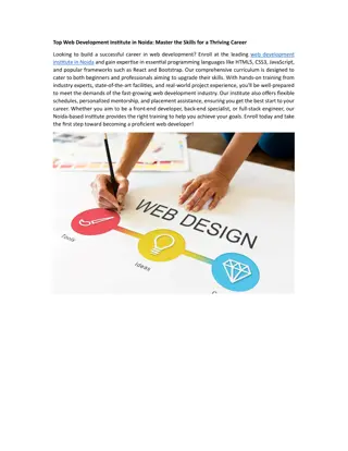
Introduction to Bootstrap: A Beginner's Guide
Bootstrap is a free and open-source CSS framework designed for responsive, mobile-first web development. It provides templates for various interface components like typography, forms, buttons, and navigation. Understanding HTML is key to learning Bootstrap, and familiarity with CSS selectors is helpful. The Bootstrap grid system offers classes for different screen sizes, and the framework comes with numerous reusable components. Advantages include fewer cross-browser bugs, lightweight customizability, responsive structures, JavaScript plugins, good documentation, and a supportive community.

Download Presentation

Please find below an Image/Link to download the presentation.
The content on the website is provided AS IS for your information and personal use only. It may not be sold, licensed, or shared on other websites without obtaining consent from the author.If you encounter any issues during the download, it is possible that the publisher has removed the file from their server.
You are allowed to download the files provided on this website for personal or commercial use, subject to the condition that they are used lawfully. All files are the property of their respective owners.
The content on the website is provided AS IS for your information and personal use only. It may not be sold, licensed, or shared on other websites without obtaining consent from the author.
E N D
Presentation Transcript
Bootstrap PPT by - Shafeeq Khan
| What is Bootstrap | Bootstrap is a free and open-source CSS framework directed at responsive, mobile-first front-end web development. It contains HTML, CSS and JavaScript-based design templates for typography, forms, buttons, navigation, and other interface components.
| How to Use | A basic understanding of HTML is required to start learning Bootstrap. Some familiarity with how CSS works (CSS Selectors and Visual Rules) would be helpful, 1. 2. Include Bootstrap from a CDN Download Bootstrap from getbootstrap.com
| Bootstrap Grid | The Bootstrap grid system has four classes: xs (<576px wide) sm ( >576px wide) md (for >768px wide) lg ( >992px wide) xl ( >1200px wide) XXl (For >1400px wide)
| Viewport | The viewport is the user's visible area of a web page. The viewport varies with the device, and will be smaller on a mobile phone than on a computer screen. <meta name="viewport" content="width=device-width, initial-scale=1.0">
| Components | Many more reusable components built to provide iconography, dropdowns, input groups, navigation, alerts, and much more. Accordion
| Components | Alerts
| Components | Accordion Alerts Badge Breadcrumb Buttons Button group Card Carousel Close button Collapse Dropdowns List group Modal Navs & tabs Navbar Offcanvas Pagination Popovers Progress Scrollspy Spinners Toasts Tooltips
| Advantages of Bootstrap | 1. 2. 3. 4. 5. 6. 7. 8. Fewer Cross browser bugs A consistent framework that supports major of all browsers and CSS compatibility fixes Lightweight and customizable Responsive structures and styles Several JavaScript plugins using the jQuery Good documentation and community support Loads of free and professional templates, WordPress themes and plugins Great grid system


![[PDF⚡READ❤ONLINE] Zen Mind, Beginner's Mind: 50th Anniversary Edition](/thumb/20459/pdf-read-online-zen-mind-beginner-s-mind-50th-anniversary-edition.jpg)