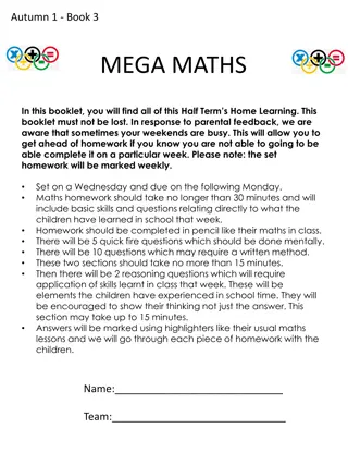
Graphic Communication Tasks Booklet
This booklet guides you through tasks focusing on graphic communication concepts such as the rule of thirds, flashbars, and color theory. You will learn to analyze existing designs, create enhancements, and understand design principles to improve your graphic communication skills.
Download Presentation

Please find below an Image/Link to download the presentation.
The content on the website is provided AS IS for your information and personal use only. It may not be sold, licensed, or shared on other websites without obtaining consent from the author.If you encounter any issues during the download, it is possible that the publisher has removed the file from their server.
You are allowed to download the files provided on this website for personal or commercial use, subject to the condition that they are used lawfully. All files are the property of their respective owners.
The content on the website is provided AS IS for your information and personal use only. It may not be sold, licensed, or shared on other websites without obtaining consent from the author.
E N D
Presentation Transcript
S1/2 GRAPHIC COMMUNICATION Tasks Name: Class:
ABOUT THIS BOOKLET This booklet contains the tasks that you should complete alongside reading through the presentation you have been supplied with. You can either print this booklet on A4 paper to complete by hand, or you can edit this power point to complete tasks, or grab some A4 paper, copy the drawings and complete them that way. Learning Intentions: -You will have a basic knowledge of how to use the rule of thirds -You will understand what flashbars are and how they enhance a design -You will have a basic knowledge of colour theory, including the colour wheel and how to effectively use harmonising and contrasting colours -You will understand what design principles are and be able to create two of the more easily understood principle, depth and dominance Success Criteria: -You will be able to identify the rule of thirds in existing advertisements -You will be able to place a flashbar in an existing design -You will be able to complete a colour wheel and answer questions regarding primary, secondary and tertiary colours -You will understand what design principles are and be able to create two of the more easily understood principle, depth and dominance Benchmarks: TCH 2-11a - I can use a range of graphic techniques, manually and digitally, to communicate ideas, concepts or products, experimenting with the use of shape, colour and texture to enhance my work.
TASK 1 RULE OF THIRDS Find a poster/advert either in a magazine you have at home, or find one on the internet that you believe displays the rule of Thursday. They, either on the computer or by hand, draw the four lines that divide the page and draw the circles on the impact points, were you right? How could you change the advert to improve it? Examples: Impact Points
TASK 2 - FLASHBARS Add a flashbar to the poster. This flashbar should be used to add depth and make the main product (the table) stand out against the background! Book Table (If you are completing this on paper, then redraw the whole poster) ajhsdkjahsdkjajhsdkjahsdkj ajhsdkjahsdkjajhsdkjahsdkj ajhsdkjahsdkjajhsdkjahsdkj ajhsdkjahsdkjajhsdkjahsdkj ajhsdkjahsdkjajhsdkjahsdkj
TASK 3 COLOUR WHEEL Answer the following questions: What are the three primary colours? Colour the colour wheel (mix colours to complete the tertiary colours) a) How is a secondary colour made? b) How is a tertiary colour made? c) Name a warm colour d) Name a cool colour e)
TASK 4 HARMONY AND CONTRAST a) Finish the following sentences with the names of colours a) Complete the following questions What effect does using contrasting colours make? __________ contrasts with ___________ __________ contrasts with ___________ __________ contrasts with ___________ ____________________________________ ____________________________________ ____________________________________ ____________________________________ What effect does using harmonising colours make? __________ harmonises with __________ __________ harmonises with __________ __________ harmonises with __________ ____________________________________ ____________________________________ ____________________________________ ____________________________________
TASK 5 HARMONY AND CONTRAST The two images show a product and a flash bar, your task is to colour A using only harmonising colours and B using contrasting colours, what effect does it create? A) B)
TASK 6 - DEPTH Find an example of a poster/advertisement/image that has depth. You can find this advert in magazines, online, or you can sketch one yourself! Add annotation to the advert so show how they have added depth. Example: Drop-shadow added to title and main image of product product Drop-shadow added to title and main image of Book Table Book Table Elements of the layout overlap, making it look as though some are closer than others Used 3D image of product Dfjhksjfh akshkjdfh fkjahdsk askdjhasdf ajkhadfam sdkjhaf ajfbmn asfdja dkjasnd kjhad jhaf jamn kjfmns djabsdm fkjasdmfn Store your books in style!
TASK 7 It s time to take everything that you have learned and bring it all together! Your final and largest task is to find a product in your home (this could be your games console, your kettle or even a table and create an A4 advert for the product that could be in a magazine. It is up to you whether this advertisement is portrait or landscape but it must include the following things: 1. A title 2. An image of the product (either a photo or a sketch) 3. A box of text that describes the product 4. A flash-bar Your advert must also make use of contrast, depth and dominance
