Enhancing Typography for Better Readability in Design


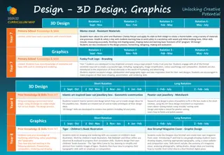
The Hilltopper Journey
SAMPLE HEADING FONT & STYLE
Interstate, Bold
HEADING
SAMPLE HEADING
FONT & STYLE
HEADING BOLD &
CAPS
FONT & STYLE
Interstate, Bold
HEADING
SAMPLE HEADING
FONT & STYLE
Do not over fill
with text, add a page when
in doubt
Play with
Text Location.
Less is More!
Main Body:
Lower Case
Font & Style: Interstate Reg
.
Allow the eye to travel
Allow for space
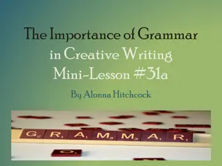
Sample Heading
UPPER CASE
Interstate Bold, Caps
Sample Body Text
Lower Case
Interstate Regular
Sample Text
–
Use Lower Case when there are
long paragraphs or sentences for
easier reading.
You can Increase line spacing for easier
reading.
Sample Heading
UPPER CASE
Interstate Bold, Caps
Sample Body Text
Lower Case
Interstate Regular
Sample Text
–
Use Lower Case when there are long
paragraphs or sentences for easier
reading.
You can Increase line spacing for easier
reading.
Explore the usage of fonts like Interstate Bold and Regular to improve the readability of your designs. Understand the importance of text location, spacing, and styling to create visually appealing content that is easy on the eyes. Utilize upper case for headings and lower case for lengthy paragraphs for optimal reading experience.

Download Presentation

Please find below an Image/Link to download the presentation.
The content on the website is provided AS IS for your information and personal use only. It may not be sold, licensed, or shared on other websites without obtaining consent from the author.If you encounter any issues during the download, it is possible that the publisher has removed the file from their server.
You are allowed to download the files provided on this website for personal or commercial use, subject to the condition that they are used lawfully. All files are the property of their respective owners.
The content on the website is provided AS IS for your information and personal use only. It may not be sold, licensed, or shared on other websites without obtaining consent from the author.
E N D
Presentation Transcript
The Hilltopper Journey SAMPLE HEADING FONT & STYLE Interstate, Bold
HEADING BOLD & CAPS FONT & STYLE Interstate, Bold HEADING SAMPLE HEADING FONT & STYLE HEADING SAMPLE HEADING FONT & STYLE
Main Body: Lower Case Font & Style: Interstate Reg. Play with Text Location. Less is More! Allow the eye to travel Allow for space Do not over fill with text, add a page when in doubt
Sample Heading UPPER CASE Interstate Bold, Caps Sample Text Use Lower Case when there are long paragraphs or sentences for easier reading. Sample Body Text Lower Case Interstate Regular You can Increase line spacing for easier reading.
Sample Heading UPPER CASE Interstate Bold, Caps Sample Text Use Lower Case when there are long paragraphs or sentences for easier reading. Sample Body Text Lower Case Interstate Regular You can Increase line spacing for easier reading.