Crafting Effective and Accessible Presentation Slides
Discover essential tips for creating impactful slides that enhance communication. Learn how to optimize content, design slides, plan effectively, and present with confidence. Ensure accessibility through color contrast, alt text, font size, typeface, and plain English for inclusive presentations.
Download Presentation

Please find below an Image/Link to download the presentation.
The content on the website is provided AS IS for your information and personal use only. It may not be sold, licensed, or shared on other websites without obtaining consent from the author.If you encounter any issues during the download, it is possible that the publisher has removed the file from their server.
You are allowed to download the files provided on this website for personal or commercial use, subject to the condition that they are used lawfully. All files are the property of their respective owners.
The content on the website is provided AS IS for your information and personal use only. It may not be sold, licensed, or shared on other websites without obtaining consent from the author.
E N D
Presentation Transcript
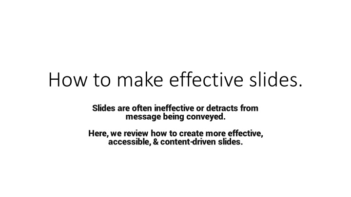
How to make effective slides. Slides are often ineffective or detracts from message being conveyed. Here, we review how to create more effective, accessible, & content-driven slides.
Effective communication is getting your message across Information Interpretation Message You need audience to both pay attention and then understand your message
Keys for optimizing communication Adapt to your audience See the presentation through the eyes of the audience, not the speaker Reduce noise i.e., frivolous information or distracting formatting e.g., too much text Use effective redundancy This is the strongest reason for having slides in the first place, However, the key is in the word effective
Planning Slides Design your slides in a content-driven manner Get the message across both verbally and visually This way the message could be received using either modality Make good use of prominent title areas State the message in the title as a sentence
Constructing slides Template slides are typically noisy Consider logos & affiliations on title & acknowledgement slides Add only content that supports your message Start by asking yourself, What am I trying to tell people? Visual flow: connect text with graphics Additionally: speak in relation to the visual representation Ensure text size is not too small How to check: print slides as handouts (6 per page). Any text that is too small will be too small for your audience.
Presenting your slides Plan your slides Structure your slides Practice! Be concise: one slide, one message Interact with your slides Point out parts of your slide Know your next slide Be a speaker, not a guide Could you give your presentation without your slides? The best way to know, is to practice, practice, practice.
Accessibility Tips Color contrast select colors for colorblind & general visibility Alt text - describe figures and other graphics Font size - Print large (enough) Typeface - Use accessible fonts e.g., sans serif Reading order - Ensure easy flow, cognitive load is exacerbated by disability Plain English simple language & spell out acronyms Resources: Make your PowerPoint presentation accessible Accessibility Guidelines for Presenters
Using the Microsoft accessibility checker accessibility checker is found under Review --> Check Accessibility
What is to be sought in designs for the display of information is the clear portrayal of complexity. Not the complication of the simple; rather the task of the designer is to give visual access to the subtle and the difficult that is the revelation of the complex. The Visual Display of Quantitative information -- Edward R. Tufte
References Doumont, J. L. (2009). Trees, maps, and theorems. Brussels: Principiae. Tufte, E. R. (2001). The visual display of quantitative information (Vol. 2, p. 9). Cheshire, CT: Graphics press. Make your PowerPoint presentations accessible to people with disabilities https://support.microsoft.com/en-us/office/make-your-powerpoint-presentations- accessible-to-people-with-disabilities-6f7772b2-2f33-4bd2-8ca7-dae3b2b3ef25 Write helpful Alt Text to describe images. https://accessibility.huit.harvard.edu/describe-content-images
Addl Resources: Color palettes Check your color palettes: https://coolors.co Check your color palettes (adobe): https://color.adobe.com/create/color-accessibility Color blindness simulator: http://www.color- blindness.com/coblis-color-blindness-simulator/ Example color palettes: https://davidmathlogic.com/colorblind/#%23D81B60- %231E88E5-%23FFC107-%23004D40 Anbuhl 2022 Tips for accessible and inclusive design practices
Addl Resources: Visualization and Accessibility https://www.betterment.com/design/accessible-data- visualization https://towardsdatascience.com/an-incomplete-guide-to- accessible-data-visualization-33f15bfcc400 http://www.inclusivedesigntoolkit.com/UCvision/vision.html#nog o https://www.brightcarbon.com/blog/optimising-presentations-for- people-with-colour-blindness/ Anbuhl 2022 Tips for accessible and inclusive design practices
