Analyzing Pupils' Test Marks in Maths and Science
In this educational content, scatter graphs are used to plot pupils' test marks in Maths and Science out of 100. The data is analyzed to identify patterns and correlations between the two subjects. Students learn to plot scatter graphs, identify correlation types, and draw lines of best fit for estimation purposes. Utilizing these visual representations helps in understanding the relationship between the test marks in the two subjects.

Download Presentation

Please find below an Image/Link to download the presentation.
The content on the website is provided AS IS for your information and personal use only. It may not be sold, licensed, or shared on other websites without obtaining consent from the author.If you encounter any issues during the download, it is possible that the publisher has removed the file from their server.
You are allowed to download the files provided on this website for personal or commercial use, subject to the condition that they are used lawfully. All files are the property of their respective owners.
The content on the website is provided AS IS for your information and personal use only. It may not be sold, licensed, or shared on other websites without obtaining consent from the author.
E N D
Presentation Transcript
Starter What patterns can you spot in this data? Is it what you d expect? Does all the data follow the pattern you ve spotted? The data is pupils test marks out of 100 in Maths and Science Science Mark 57 31 81 34 93 16 24 60 75 44 Maths Mark 60 40 90 88 85 25 35 65 73 42
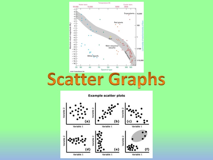
Scatter Graphs Learning Objectives All will be able to plot a Scatter Graph for a set of relevant data (Level 5/6) Most will then be able to state the type of correlation (Level 6) Some will be able to draw an appropriate line of best fit and use it to make estimates (Level 6)
Scatter Graphs Today we will be looking at plotting Scatter Graphs Scatter Graphs are used to represent two linked pieces of data Once plotted, patterns can more easily be found and estimates can be made from it
Scatter Graphs Plot a Scatter Graph of the following Information on test marks out of 100. What patterns do you notice? Science Mark Maths Mark 57 31 81 34 93 16 24 60 75 44 60 40 90 88 85 25 35 65 73 42
Scatter Graphs You can draw a line of best fit on Data A line of best fit roughly follows the pattern of the points It does NOT have to go through any points or start on the axes Positive Correlation As one value increases, the other increases Negative Correlation As one value increases, the other decreases No Correlation There is no pattern in the data (and therefore no line of best fit )
Scatter Graphs Using a line of best fit 100 90 80 70 A pupil scored a mark of 40 on their Science test but was absent for their Maths test. Use a line of best fit to estimate the score they would have achieved 60 Maths Mark 50 40 30 20 10 0 0 10 20 30 40 50 60 80 90 100 70 Science Mark
Summary We have learnt to plot Scatter Graphs We have seen the 3 main types of correlation We have learnt how to draw and use a line of best fit on a graph