Mastering Graph Axes Customization: Techniques and Tricks
Explore advanced techniques for customizing graph axes by adjusting scales, labels, and ticks. Learn how to suppress ticks, modify label alignment, and work with non-standard scales like logarithmic or reciprocal. Discover ways to maintain consistent styles across a series of graphs and gain more control over your visualization outcomes.

Uploaded on Sep 28, 2024 | 0 Views
Download Presentation

Please find below an Image/Link to download the presentation.
The content on the website is provided AS IS for your information and personal use only. It may not be sold, licensed, or shared on other websites without obtaining consent from the author. Download presentation by click this link. If you encounter any issues during the download, it is possible that the publisher has removed the file from their server.
E N D
Presentation Transcript
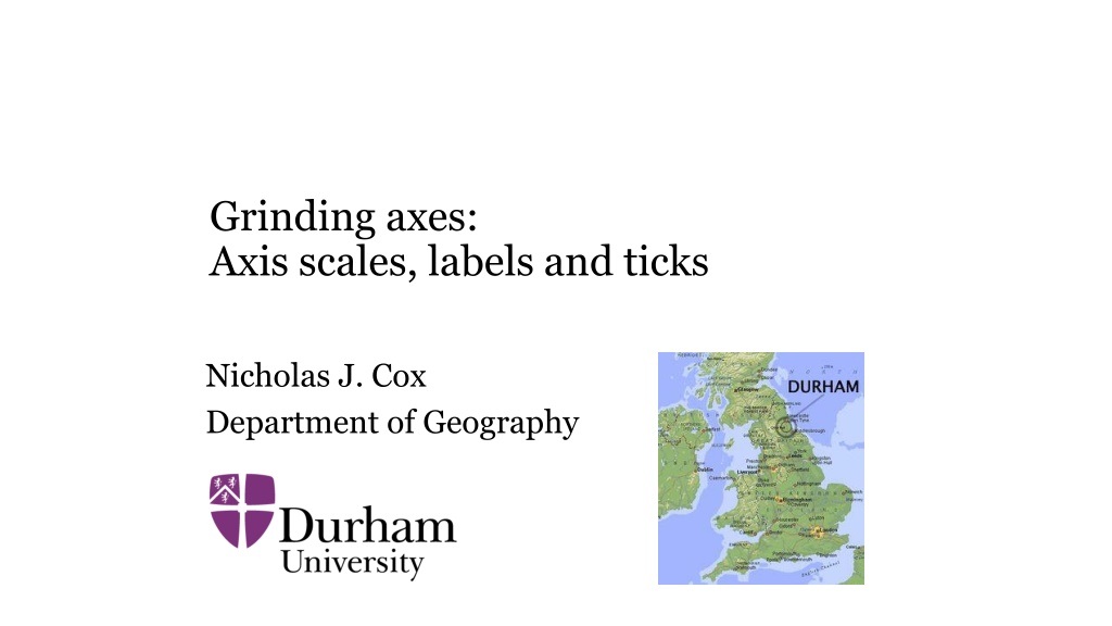
Grinding axes: Axis scales, labels and ticks Nicholas J. Cox Department of Geography
Aims Axis axis, the chital or spotted deer This is a round-up of some technique for graph axes, ranging from some simple tricks to some community- contributed commands, both old and new. Code to reproduce all graphs will be posted after the meeting. 2
Commands from SSC and Stata Journal nicelabels SSC and Stata Journal 22(4) in press niceloglabels Stata Journal 18(1): 262 286 and 20(3): 1028 mylabels and myticks SSC and Stata Journal 22(4) in press qplot latest Stata Journal 19(3): 748 distplot latest Stata Journal 19(1): 260 transplot SSC 3
Once stated, often applied A common perhaps increasingly common need is for a series of graphs produced by a loop or other repetition to have a pre-stated consistent style. The grey area is where graph will make decisions for you that turn out to be what you don t want. So, you may need to spell out your desires more explicitly. 4
Ever needed a tick to be suppressed? labels between ticks, not at them? minor nudging of labels? a logarithmic scale but found default labels undesirable? automatic choice of nice labels that is under your control? a slightly non-standard scale such as logit, reciprocal or root? 5
Suppressing ticks Axis ticks are like marks on a ruler showing a graduated scale. You might want to suppress them, particularly if your scale is categorical, not quantitative. The sub-option noticksis the obvious thing to try, but it doesn t always work or may not be quite right. Other tricks are to set tlcolor(bg) or tlcolor(none) or to adjust tlength(), e.g. to zero. A tick one can t see is in effect not present. 6
The ticks on the x axis are not needed, as the scale is categorical. 7
Here we set tlc(bg) tlength(2) to suppress the tick but also to keep the label text at a modest distance from the axis. We also stretched the axis with xsc(). We also changed the alignment, to be explained next. 8
Aligning labels and ticks Usually label text is centred on the corresponding tick. If you want text to start or end at the tick, use a small angle, say ang(-0.0001) for left justification or ang(0.0001) for right justification. You may need to tweak other settings. Vince Wiggins taught me this trick. See also our paper at https://www.stata-journal.com/article.html?article=gr0079 9
Labels may refer to intervals, not points Sometimes a text label refers to an interval, not a point. Consider time series. A time series extending over say 100 years is usually treated as a series of points and we don t try to label each year on the time axis. A time series extending over say 10 years or less is one where a different approach often helps, namely labels without ticks in the middle of each interval big ticks at the ends of each interval. 10
Christmas is coming, or showing seasonal detail A small bonus of this trick using grid lines too is that we get to see more clearly that turkey sales are usually highest in the 4th quarter. More generally, detail on seasonality can be important, or at least interesting. This was written up at https://www.stata-journal.com/article.html?article=gr0030 13
A pet peeve (I have others) I often see time or year as x axis title. Who needs that? It can be cut without loss. In your past there was some teacher (of physics???) who was savage if you did not give precise axis titles. That teacher was right except in this case. 14
Nudging axis labels slightly On graphs with multiple panels, labels can get unfortunately close, or even overlap. You can increase the separation of panels, which may be wasteful of space, or just add spaces on the fly to nudge the end labels inwards. For example: Xla(1935 1935" 1955 "1955 " 1940(5)1950) Who introduced a(b)c notation, and when? The first use known to me was by J.W. Tukey in 1948. 15
Labels on logarithmic scale That example leads naturally to the question of plotting on logarithmic scale. graph doesn t an especially good job of automating nice labels on logarithmic scale. This is what you get by asking for the previous graph to be shown with ysc(log). 18
niceloglabels A generous interpretation is that Stata is saying You should know what you want here, so back to you to tell me . A few failed attempts at better code indicated that there isn t a solution except what people prefer as their style and that works well for their data. Something better is offered by niceloglabels, which suggests nice log labels given a style choice puts their specification into a local macro for later use. 20
So what are nice log labels? As in the rest of life, nice can be hard to define precisely, but easier to recognise in practice. niceloglabels suggests labels depending on a range and a preferred style. So, style 1 is for labels that are powers of 10 style 2 is for powers of 2 style 13 is for sequences like 1, 3, 10, 30, 100 style 125 is for sequences like 1, 2, 5, 10, 20, 50, 100 And there are others. 21
Yet more: you can specify that you want to see powers with superscripts like 106 or 10-9 or unit fractions such as 1/10 or 1/16. 22
nicelabels nicelabels came after niceloglabels, as it is needed less often. It extends James Hardin s nicenum from Stata Technical Bulletin 25: 2 3 (1995). In essence, 1, 2 and 5 times powers of 10 are nice. 1, 20 and 500 are nice. Given a range (equivalently a variable with its range), nicelabels can suggest tight labels (within the range) or loose labels (wider than the range). It can be used together with other preferences such as always showing zero or always showing the observed minimum and maximum. 24
Being nice isnt everything Multiples of 0 25 50 75 100 might be exactly what you need for labelling extremes, median and quartiles or benchmarks on any percent scale. For hours of the day, 0(3)24 or 0(6)24 could be good. For map directions as compass bearings, 0(45)360 or 0(90)360 could be good (noting that 0 360 ). 25
. numlist "22652(14)22820 . di "`r(numlist)'" 22652 22666 22680 22694 22708 22722 22736 22750 22764 22778 22792 22806 22820 may look horrible, but the list denotes every other Friday in the first half of 2022 and could be the basis for acceptable date labels. 26
nicelabels with a numeric range . nicelabels 142 233, local(foo) step: 20 labels: 140 160 180 200 220 240 . nicelabels 142 233, local(foo) tight step: 20 labels: 160 180 200 220 . nicelabels 142 233, local(foo) nvals(10) step: 10 labels: 140 150 160 170 180 190 200 210 220 230 240 . Nicelabels 142 233, local(foo) nvals(10) tight labels: 150 160 170 180 190 200 210 220 230 27
nicelabels with a numeric variable (census.dta) . nicelabels medage, local(agela) step: 5 labels: 20 25 30 35 . nicelabels medage, local(agela) tight step: 5 labels: 25 30 . nicelabels medage, local(agela) nvals(10) step: 2 labels: 24 26 28 30 32 34 36 . nicelabels medage, local(agela) nvals(10) tight step: 2 labels: 26 28 30 32 34 28
Axis labels must start at zero? A variable is all positive, but regardless you want to insist on labels starting at zero: . sysuse auto, clear (1978 automobile data) . summarize mpg, meanonly . . nicelabels 0 `r(max)', local(foo) step: 10 labels: 0 10 20 30 40 50 29
Observed minimum and maximum should be labels? This mix isn't guaranteed to be nice! . nicelabels mpg, tight local(yla) step: 10 labels: 20 30 40 . summarize mpg, meanonly . local yla `yla' `r(min)' `r(max) (similar code for weight) . scatter mpg weight, xla(`xla') yla(`yla', ang(h)) ms(Oh) 30
Want at least 5 labels? You can count the number suggested and tell nicelabels to try again if it does not suggest enough. Some degree of automation may be important to some users. . nicelabels mpg, tight local(yla) step: 10 labels: 20 30 40 . if wordcount("`yla ) < 5 nicelabels mpg, tight local(yla) nvals(10) step: 5 labels: 15 20 25 30 35 40 31
mylabels and myticks mylabels was written to support use of any transformed scale whatsoever. Hence, values are plotted on one scale, but the labels you want to see are on another scale, usually that of the original data. The main idea was to support transformations other than logarithm, which often is supported directly by ysc(log) and xsc(log). You need to specify your scale using @, which imparts some flexibility. The inspiration was given by Patrick Royston in Stata Technical Bulletin 34: 9-10 (1996). 32
Some useful transformed scales Square root Cube root Reciprocal Logit Folded root = sqrt(p) sqrt(1 p) Neglog = sign() * ln(1 + abs()) Inverse sinh = asinh() and inverse tanh = atanh() to name only a magnificent eight and not yet naming any quantile scales 33
The implication is that we need generality and flexibility Let s analyse mpg from the auto data in terms of its reciprocal but show labels in terms of miles per gallon for easier interpretation. sysuse auto, clear set scheme s1color * factor of 1000 is for convenience in regression gen gpm = 1000/mpg regress gpm weight mylabels 12 15(5)35 41, myscale(1000/@) local(yla) scatter gpm weight, ms(Oh) mc(blue) yla(`yla', ang(h)) ytitle(Miles per gallon (reciprocal scale)) 34
mytickstoo is available myticks 12/41, myscale(1000/@) local(myyti) Transformations can be motivated in terms of where they stretch and where they squeeze, relatively speaking. The pattern of axis ticks can make this vivid. 36
@ indicates the desired scale mylabels 12 15(5)35 41, myscale(1000/@) local(yla) I want to see labels with text 12 15(5)35 41. The scale used is 1000/that. So where you have value 1000/12 (work it out!), show text 12. And so on. 37
Use Stata syntax for transformation You can use standard Stata syntax to indicate the transformation, including function calls. sqrt(@) sign(@) * ln(1 + abs(@)) OR sign(@) * log1p(abs(@)) or whatever else you want. 38
Celsius from Fahrenheit webuse citytemp, clear summarize scatter tempjuly tempjan mylabels 10(5)35, myscale(32 + (9/5)* @) local(myyla) mylabels -15(5)20, myscale(32 + (9/5)* @) local(myxla) scatter tempjuly tempjan, ms(Oh) mc(blue) xli(32, lc(gs8)) /// yla(`myyla', ang(h)) xla(`myxla ) /// ytitle(Average July temperature ({°ree}C)) /// xtitle(Average January temperature ({°ree}C)) 39
Use all axes to show dual scales? scatter tempjuly tempjan, ms(Oh) mc(blue) yaxis(1 2) xaxis(1 2) /// xli(32, lc(gs8)) /// yla(`myyla', ang(h) axis(1)) xla(`myxla', axis(1)) /// yla(50(9)95, axis(2) ang(h)) xla(5(9)68, axis(2) grid) /// ytitle(Average July temperature ({°ree}C), axis(1)) /// ytitle(Average July temperature ({°ree}F), axis(2)) /// xtitle(Average January temperature ({°ree}C), axis(1)) /// xtitle(Average January temperature ({°ree}F), axis(2)) 41
Yet more mylabels has prefix() and suffix() options to add text to each axis label such as % signs, currency symbols, or units of measurement except that firstonly and lastonly options specify adding them only to the first or last label on that axis. 43
Festina lente mylabels was first posted to SSC in 2003 https://www.stata.com/statalist/archive/2003-05/msg00084.html and is written up in Stata Journal 22(4) in press. Some projects move more slowly than others . 44
Other uses of the @ syntax for flexible scales qplot is a general purpose quantile plot command that goes back to Stata Technical Bulletin 51: 16 18 (1999). The latest version is at Stata Journal 19: 748 (2019). A trscale() option allows cumulative probabilities to be mapped to some other scale, e.g. normal or Gaussian standard deviates. Similar comments apply to distplot for distribution function plots. 45
Words from the wise It can be useful to plot an observed distribution against the standard Gaussian even though there is no question of it being Gaussian in shape. The motive is that it is easier to study a distribution by comparing it with a standard shape than just by looking at it. Michael Hills (1934 2021). Statistics for Comparative Studies. London: Chapman and Hall, p.28 (1974) The normal QQ-plot is a useful exploratory tool even for nonnormal data. The plot shows skewness, heavy-tailed or short-tailed behaviour, digit preference, or outliers and other unusual values. Yudi Pawitan (1960 ). In All Likelihood. Oxford: Oxford University Press, p.92 (2001) 46
transplot transplot (SSC) supports various plots in which one or both variables may be on transformed scales. https://www.statalist.org/forums/forum/general-stata- discussion/general/1561836-transplot-package-downloadable-from-ssc gives a quick overview. https://www.stata.com/meeting/uk19/slides/uk19_cox.pptx talked about transplot earlier when under development (slides 31 to 48). 48
Rules in transplot, more or less 0. If no transform is mentioned, use that variable as it comes. 1. If @ is specified, use that variable as it comes. 2. If a Stata function is mentioned, apply that function to a variable: e.g. log10 means log10(@) 3. Otherwise apply the expression given: e.g. sqrt(@) sqrt(1 - @) 4. (Undocumented!) Try the code as a call to an egen function. These rules are a fairly elaborate implementation of flexible scaling, and so the corresponding code may interest Stata user-programmers. 49
webuse grunfeld, clear transplot qnorm invest mvalue kstock, trans(@ log10) ms(Oh) mc(blue) transplot qnorm invest mvalue kstock, trans(@ log10) ms(Oh) mc(blue) combine(colfirst) transplot qnorm invest mvalue kstock, trans(@ log10) combine(colfirst) recast(line) lc(blue) lw(medthick) 50


 tlength(2)")


")


22820“")

")