Exploring Colour Theory: A Visual Guide
Dive into the world of colour theory with this visual guide. Learn about the colour wheel, primary, secondary, and tertiary colours, contrast versus harmony, warm versus cool colours, and key colour terms. Discover how colours interact and influence design and aesthetics.
Download Presentation

Please find below an Image/Link to download the presentation.
The content on the website is provided AS IS for your information and personal use only. It may not be sold, licensed, or shared on other websites without obtaining consent from the author. Download presentation by click this link. If you encounter any issues during the download, it is possible that the publisher has removed the file from their server.
E N D
Presentation Transcript
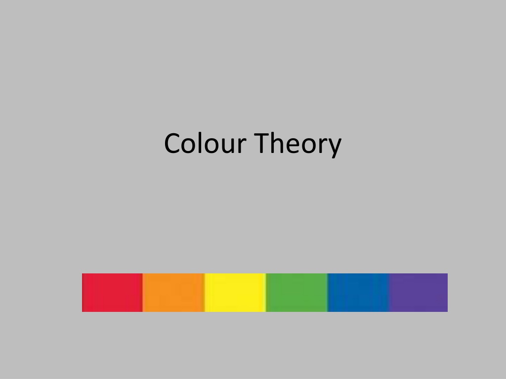
The colour wheel The colour wheel is designed in a way to show how colours relate to each other. There are 3 layers of the colour wheel.
The colour wheel YELLOW The inside 3 colours are referred to as PRIMARY COLOURS. These colours work in various combinations to create all the other colours. RED BLUE
The colour wheel GREEN ORANGE The next layer of the colour wheel are SECONDARY COLOURS. These are made up of mixing equal parts of TWO PRIMARY COLOURS. VIOLET
The colour wheel The final, outer layer of the colour wheel is filled with Tertiary colours. These are made of a SECONDARY and a PRIMARY colour. They therefore take their name from the two colour; eg yellow and green make yellow-green.
Contrast/Harmony CONTRAST- Colours that are far apart from each other on the colour wheel are known as contrasting colours. Contrast is eye-catching and makes objects stand out.
Contrast/Harmony HARMONY- Colours close to each other on the colour wheel on the outside of the colour wheel. Harmony is easy on the eyes.
Warm vs Cool Colours can also fall under being warm or cool . Warm Colours Cool Colours Evoke feelings of warmth. They are also known as ADVANCING COLOURS because they appear closer to the viewer than other colours. Evokes feelings of being cold. They are known as RECEDING COLOURS as they appear further away. Warm colours are; Reds Yellows Oranges Cool colours are; Blues Greens Violets
Terms HUE- The basic colour TONE- Lighter or darker than the basic colour TINT- The basic hue mixed with some white SHADE- The basic hue mixed with some black
Colour Gradients When a colour moves through a variety of tones from light to dark, this is termed a gradient. This effect is used a lot to give the impression that an object is three dimensional. Gradients can be stepped like the first example here or they can be more gradual as shown in the second.
Great power of attraction but too much can be tiring. Hot, bold, exciting, festive, passionate, positive. Red can be associated with rage, aggression, danger, courage, masculinity and speed. RED The colour which is most easily seen (luminous). Bright, pleasant, happy, sunny, lively and cheerful. Yellow is often associated with sunshine and holidays. YELLOW Blue is more formal than red or yellow. Cool, sophisticated, aristocratic, serene, passive, elegant and reliable. Rarely used in food because of its association with mould. Associated with reliability BLUE Sunny, cheerful, warm and happy. Orange is one of the appetite colours associated with flavour, energy and vitality. ORANGE Green is the most restful of all of the colours. Fresh, youthful, cool, soothing, natural and informal. It is also associated with safety, health and environmental concern. GREEN
In Graphic Communication we use colour extensively. However, we do not simply use it for the sake of using it. We use it for specific purposes. We select certain colours to render, design and tone products to suit the individual environment.
Colour Association We are surrounded by colours everywhere and colours are involved in everything we do, both consciously and sub-consciously. In the following few slides we will take a look at what certain colours mean to us and how they are manipulated in every day life. . .
RED Red is associated with areas such as passion, danger, speed, stopping, blood, fear and warmth. Certain items will be coloured red due to this colour association.
BLUE Blue is a formal colour, it is associated with sophistication, elegance and reliability. It is a cool colour which is rarely used in foods as it is associated with mould! For this reason, chef s sticking plasters are blue.
YELLOW Yellow is an easily seen, luminous colour. It is associated with brightness, sunshine, holidays, being happy and cheerful.
ORANGE Orange is similar to yellow in its associations. Orange is linked with areas such as warmth, fire, sun, being happy, cheerful and is also associated with flavour and energy.
GREEN Green is a very restful and peaceful colour. It is associated with areas such as nature, health, the environment, informal, youthful and cool.
PURPLE Purple combines the courage of red and the nobility of blue. It is a rich, pompous, impressive and regal colour.
WHITE White is luminous, positive, light, delicate and clean. It is also associated with innocence and purity in our culture but with death in some other cultures. When used with black it gives a dramatic effect.
BLACK Black is very subdued, solemn, profound, it is associated with death, sorrow and evil in our culture. Used with white it is very dramatic.

![textbook$ What Your Heart Needs for the Hard Days 52 Encouraging Truths to Hold On To [R.A.R]](/thumb/9838/textbook-what-your-heart-needs-for-the-hard-days-52-encouraging-truths-to-hold-on-to-r-a-r.jpg)

