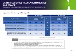
Expert Insights on Data Visualization Techniques
Explore various topics from simplifying data structures to enhancing chart readability in this informative webinar session with expert David Goldstein. Learn about segmenting data, handling outliers, and optimizing different chart types such as Marimekko and Bubble charts. Discover tips for creating visually appealing and informative presentations directly from Excel analysis data in PowerPoint.

Download Presentation

Please find below an Image/Link to download the presentation.
The content on the website is provided AS IS for your information and personal use only. It may not be sold, licensed, or shared on other websites without obtaining consent from the author. If you encounter any issues during the download, it is possible that the publisher has removed the file from their server.
You are allowed to download the files provided on this website for personal or commercial use, subject to the condition that they are used lawfully. All files are the property of their respective owners.
The content on the website is provided AS IS for your information and personal use only. It may not be sold, licensed, or shared on other websites without obtaining consent from the author.
E N D
Presentation Transcript
ASK AN EXPERT WEBINAR David Goldstein April 2020
Todays Topics Data structure Simplifying your chart Segmenting your data Chart-specific questions Marimekko Percentage Calculations Bar Mekko Totals Bar Chart with Different Series Bubble Chart Outliers
Data Structure Can I use the data from my Excel analysis to create a chart in PowerPoint without copying it into a simple data table? z
Simplifying your Chart When I make a line chart with a lot of data points, how do I only show a subset of data labels on the x axis? A common example of this is daily stock prices.
Simplifying Your Chart I have more data than I can fit in my marimekko chart. What can I do to make the chart easier to read?
Segmentation I would like to dive deeper into segmentation. For example: Percentage of each customer segment interested in each product. I want to sub-segment each customer into different persona categories. How do I do this in one chart?
Marimekko Percentage Calculation I am making a Marimekko chart and I would like my sub segments to show series name and % of the total mekko (not % of individual segment). Is there an easy way to do this?
Bar Mekko Totals What s the best way to show totals on a bar mekko chart?
Bar Chart with Different Series This chart shows overall tuition growth in the first column. The second segments this increase. The third column is the % of what is in the second. What s the best way to show this?
Bubble Chart with Outliers I am working on a bubble chart and some of the data points are outside the manual range. Is there a way to show the data points with arrows rather than leaving them off the chart?