Analyzing DVD Cover Design Elements for Pulp Fiction
"Identifying technical denotations and developing connotations from the DVD cover of Pulp Fiction, focusing on elements like the spine details, synopsis, anchoring text, dominant images, and cast list to understand the design choices and intended messages."

Download Presentation

Please find below an Image/Link to download the presentation.
The content on the website is provided AS IS for your information and personal use only. It may not be sold, licensed, or shared on other websites without obtaining consent from the author.If you encounter any issues during the download, it is possible that the publisher has removed the file from their server.
You are allowed to download the files provided on this website for personal or commercial use, subject to the condition that they are used lawfully. All files are the property of their respective owners.
The content on the website is provided AS IS for your information and personal use only. It may not be sold, licensed, or shared on other websites without obtaining consent from the author.
E N D
Presentation Transcript
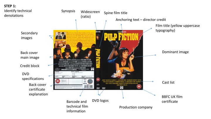
STEP 1: Identify technical denotations Synopsis Widescreen (ratio) Spine film title Anchoring text director credit Film title (yellow uppercase typography) Secondary images Dominant image Back cover main image Credit block DVD specifications Cast list Back cover certificate explanation BBFC UK film certificate DVD logos Barcode and technical film information Production company
The spine includes the film title, certificate, a secondary image, the Widescreen ratio logo and a DVD logo. The synopsis features at the top of the back cover written in red font on a yellow background. STEP 2: Describe denotations The anchoring text to the film title is a director credit for Quentin Tarantino. Secondary images feature on the back of the DVD cover film stills of key characters (blood stained gangsters and a couple in bed). The film title PULP FICTION is written in yellow uppercase typography at the top of the DVD cover. Back cover main image features four protagonists with shadow reflections in the background. The dominant image of a brunette woman in a black dress lying down smoking a cigarette and reading pulp fiction The credit block anchors the main images on the back cover and features the main cast and crew for the production. The cast list is anchored to the dominant image BBFC UK film certificate 18 is given. Back cover 18 certificate gives details of the sex, violence, swearing and drug use which ensures that it gains the highest age rating. The production company Miramax anchors the cast list and dominant image. DVD logos are placed on the spine and bottom left of the front cover. The barcode and technical film information features.
The anchoring text to the film title is a director credit for Quentin Tarantino. A USP for the film is his role as an auteur who is as important as the A-list cast in advertising the film. The synopsis features at the top of the back cover written in red font on a yellow background. This highlights the premise and genre of this alternative film. It also lists awards won which suggests that it is a highly rated film. The spine includes the film title, certificate, a secondary image, the Widescreen ratio logo and a DVD logo. This gives the impression that this is an iconic film which has a professional quality. The film title PULP FICTION is written in yellow uppercase typography on a red background at the top of the DVD cover. The garish contrast of primary colours illustrates how the content may be trashy like a pulp fiction novel and will include violence and explicit material. STEP 3: Develop connotations Secondary images feature on the back of the DVD cover film stills of key characters (blood stained gangsters and a couple in bed). These identify key scenes in the film and the most iconic characters. The dominant image of a brunette woman in a black dress lying down smoking a cigarette and reading pulp fiction highlights the rebellious style of this film. She seems like a rebel without a cause femme fatale figure like in a film noir. There may be feminist connotations in her representation also. Back cover main image features four protagonists with shadow reflections in the background. The shadows create a threatening quality. The cast list is anchored to the dominant image and features an ensemble cast A-list actors like John Travolta, Samuel L. Jackson, Uma Thurman, Bruce Willis, Ving Rhames, Christopher Walken, Harvey Keitel and Eric Stoltz. This suggests that this film has many characters and intriguing interrelated storylines. The credit block anchors the main images on the back cover and features the main cast and crew for the production. This underlines the role of an extensive crew to show that this is a major official production. BBFC UK film certificate 18 is given which shows that this film has X- rated explicit material. This will appeal to a certain demographic which likes edgy films. Back cover 18 certificate gives details of the sex, violence, swearing and drug use which ensures that it gains the highest age rating. This acts as a Unique Selling Point for a certain audience demographic. The production company Miramax anchors the cast list and dominant image. This is an independent company which highlights the film s indie credentials. DVD logos are placed on the spine and bottom left of the front cover. This anchors the product within the conventions of DVD sales. The barcode and technical film information features. These are required spec details for a DVD film product.
The anchoring text to the film title is a director credit for Quentin Tarantino. A USP for the film is his role as an auteur who is as important as the A-list cast in advertising the film. The synopsis features at the top of the back cover written in red font on a yellow background. This highlights the premise and genre of this alternative film. It also lists awards won which suggests that it is a highly rated film. STEP 4: Discuss audience/industry/producer s intentions/effect on audience/wider context The spine includes the film title, certificate, a secondary image, the Widescreen ratio logo and a DVD logo. This gives the impression that this is an iconic film which has a professional quality. The film title PULP FICTION is written in yellow uppercase typography on a red background at the top of the DVD cover. The garish contrast of primary colours illustrates how the content may be trashy like a pulp fiction novel and will include violence and explicit material. Secondary images feature on the back of the DVD cover film stills of key characters (blood stained gangsters and a couple in bed). These identify key scenes in the film and the most iconic characters. The dominant image of a brunette woman in a black dress lying down smoking a cigarette and reading pulp fiction highlights the rebellious style of this film. She seems like a rebel without a cause femme fatale figure like in a film noir. There may be feminist connotations in her representation also. Back cover main image features four protagonists with shadow reflections in the background. The shadows create a threatening quality. The cast list is anchored to the dominant image and features an ensemble cast A-list actors like John Travolta, Samuel L. Jackson, Uma Thurman, Bruce Willis, Ving Rhames, Christopher Walken, Harvey Keitel and Eric Stoltz. This suggests that this film has many characters and intriguing interrelated storylines. The credit block anchors the main images on the back cover and features the main cast and crew for the production. This underlines the role of an extensive crew to show that this is a major official production. BBFC UK film certificate 18 is given which shows that this film has X- rated explicit material. This will appeal to a certain demographic which likes edgy films. Back cover 18 certificate gives details of the sex, violence, swearing and drug use which ensures that it gains the highest age rating. This acts as a Unique Selling Point for a certain audience demographic. The production company Miramax anchors the cast list and dominant image. This is an independent company which highlights the film s indie credentials. DVD logos are placed on the spine and bottom left of the front cover. This anchors the product within the conventions of DVD sales. The barcode and technical film information features. These are required spec details for a DVD film product.
Technical denotations Hyperlink Strapline Masthead Date line and priceline Cover line Cover line Cover line Anchoring image Cover line Cover line Main cover line Bar code Sub-heading
The PRIDEMAGAZINE.COM hyperlink features above the masthead as a web address which highlights the magazine s modern appeal and for readers to access for additional content or an online version of the magazine. It shows that there are multiple methods of accessing magazine content. EXAMPLE ANSWER The strapline Celebrating 26 years at the top! features on the top left above the masthead. This reinforces the magazine s long-term success as a leading representative for Black British women. Readers are reassured by the magazine s proven track record, which makes it more appealing. The PRIDE masthead is positioned at the top of the page, written in turquoise uppercase text. The masthead suggests that the magazine has a sense of confidence in its identity. The effect on the reader is identification and inclusion, particular for the magazine s target audience: Black British women. The dateline November 2017 shows that this is a recent issue and the 3 priceline also illustrates that this is an affordable magazine for its target audience. The Cost of Standing Up To Racism coverline in blue uppercase font represents one of the magazine s key values: pride in racial identity and rebuking racism. The effect on the reader is to challenge them to respond actively to a major issue in society. Confessions of a Black Actress coverline reinforces the magazines two main themes: racial and gender identity. The audience will enjoy the personal nature of these articles, highlighted by the term Confessions . The direct address black and white photography anchoring image of Naomi Campbell features her looking over her shoulder wearing a fur coat with her hair pulled back shows a confident Black British celebrity (fashion model) who acts as a role model for the target audience. PRIDE intend to celebrate Campbell s success and show her as an example of what readers can also achieve. The 101 ways to Stand Up and Be Heard coverline emphasises a key idea for the magazine: pride, self- esteem, confidence and courage. The quantity of ideas will appeal to readers who can appreciate the amount of options they have to make an impact. The coverline How healthy is your makeup bag? . shows that the magazine wishes to cater for fashion and beauty enthusiasts and encourage further consumerism. It challenges readers to self-evaluate. The coverline: Hair: Liven up your winter with colour (which is written in white and orange cursive font) highlights the magazine s interest in fashion and beauty. It shows that PRIDE realises that its target audience are interested in hairstyles, and provides them with ideas in order to encourage diverse creativity with fashion. The main coverline Naomi speaks out is written in gold cursive font and shows that the magazine wants to give the fashion icon a platform to share what matters to her. It encourages readers to find platforms themselves as Naomi and the magazine clearly want to empower other black British women. The bar code features on the bottom right of the page. This shows that this version of the magazine is the print edition. This magazine has a readership of 250,000 every year which shows it is popular. The sub-heading on diversity, acting and being herself highlights how the magazine is interested in the star s response to her racial identity, what it is like to be a celebrity and how to remain authentic in such a competitive world. The reader will appreciate the down-to-earth approach of the magazine which hopes to reveal the real Naomi behind the media persona. Extended analysis: C&C design, the magazine s ideology, the overall aesthetic, social/historical context of the magazine, the impact of its representations, industry information.