Overview of Human-Computer Interaction Course
Gain insight into Human-Computer Interaction (HCI) by understanding user interface design, alternative computing methods, cognitive psychology models, ethical responsibilities, and team-work experience. Explore conventional and non-traditional interface paradigms, design tools for accessibility, and principles of interaction design. Dive into the history and principles of user interfaces, the concept of direct manipulation, and merging graphical systems with the web.
Download Presentation

Please find below an Image/Link to download the presentation.
The content on the website is provided AS IS for your information and personal use only. It may not be sold, licensed, or shared on other websites without obtaining consent from the author. Download presentation by click this link. If you encounter any issues during the download, it is possible that the publisher has removed the file from their server.
E N D
Presentation Transcript
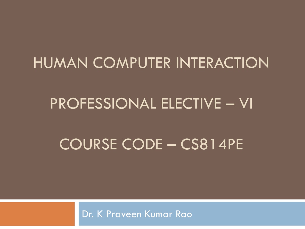
HUMAN COMPUTER INTERACTION PROFESSIONAL ELECTIVE VI COURSE CODE CS814PE Dr. K Praveen Kumar Rao
COURSE OBJECTIVE To gain an overview of Human-Computer Interaction (HCI), with an understanding of user interface design in general, and alternatives to traditional "keyboard and mouse" computing To become familiar with the vocabulary associated with sensory and cognitive systems (technical systems capable of independently solving and developing strategies for human tasks) as relevant to task performance by humans
COURSE OBJECTIVE Be able to apply models from cognitive psychology to predicting user performance computer interaction tasks and recognize the limits of human performance as they apply to computer operation in various human Appreciate the importance of a design and evaluation methodology that begins with and maintains a focus on the user
COURSE OBJECTIVE Be familiar with a variety of both conventional and non traditional user interface paradigms, the latter including virtual and augmented reality, mobile and wearable computing, and ubiquitous computing Understand the social implications of technology and their ethical responsibilities as engineers in the design of technological systems
COURSE OBJECTIVE Finally, working in small groups on a product design from start to finish will provide you with invaluable team-work experience.
COURSE OUTCOMES Ability to apply HCI and principles to interaction design. Ability to design certain tools for blind or physically handicapped people.
SYLLABUS UNIT I From Text Book 1 The User Interface An Introduction and Overview Importance of User Interface Defining the User Interface Importance of Good Design Benefits of Good Design ABrief History of the Human Computer Interaction A Brief History of Screen Design Characteristics of Graphical and Web User Interfaces The Graphical User Interface The Popularity of Graphics The Concept of Direct Manipulation Graphical System : Advantages and Disadvantages Characteristics of the Graphical User Interface The Web User Interface The Popularity of the Web Characteristics of a Web Interface The Merging of Graphical Business Systems and the Web Characteristics of an Intranet versus the Internet Principles of User Interface Design Principles for the Xerox STAR General Principles
SYLLABUS UNIT II From Text Book 1 The User Interface Design Process Obstacles and Pitfalls in the Development Process Designing for People: The Five Commandments Usability Usability Assessment in the Design Process Common Usability Problems Some Practical Measures of Usability Some Objective Measures of Usability The Design Team Know Your User or Client Understanding How People Interact with Computers Important Human Characteristics in Design Human Considerations in Design Human Interaction Speeds Understand the Business Function Business Definition and RequirementsAnalysis Determining Basic Business Functions Design Standards or Style Guides SYSTEM Training and Documentation Needs
SYLLABUS UNIT II contd.. Understanding the Principles of Good Screen Design Human Considerations in Screen Design How to Distract the Screen User What Screen Users Want What Screen Users Do Interface Design Goals The Test for a Good Design Screen Meaning and Purpose Organizing Screen Elements Clearly and Meaningfully Consistency Ordering of Screen Data and Content Upper-Left Starting Point Screen Navigation and Flow Visually Pleasing Composition Amount of Information Distinctiveness Focus and Emphasis Presenting Information Simply and Meaningfully Organization and Structure Guidelines Reading, Browsing and Searching on the Web Statistical Graphics Technological Considerations in Interface Design
SYLLABUS UNIT III From Text Book 1 Develop System Menus and Navigation Schemes Structures of Menus Functions of Menus Content of Menus Formatting of Menus Phrasing the Menu Selecting Menu Choices Navigation Menus Kinds of Graphical Menus Select the Proper Kinds of Windows Window Characteristics Components of a Window Window Presentation Styles Types of Windows Window Management Organizing Window Functions Window Operations Web Systems
SYLLABUS UNIT III contd.. Select the Proper Device Based Controls Characteristics of Device Based Controls Selecting the Proper Device Based Controls Choose the Proper Screen Based Controls Operable Controls Text Entry/Read Only Controls Selection Controls Combination Entry/Selection Controls Other Operable Controls Custom Controls Presentation Controls Selecting the Proper Controls Write Clear Text and Messages Words, Sentences, Messages and Text Text for Web Pages
SYLLABUS UNIT III contd.. Create Meaningful Graphics, Icons and Images Icons Multimedia Choose the Proper Colors Color What is it? Color Uses Possible Problems with Color Color What the Research Shows Color and Human Vision Choosing Colors Choosing Colors for Textual Graphic Screens Choosing Colors for Statistical Graphics Screens Choosing Colors for Web Pages Use of Color to Avoid
SYLLABUS UNIT IV From Text Book 2 HCI in the Software Process The Software Life Cycle Usability Engineering Iterative Design and Prototyping Design Focus: Prototyping in Practice Design Rationale Design Rules Principles of Support Usability Standards Guidelines Golden Rules and Heuristics HCI Patterns
SYLLABUS UNIT IV contd.. Evaluation Techniques What is Evaluation? Goals of Evaluation Evaluation Through ExpertAnalysis Evaluation Through User Participation Choosing an Evaluation Method Universal Design Universal Design Principles Multi Modal Interaction Design Focus: Designing Websites for Screen Readers Design Focus: Choosing the Right Kind of Speech Design Focus: Apple Newton
SYLLABUS UNIT V From Text Book 2 Cognitive Models Goal and Task Hierarchies Design Focus: GMOS Saves Memory Linguistic Models The Challenge of Display Based Systems Physical and Device Models Cognitive Architectures Ubiquitous Computing and Augmented Realities Ubiquitous Computing Applications Research Design Focus: Ambient Wood Augmenting the Physical Design Focus: Shared Experience Virtual and Augmented Reality Design Focus: Applications of Augmented Reality Information and Data Visualization Design Focus: Getting the Size Right
Part 1 The User Interface An Introduction and Overview : Defining the User Interface User interface design is a subset of the field of study called Human Computer Interaction (HCI). HCI is the study, planning and design of how people and computers work together so that a person s needs are satisfied in the most effective way. HCI designers must consider a variety of factors: What people want and expect What physical limitations and abilities people possess How their perceptual and information processing systems work What people find enjoyable and attractive Technical characteristics and limitations of the computer hardware and software must also be considered.
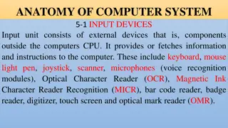
Defining the User Interface The user interface is the part of a computer and its software that people can see, hear, touch, talk to or otherwise understand or direct. The user interface has essentially two components: input and output. Input is how a person communicates his or her needs or desires to the computer. components are the keyboard, mouse, trackball, one s finger (for touch-sensitive screens), and one s voice (for spoken instructions). Some common input
Defining the User Interface Output is how the computer conveys the results of its computations and requirements to the user. The most common computer output mechanism is the display screen, followed by mechanisms that take advantage of a person s auditory capabilities: voice and sound. The use of the human senses of smell and touch output in interface design still remain unexplored. Proper interface design will provide a mix of well-designed input and output mechanisms that satisfy the user s needs, capabilities and limitations in the most effective way possible.
Defining the User Interface The best interface is one that is not noticed, one that permits the user to focus on the information and task at hand not the mechanism used to present the information and perform the task.
The Importance of Good Design The main reason for producing systems that are inefficient and confusing, even with the presence of today s technology and tools. Some of the reasons are We don t care? We don t possess common sense? We don t have time? We still don t know what really makes good design? The root causes for the above are mainly due to number 4 with a good deal of number 3. The developers say We Do Care, but they never seem to have time to find out what makes good design nor to properly apply it.
The Importance of Good Design A well designed interface and screen is very important to the users. It is their window to view the capabilities of the system. It is the system, being one of the few visible components of the product the developers create. It is also the vehicle through which many critical tasks are presented. These tasks often have a direct impact on an organization s relations with its customers and its profitability.
The Importance of Good Design A screen s layout and appearance affect a person in a variety of ways. If they are confusing or inefficient, people will have greater difficulty in doing their jobs and will make more mistakes. Poor design may even chase some people away from the system permanently. It may lead to aggravation, frustration and increased stress.
The Benefits of Good Design The benefits of a well designed screen include Improve Screen Clarity Improve Readability by making screens less crowded Separate items which can be combined on the same display line to conserve space, were placed on separate lines instead. Proper formatting of information on screens have a significant positive effect on performance. With redesigning the information on the screen, there is an increase in the extraction of desired information by the users.
The Benefits of Good Design Training costs are lowered because training time is reduced. Support line costs are lowered because fewer assist calls are necessary. Employee satisfaction is increased because aggravation and frustration are reduced. The organization s customers benefit because of the improved service they receive. Identifying and resolving problems during the design and development process also have economic benefits.
A Brief History of the Human Computer Interaction The need for people to communicate with each other has been in existence for long time. lowest and the communication modes we share are movements and gestures. The most common level of They are the language independent, that is, they permit people who do not speak the same language to deal with one another.
A Brief History of the Human Computer Interaction The next higher level, in terms of universality and complexity, is spoken language. A spoken language is communication if both parties to the communication understand it. At the third and highest level of complexity is written language. However, writing is still nowhere near as efficient as means of communication as speaking. In modern times, typewriter is an another step upward in communication complexity. However, spoken language is still more efficient than typing, regardless of typing skill level. a very efficient mode of
A Brief History of the Human Computer Interaction The communication was inversely related to what was easy for people to do. The computer demanded rigid, typed input through a keyboard, people responded slowly using the device and with varying degrees of skill. The human computer dialog reflected the computer s preferences, consisting of one style or a combination of styles using keyboards, commonly referred to as Command Language, Question and Answer, Menu Selection, Function Key Selection and Form Fill In. ability to deal with human computer s
Brief History of Screen Design The developers have been designing screens since CRT (Cathode Ray Tube) display was attached to a computer. Until 1970s, there was less interest in the application of good design principles. When IBM introduces 3270 CRT text-based terminal, good screen guidelines began to emerge. This usually consisted of many fields with very confusing and with unintelligible captions. It was cluttered and possessed a command field that challenged the user to remember what had to be keyed into it.
Brief History of Screen Design It was often required a referral to a manual to interpret. Using this kind of screen required a great deal of practice and patience. The screens were monochromatic, typically presenting green text on black backgrounds.
Brief History of Screen Design After a decade, guidelines for text-based screen design were finally made available. This helped in designing screens with much less cluttered look through the concepts of grouping and alignment of elements. User memory was supported by providing clear and meaningful captions and by listing commands on the screen and enabling them to be applied through function keys. Messages became clearer. The screens were not entirely clutter-free.
Brief History of Screen Design With the advent of graphics, another milestone in the evolution of screen design began. Some basic design principles did not change, groupings and alignment, borders were made available to visually enhance groupings, buttons implementing commands replaced function keys. and menus for Multiple properties of elements were also provided, including many font sizes and styles, line thickness an colors.
Brief History of Screen Design The entry field was supplemented by a multitude of other kinds of controls including list boxes, drop-down combination boxes, spin boxes and many more. These new controls were much more effective in supporting memory, simply allowing for selection from a list instead of requiring a remembered key entry. The old design was replaced by one of the new listing controls. Screens were simplified with the much more powerful computers.
Characteristics of Graphical and Web User Interface The Graphical User Interface Definition A user interface is a collection of mechanisms to interact with something. In a graphical interface, the primary interaction mechanism is a pointing device. What the user interacts with, is a collection of elements referred to as objects. techniques and They can be seen, heard, touched or otherwise perceived. Objects are visible the user and are used to perform tasks.
Characteristics of Graphical and Web User Interface They are interacted with as entities independent of all other objects. People perform actions called actions on objects. The operations include accessing and modifying objects by pointing, selecting and manipulating. All objects have standard resulting behaviors.
The Popularity of Graphics The graphics revolutionized design and user interface. The old text-based screen possessed one-dimensional, text-oriented, form-like quality. The graphics screen assumed a three-dimensional look. This revolution brought changes like information floated on windows, small rectangular boxes seem to rise above the background plane. The controls appeared to rise above the screen and move when activated. Lines appeared to be etched into the screen.
The Popularity of Graphics Information could appear and disappear as needed, sometimes text could be replaced by graphical images called icons. These icons could represent objects or actions. Screen navigation and commands are executed through menu bars and pull-downs. Menus pop-up on the screen. The screen body included selection fields such as radio buttons, check boxes, list boxes coexisted with the reliable old text entry field.
The Popularity of Graphics Text entry fields with attached or drop-down menus were made available. Screen objects and actions were selected through the use of pointing mechanisms like mouse or joystick instead of keyboard. Increased computer power and improvement in the display enable the user s actions to be reacted quickly, dynamically and meaningfully. This type of interface is referred to as WIMP interface: Windows, Icons, Menus and Pointers.
The Popularity of Graphics Graphical presentation of information utilizes person s information-processing capabilities. When properly used, it reduces the requirement for perpetual and mental information, reorganization and also reduces the memory loads. It permits faster information transfer between computers and people by permitting more visual comparison, more compact representation of information and simplification of the perception of structure. It can also add appeal and charm to the interface and permit greater customization to create a unique corporate or organization style. recording and
The Concept of Direct Manipulation The term used to describe this style of interaction for graphical systems was first used by Shneiderman (1982) These systems were called direct manipulation and they possess the following characteristics The system is portrayed as an extension of the real world The system simply replicates the objects and actions and portrays them on the screen. A person has the power to access and modify these objects. Continuous visibility of objects and actions Objects are continuously visible. Nelson described this concept as virtual reality . Hatfield called it WYSIWYG What You See Is What You Get.
The Concept of Direct Manipulation Actions are rapid and incremental with visible display of results The results of actions are immediately displayed visually on the screen in their new and current form. The impact of a previous action is quickly seen and the evolution of tasks is continuous and effortless. Incremental actions are easily reversible Actions, if discovered to be incorrect or not desired, can be easily undone.
Earlier Direct Manipulation Systems The concept of direct manipulation actually preceded the first graphical system. The earliest full-screen text editors possessed similar characteristics. Screens of text could be created (extension of real world) and then reviewed in their entirety (continuous visibility). Editing and restructuring could be easily accomplished (through rapid incremental actions) and the results immediately seen. Actions could be reversed when necessary.
Indirect Manipulation Direct manipulation of all screen objects and actions may not be feasible because of the following The operation may be difficult to conceptualize in the graphical system The graphics capability of the system may be limited The amount of space available for placing manipulation controls in the window border may be limited It may be difficult for people to learn and remember all the necessary operations and actions When this occurs, indirect manipulation is provided.
Indirect Manipulation Indirect manipulation substitutes words and text, such as pull-down or pop-up menus, for symbols and substitutes typing for pointing. Most window systems are a combination of direct and indirect manipulation. A menu may be accessed by pointing at the menu icon and then selecting it (direct manipulation). The menu itself is a textual list manipulation). When an operation is selected from the list, by pointing or typing, the system executes it as a command. of operations (indirect
Graphical Systems : Advantages Symbols recognized faster than text Faster learning Faster use and problem solving Easier remembering More natural Exploits visual/ spatial cues Fosters more concrete thinking Provides context Fewer errors
Graphical Systems : Advantages Increased feeling of control Immediate feedback Predicate system responses Easily reversible actions Less anxiety concerning use More attractive May consume less space Replaces national languages Easily augmented with text displays
Graphical Systems : Advantages Less typing requirements Smooth transition from command language system
Graphical Systems : Disadvantages Greater design complexity Learning still necessary Lack of experimentally-derived design guidelines Inconsistencies in technique and terminology Working domain is the present Not always familiar Human comprehension limitations Window manipulation requirements Production limitations
